
Nowadays, people browse products, interacting, and mostly purchase products on their mobile devices.
Think about it. At least 73% of the world’s population are smartphone users, according to Statista 2020. This number is projected to increase to 3.8 billion by 2021. Mobile ecommerce sales were expected to hit $ 2.92 trillion in 2020.
All of this suggests that if you haven’t optimized your website for mobile yet, you will risk losing customers and your business.

Why do mobile sites need testing?
Table of Contents
Back in 2016, or 2017, it’s common for websites to focus on their desktop interface while less prioritizing how the site performs on mobile devices.
This happens due to different shopping generations’ habits, and Millennials shoppers still tend to browse for their online products and make purchases on desktops.
But as time goes, Gen Z gains purchasing powers, and they prefer mobile responsive ecommerce sites as they often browse and place orders on-the-go.

This explains why merchants should perform ecommerce testing and optimize their website in 2020 to compete in the mobile marketplace.
HURRY UP and finds out Gen Z e-commerce trends to target the young online shoppers in 2020!
There are several approaches that businesses might have to gain a foothold in the mobile marketplace:
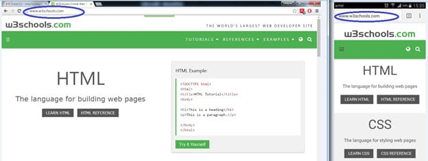
Stand-alone mobile website: Websites with the m. at the beginning of their domain is the earliest strategy companies used to adopt with mobile devices. When users access the website, the server will detect their devices, then redirect customers to the mobile site.
Although this method solves the problem, it does have some limitations, such as the SEO ranking status from the mobile website will also be separate from the desktop domain.
Adaptive website design: Another possibility is adaptive web design. The server will send different HTML & CSS codes to different devices, which means mobile, tablet, and desktop experience would greatly vary.
Responsive web design: The responsive web design will define how the content, layout, and display media will be shown according to browser screen size, not devices.
Progressive web apps: Finally, Progressive Web Apps is a relatively new technology to adapt to mobile websites. It allows a website to be pin on the home screen and operate as an application without the URL heading. This method will significantly improve the performance, UX & UI of the page.
NOTE DOWN these effective ecommerce website testing factors for a flawless online store!
No matter which approaches your business use, there is still a common testing checklist for your site, and you should follow them to ensure your site runs smoothly and seamlessly on mobile devices.
The Ecommerce Mobile Website Testing Checklist
Websites’ purpose is also considered when designing how the mobile website should look and which criteria should be tested. For example, sites sell products such as coffee or other consumable products; they prioritize how their media contents such as images or videos look like on mobiles’ screen.
However, for B2B products which require consideration over long periods, or news reports, then they might be less concerned about the image appearing on the screen.
Their attention was put more on if the information was easy to read for customers, or if the small screen accidentally hinders functions in the site.
CHECK-UP with Magento testing experts for optimized websites, ready for big sales rolling in!
Responsiveness to all devices & browsers
When talking about ecommerce website testing, the first element you should test for mobile-friendly is responsiveness and the designs on various displays, browsers, and devices. Some of the things you should consider when performing testing on multiple devices are:
- Do the text, image, and controls in the website display properly in different browsers and devices?
- The responsiveness was both with clicks and a touch-based screen.
- The boundaries of the screen, navigation, color, gradients, and other design elements must be tested to present according to the screens.
Website’s functionality
A website’s functionality should also be tested to make sure that your mobile website function on your website works the same as your desktop or tablet counterpart. To test the ecommerce mobile website or application functions, you must understand the website’s structure well.
For ecommerce website testing, it’s required for you to test every element’s functionality in the browsing and checkout process of buyers.
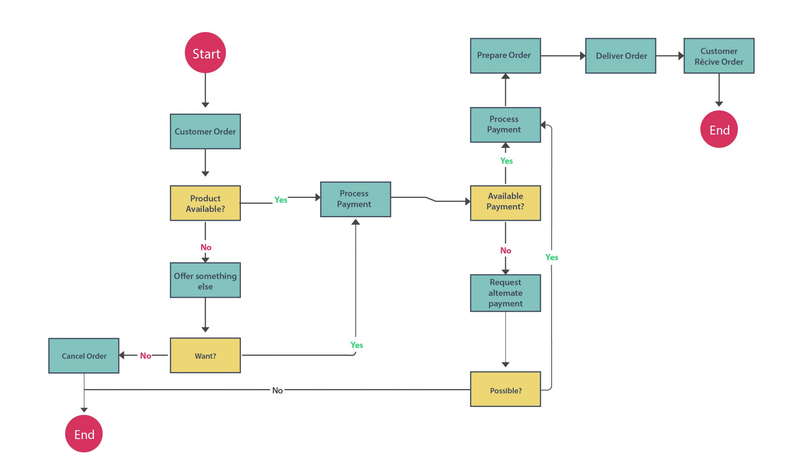
There are three important elements in its structure, which are:
Main page: The main pages are pages which customers navigate to access information about the website, the products, or to contact customer service. E.g. Homepage, Product description page, Special Offers, About Us page, Sitemap pages, Privacy Policy page, Press Releases page, etc.
Category/ Product Type pages: The pages that list the categories and filtering products based on size, price, model, etc. The tester should also pay attention to whether or not there are “Add to cart” or “Wishlist” buttons included for each product on the product listing page.
Shopping cart: Product listed in the cart, change the quantity, editing/remove products in the cart, select delivery methods, card payments, etc. After the shopping cart, it’s also necessary to check the payment flow and ensure all functions work well when customers perform the purchase.
While most websites have similar elements, it depends on the business request to customize and test the parts according to the customization requirements.
Website’s performance on mobile devices
Performance is one of the distinguishing factors when it comes to mobile websites. As mobile phones become more advanced, people’s attention span gets shorter, and they won’t wait around if the site takes longer to load.
However, the loading time on pages is also a challenge for responsive websites. Many businesses focus on the rich showcase of content on their website but forget that the wowing moment only happens when customers get past before they lose patience.
When doing performance mobile testing for websites, you should measure how long the site takes to render across devices, browsers, and internet speed. Ensure that the ecommerce testing website uses lazy image loading, compresses large elements, and uses other techniques to improve performance.
It would be best if you also ran load tests during peak traffic simulation. Your website should perform well even when multiple users perform different tasks on the site simultaneously.

IMPROVE your website’s speed significantly by applying these performance testing points!
Website contents & media optimize for mobile devices
The contents and media design on the responsive mobile website are divided into three components, which we could also apply for assessment:
Flexible Layout: The website should be built with a flexible grid that could be resized dynamically to all screens.
Media Queries: Capable of changing the website’s style to adapt to different screen sizes while still using the same URL (different to mDot websites.)
Flexible Media: When the size of the viewports (the area that the website content displayed, doesn’t include the toolbar or tabs, etc.) change, the media (image, videos, etc.) will also change the size and resolution with it.
Mobile-friendly Website Testing Tools
There are different ecommerce testing tools available for you to test the responsive design of your website. You can also check out some other mobile-friendly tools to perform ecommerce testing for your mobile website listed in the article below:
DIVE IN for a full review of ecommerce website usability testing tools, pros & cons, and tools’ alternatives!
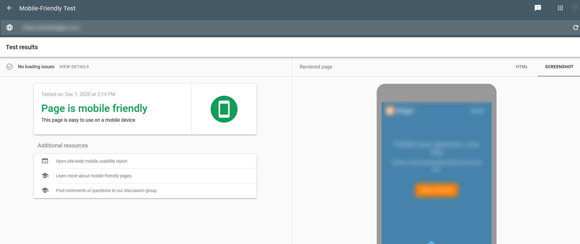
Google’s Mobile-Friendly Test Tool
Google’s Mobile-Friendly Test Tool is a tool that you can use to check quickly how mobile-friendly the website is. The tool has the advantage of a simple interface, steps, and lists the usability problems that it could find. This will help you detect the issues if your page doesn’t load, or there was some resource that was not loadable, either fails to load in a reasonable amount of time or doesn’t exist, blocked by Googlebot, etc.
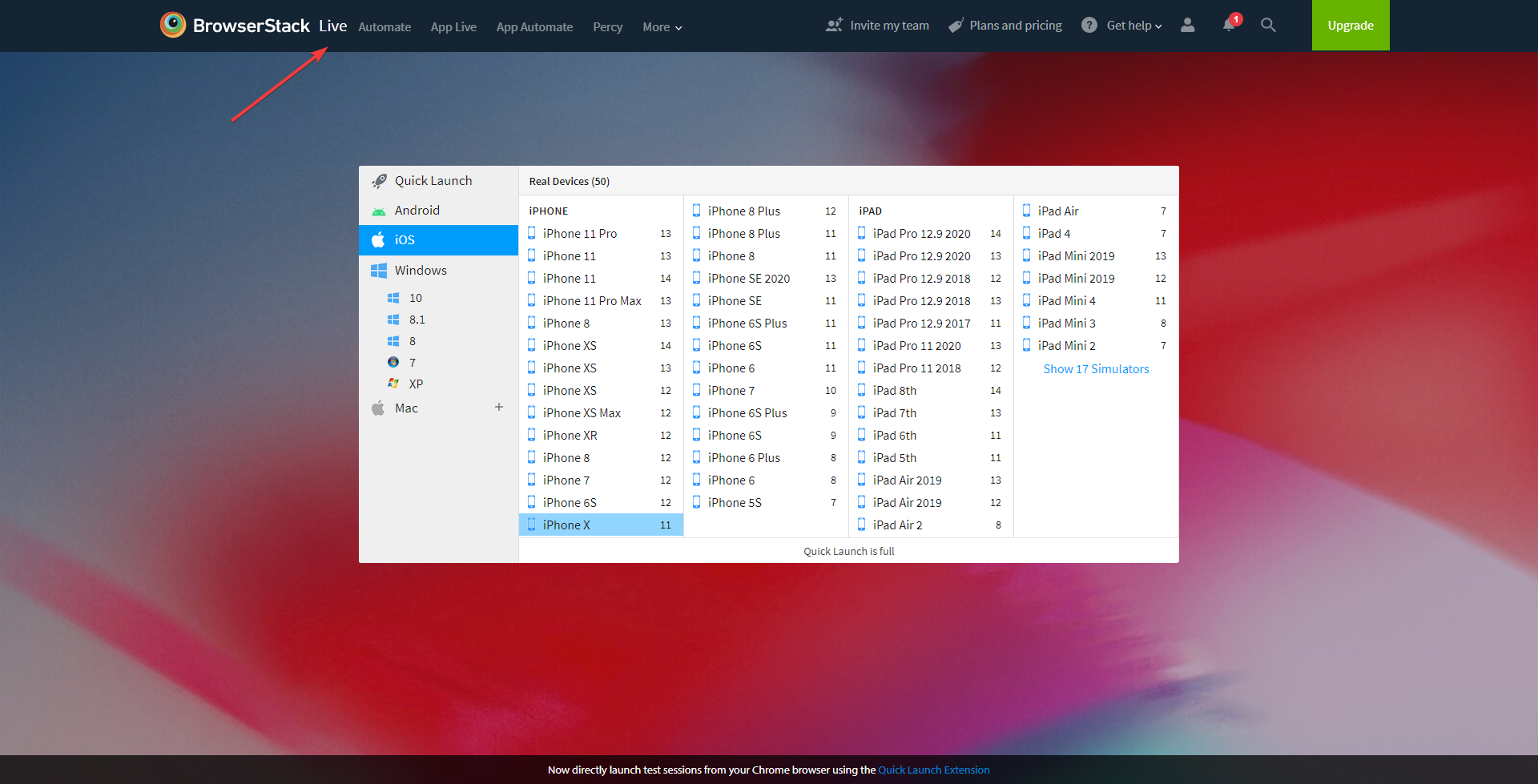
Browser Stack
Browser Stack is also a useful mobile testing tool for websites because it can launch your website on different devices in its live mode. It is preferred as it can be used to test online, or use at the local machines to test out the environment. Browser Stack enables users to test in specific locations, and is handy with developers, as they can perform unit test scenarios within the development environment.
Mobile Application Testing
Unlike mobile websites, mobile applications operate with the phone’s built-in infrastructures, which means the testing bar for performance and responsive design would be much higher. But when performing ecommerce testing on mobile applications, you should consider more factors that could affect the application that differs from the mobile ecommerce website in the browser.
Operating System compatibility
Ecommerce mobile app testing should first take system compatibility into account. Each system, Android & iOS, or Chrome OS, are all different in operating systems, devices’ hardware, and screen size.
In terms of the software & hardware structure compatibility, you should also concern about:
- The Android/iOS/ChromeOS version that your application supports.
- Other software that the application is compatible with within your device. For example Google Drive, Docs, Outlook, etc.
- Ecommerce mobile app testing should also test Devices that the application might be using if they can connect and utilize them or not. E.g. Wi-Fi, Bluetooth, Camera, etc.
In-app Game Testing
An application is a perfect environment for ecommerce brands to throw some mini-games and lucky draw contests, attract customers to play, and get their discount code. While there are also mini-games on mobile ecommerce websites, they are often more straightforward and weren’t expected with high performance as apps.
However, the games on apps can appear different in Android or iOS mobiles, tablets, or computer runs ChromeOS, which means there is a need to perform ecommerce testing to ensure that it functions well.
Conclusion
Mobile testing for websites in the ecommerce industry is important, as it ensures that your website is mobile-friendly and responsive to catch up with the shopping trends from small screen shoppers.
We have listed the important aspects and useful testing tools that you can utilize to take a quick look at your website to see if it has met all the requirements. You can also consult with us to find the most optimal solution for your mobile website, as we would be available at any time.
BSSCommerce is one of the leading Magento development services providers in the world. With 7+ years of experience, certified Magento developers, and specialists, we guarantee high-quality and commitment to satisfying your business requests.
We covered a wide range of Magento services such as website development, maintenance, speed-up consulting package, etc. Our PWA Magento website development service and Magento 2 PWA Theme will give your site transforming looks, and significant improvements in mobile experience.
We also provide a library of 178 free & paid Magento and Magento 2 extensions, and offer FREE Installation – FREE 1-year Support and FREE Lifetime Update for every Magento extension.
CONTACT NOW to explore our services and boost your business to the next height!