You may put lots of attention and effort into making pages that convert by content optimization, call-to-action adjusting, and navigation streamlining. However, there is usually a lack of foresight on the part of Magento 2 custom checkout fields.
While online checkout is a reasonably typical procedure, some companies do it wrong, and others do an excellent job. Let’s dive into the following case and how to fix it.
Examples of Bad Magento 2 Custom Checkout Fields
Table of Contents
Unhelpful error messaging
It’s usually good to notify form users when they make mistakes. However, if your error message is incorrect, like in this case, it can cause more harm than good.
Even though the text informs the user that there is a problem, there are two UX design issues:
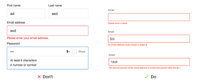
The error notice does not specify the issues or where they are in the form, requiring the user to examine each field individually.
After moving on from the field, the error message appeared after the form, prompting the user to readjust mentally. As a result, there will be increased mental strain and irritation.
Don’t know how to improve error messaging? Check out 4 Rules Of Error Messaging In Magento 2 Checkout Page now!
Indiscriminate upsell
Customers are frequently given the option to purchase related products during the Magento 2 custom checkout fields. You’ll attract more customers to buy if you time your product placements correctly. However, don’t upsell when customers have already entered their credit card numbers. You’re more likely to confuse customers than to close sales if you recommend an “important extra” after the customer has paid.
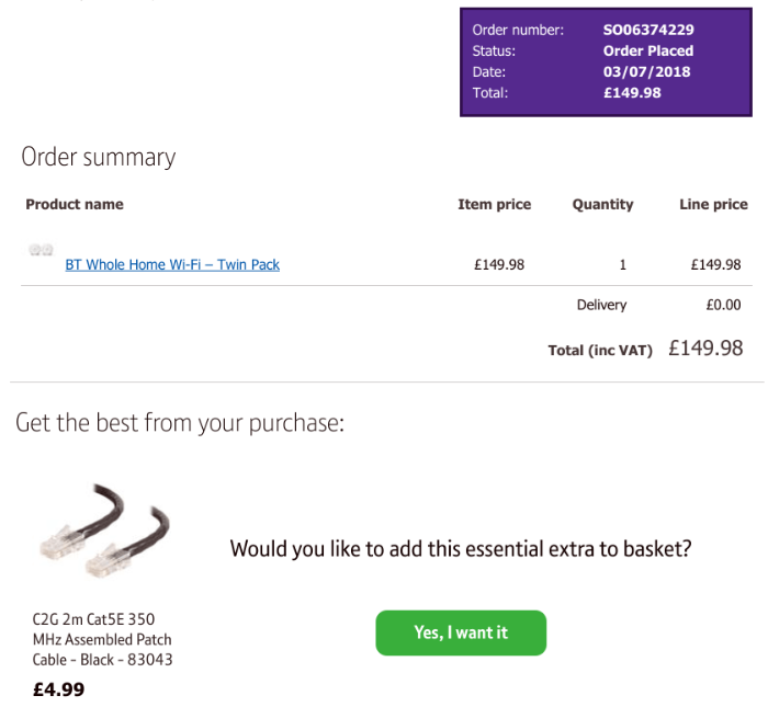
Magento Customize Checkout: Upsell To Boost At Least 10% Sale
Dropdown is one of the selections in the Magento feature, but in some cases, dropdown menus that didn’t drop down were a significant form design problem.
For example, the customer was asked to fill out a feedback form. There was no other motive than to assist the organization in improving its service. However, clicking in the expected location had no effect.
The user’s alternatives were only exposed when the cursor was positioned in the field to display the selected response according to trial and error.
This design makes it more difficult for users to fill out the form, wasting time and raising cognitive load as they try to figure out how to expose the menu options. This type of online form does not provide a pleasant user experience.

Other Magento 2 custom checkout fields issues
What’s the best place to start with this Magento 2 custom checkout fields design? When your online checkout form serves as your store’s cash register, it must function correctly. This is why the numerous issues encountered during the purchase process are so astounding:
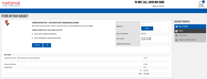
1. The checkout form is massive — filling out this form didn’t take long, but there’s too much space, tiny text boxes, and small font size that makes it appear more intimidating.
2. The basket is undetectable – it was only at the point of payment that it became apparent that the basket contained two goods. It necessitated going back several steps to remove an item and then resubmitting the finished pages.
3. Confusing navigation – the ‘next’ button in the right-hand menu bar is a strange black color. Users squander time attempting to figure out how to proceed because it’s challenging to find.
4. Unremovable extras – your customer may reconsider and want to leave some product out on the checkout page, but there was no option to delete it. After the Magento 2 custom checkout fields, there was an unwelcome surprise.
5. Tick box with difficult-to-target Terms & Conditions — tiny boxes are difficult to choose, and there was no link to the T&Cs, so you could see what you agreed.
Generally, it doesn’t help when lousy form design makes things more complicated than they need to be—re-entering information. Identify the issue with the data you’ve entered and try to go through forms that aren’t well-marked.
Real Custom Checkout Fields Cases & Actions
ACE Hardware
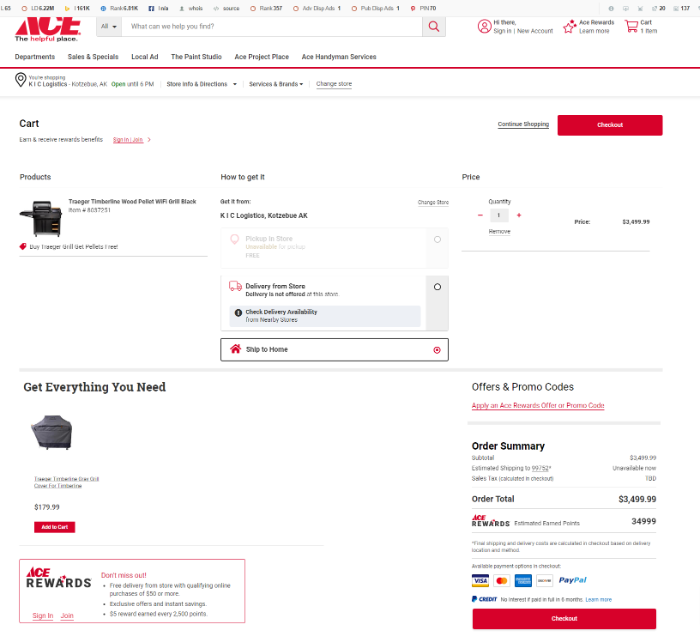
From a conversion standpoint, ACE’s pre-checkout page accomplishes multiple goals.
Pros:
The ACE Hardware page manages to cram a lot onto a compact screen – they design all of the options to encourage you to act rather than abandon your shopping cart. Large photos, similar items, free shipping, and product information are essential when making an informed purchasing decision. They’ve also included free shipment to your local ACE shop, a bill me later option, and the option to put the item on your wish list if you’re not ready to buy it yet.
ACE has also done an excellent job at including social and sharing features. There’s the Facebook like (for buckets! ), and the Twitter follow (for buckets!). There’s also a mention of a loyalty points program. Unmistakable is the large Add to Cart button.
Cons:
Because the rewards program is mentioned three in the checkout process, it nearly looks redundant. This site uses many screen real estate, yet it’s well-organized and smooth. Their product/store availability may be shown more prominently, and order security is not mentioned (though trust badge, fraud-protection, or other safe ordering methods).
Furthermore, there is no means to contact someone if the user has a question. Customers should be able to ask questions directly to a salesperson by including a phone number or a live chat option.
Actions:
- Make free shipping a prominent component of your offer if at all possible. It has a greater conversion rate than other e-commerce conversion testing.
- To assist customers at the point of purchase, consider employing live chat or displaying your customer support number in a prominent, visible location on your product page.
- Make it clear to customers how to return things and that purchasing on your site is secure.
ADD Magento 2 custom checkout fields to collect more customer data!
Apple
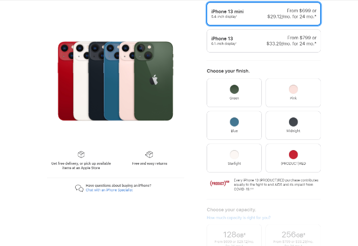
Apple encourages customers to personalize their purchases before paying for them at the checkout page.
Pros:
One of the reasons Apple products are so popular is that they are both intelligent and straightforward. The pre-checkout screen on the iPhone is no exception. You’ll be faced with simple clickable radio-button customization options that range from which cellular carrier you’ll use to what size memory capacity iPhone you desire from the time you decide to buy.
The customizing possibilities don’t stop there. You’ll prompt to purchase an iPhone cover and other relevant products when you check out. You’ll see an order summary and a vast green “proceed” button, and live chat/phone options if you have any considerations throughout the process. Free shipping and “in stock” messages assist the consumer get through the ordering process more quickly.

Cons:
Apple focuses on letting users design their Apple coverage in the example above that it’s easy to skip the accessories area entirely. After the first page, there’s no mention of the most typical queries customers would have before investing, such as the difference between 13 and 13mini. What are the options for my chosen carrier’s rate plans? How about technical assistance?
Actions:
- Provide FAQs to answer the user’s questions up front, especially if they’re making a high-ticket item purchase or buying something technical. Even approximate costs are better than nothing.
- If you offer support options for your product, make sure they are comprehensive. They’re just as noticeable as the package’s accessories or other essential items.
Crocs
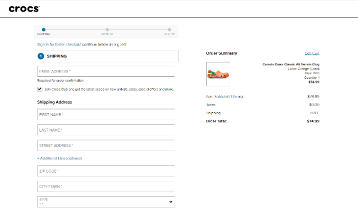
Crocs’ website takes customers step by step through the checkout procedure.
Pros:
If only Crocs paid as much care to their shoe design as they did to their website design. Whether you like them or not, you can’t deny that the checkout page does many things well. Your front-end will show the order amount with shipping and the policy on the right. One more bonus point is getting customers to sign up for their newsletter.
One of the best things about this page is that it tells users exactly how many steps are involved in the checkout procedure and what they are. So customers can not only change the items in their basket, but they can also double-check their order before they check out.
Cons:
There are no trust seals or order processing security details on the first screen. How do customers know it’s a safe site to do business on if they’ve never purchased at Crocs before. Also, how often will I receive the newsletter if I agree to subscribe, and what kinds of “special discounts and last-minute sales” will I see? As an example, a link to a past newsletter would be fantastic.
Moreover, there is a lack of live chat buttons and a customer support phone number if you have any questions.
Actions:
- Look for ways to eliminate anything that could serve as a distraction or a reason not to buy, even if it’s something else your company sells. The newsletter is a better location to put that information.
- If you allow them to sign up for discounts, give them a preview of what they might get in their email before they decide to join.
- People will know how long their checkout will take if they see the number of steps in the ordering procedure—allowing them to examine their order one final time before submitting it.
- Provide a live chat button
We hope the actual Magento 2 custom checkout fields case and action steps can bring you a clear vision and plan to customize the checkout process!
BSS Commerce is one of the leading Multi-platform eCommerce solutions and web development services providers globally. With experienced and certified developers, we commit to bringing high-quality products and services to optimize your business effectively.
CONTACT NOW to let us know your problems. We are willing to support you every time.
