
Today, let’s talk about the best one page checkout examples!
The utmost important step of the whole ecommerce process is checkout, no doubt. At the end of the day, all it matters is that customers finalize their purchases.
Nowadays, more and more eCommerce businesses optimize their checkout experience by shifting to the one page checkout model.
FOR MAGENTO OWNERS: Perfectly capture customer at the checkout with Magento 2 B2C Package.
In this article, we will walk you through everything you need to know to master one page checkout!
Let’s go!
Benefits Of One Page Checkout
Table of Contents
There are four major benefits for utilizing the one page checkout:
- Less steps and fewer clicks: Reducing steps and clicks will make the checkout process short, simple, frictionless, and more appealing to customers.
- Speed and efficiency: A single page checkout saves time on loading between payment pages and reduces navigation time.
- Ease of use: One page checkouts are easier to use. With all form fields in one page, customers can enter information at their own pace and in their own order.
- Lower abandonment rate: Improving the checkout experience isn’t just about pleasing your customers but also about increasing your conversions and revenue. The optimized checkout page leads to more conversions and revenue as it reduces checkout abandonment rate.
But before learning more about best one page checkout examples, we need to know the formal checkout flow and what we can do to smoothen it for customers’ convenience.
The Universal Checkout Flow
Every ecommerce website follows this checkout flow.
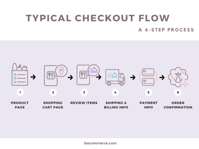
We have six steps to cover here: from the product page to the shopping cart, then review the items; after that, customers fill out their information on shipping, billing, and payment. Last but not least, you and the customers agree on the order confirmation, and the purchase is set.
Now that you know what the checkout process entails, we’ll dive deeper into how to optimize every single step to maximize your turnover.
Optimize Checkout At The Product Page
#1 Let customers check out right at the product page.
If this is not of the top 3 best e-commerce checkout practices in any checkout optimization list, consider bouncing back immediately. Because this tip comes directly from the biggest and most successful e-commerce site – Amazon.
It holds unbelievable conversion power while working on the simplest idea of customer behavior.
Some customers come to your site with a clear intention: they know what they want and direct them to the checkout page.
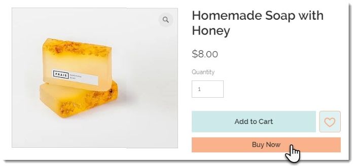
The quicker it takes to buy the product, the more likely the purchase will be finalized.
#2 No need for registration to checkout.
Here is a fact: people have a commitment issue – in order words, no one prefers bonding right at the gate. Therefore, no strings attached works excellent to encourage customers to buy.

And if you think you lose the chance to increase the customer lifetime value. Don’t worry; we’ll talk about it right now.
#3 Ask for the email first.
Yes, email over anything else. This is the utmost vital piece of customer information you need to gather. Why?
Firstly, you need the email for order confirmation.
Secondly, email marketing remains the top digital marketing tactic, even in 2020. Building the email list is vital to your ecommerce success, and that’s how you lengthen the customer lifetime value.
Finally, combined with cart abandonment automation, you can re-convert sales from the email customers give out.
#4 Put customer service on board.
Either to advise customers or troubleshoot their purchases, a phone/chat interface is essential to save your sale. Imagine waiting for a 24-hour email reply; you most definitely buy somewhere else.
And the same goes for your customers. Make their shopping experiences smooth and trouble-free is a must.
#5 Be mindful of cross-selling and upselling.
Let’s get this out of the way first, cross-selling and upselling (regardless of checkout layout, one page checkout, or more) is vital. More choices more invoices, these tactics are how you increase the order value.

Upselling refers to the tactic of recommending a better version of the current chosen product. Also, cross-selling is about listing out other products to buy with the one in the shopping cart.
However, you need to calculate what to show because: carefully
- There is limited space on the product page.
- Customers can be overwhelmed if you shower them with an abundant list of products.
- If you overdo cross-sell and up-sell, you can appear ingenuine and lost customers’ trust.
Now, let’s move to the next step in the checkout flow.
Optimize Checkout At The Shopping Cart Page
#6 Be transparent with pricing.
One of the biggest reasons that leads to abandoning carts is that customers can’t see all the fees upfront.
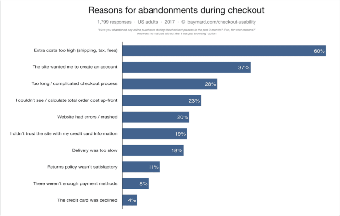
That’s why listing down every single fee in one page checkout at this step is required. For example:
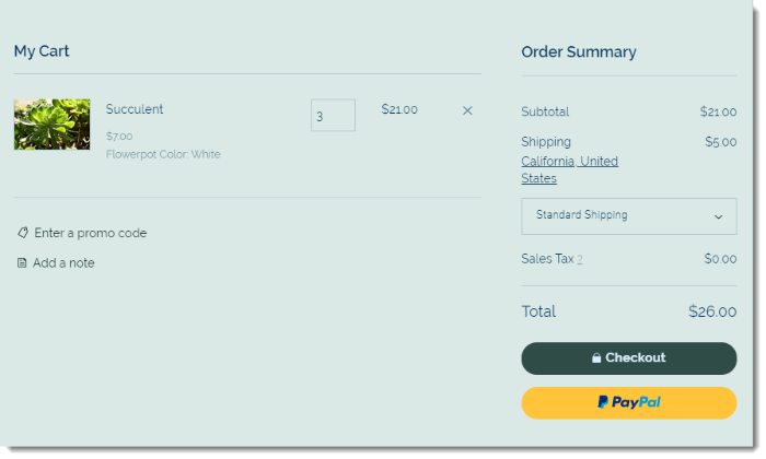
As you can see, every contributor to the total value of the cart is noted: the subtotal, the shipping, and the tax.
Trust is hard to build, and this is the first step you need to take to gain that trust from your buyers.
#7 The need for coupon code.
Everyone likes a discount, and I go as far as saying no one organized and went through the whole hustle on some unprovable reward.
It can be buy-in-bunk or a specific code from a promotion; either way, you want to give it to the customers in the easiest way to understand and apply.
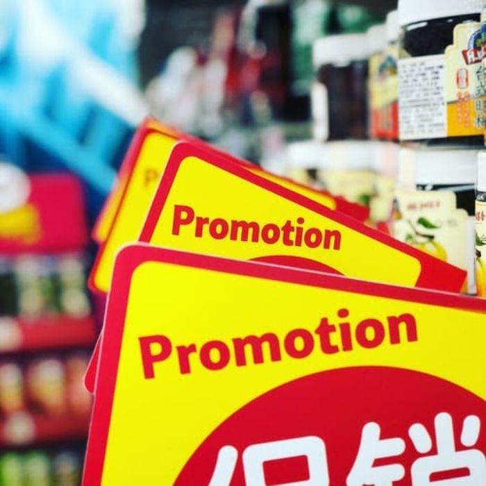
Don’t be complicated with the coupon rules. It’s a waste of time and resources to calculate the order value and a mind-twist for customers. Keep it simple and straightforward.
On that note, the coupon field needs to be visible and easy to catch but not over-attractive. The reason for that is because if this field is too vibrant, customers will be more likely to go to a coupon website and hardly come back. After all, they find a better deal.
#8 One again, provide more choices.
The shopping cart page is the last time and place for incentivizing the purchase.
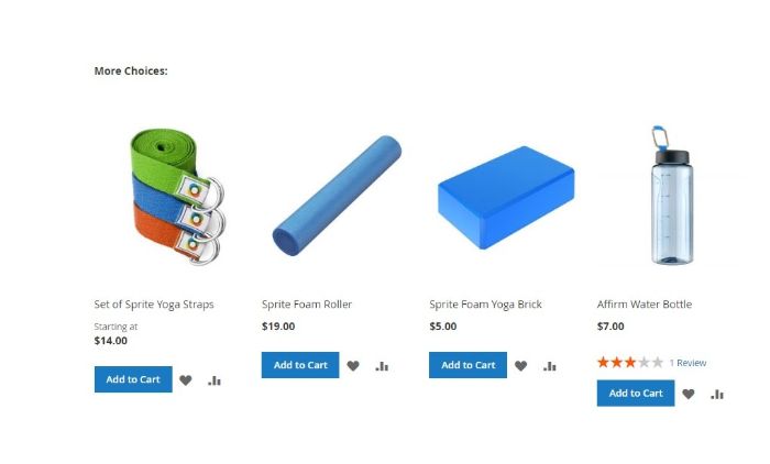
The same rules apply here: keep it short, sweet, and connected to the cart’s product.
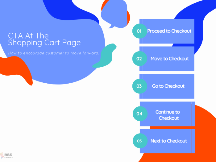
#9 Design a CTA on-point.
The primary function of this stage is to navigate customers to the filling infor part of the checkout flow. That’s why you need a CTA with that exact intent.
The design as in shapes and colors depend on your site’s aesthetic/theme as a whole, but the message is highly recommended to have:
- Clear intention
- Indicate of the process (i.e., Go, Proceed, Next, Move)
Some example:
CHECK: Start Building a Powerful Checkout NOW! for optimal and imaginative Checkout page to help covert and boost sales.
Optimize Checkout At The Review Items Stage
#10 Allow customers to review their cart on multiple locations.
It’s pretty self-explanatory. You want to create multiple entries for customers to review what they have in the cart. For one, it satisfies the urge to check the back of the buyers, and for two, you can spend these opportunities to promote your product further.

You can practically put this feature on the product page, the shopping cart page, and even when the customer is filling out their order information. Customers can quickly opt-in or opt-out of certain products before finalizing their order.
#11 Not just review. Give buyers the full functionality of the back button.
I’m talking about including a link when reviewing that takes customers right back to the product page. Why is this necessary?
There’s only so much you can put on the review pop-up. You don’t want a floating block on your site. It’ll hurt your user experience parameter.

That’s why going back to the product page is the most appropriate move. Once again, you can introduce other choices, and this time, they will have more weight because customers look for them the second time.
Optimize Checkout At The Shipping/Billing/Payment Info
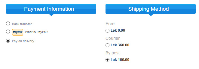
#12 Provide lots of Shipping and Payment options
Preferences run wild in these categories. Shipping, for example – some likes delivery by hand, some prefer no contact and so many more.
Payment preferences are even more diverse. We have tons of credit card brands and other payment alternatives such as Paypal, Braintree, Stripe, etc. For the record, one added payment option can triple the conversion rate.
MORE TO READ: The ultimate guide on mobile payment – the leading online shopping platform: Magento edition.
That’s why it’s fair to say that customers expect a wide range of options when it comes to shipping and payment. Satisfy them at this front, and you will see your conversion rate skyrocket.
#13 Allow freedom on delivery date
One personal touch you can put on the checkout is the ability to pick the wanted delivery date. For the long haul, this can turn into a win-win situation.
One, customers can receive the package on their terms, hustle-free. And two, you as a shop owner can avoid creating false promises and maintain your relationship with the customers themselves.
#14 Place trust signals
One of the top reasons customers don’t follow through with the purchase is because they do not have trust in the system.
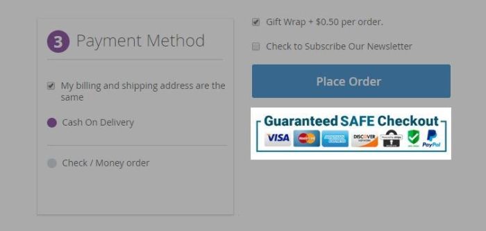
Therefore, creating subtle and overt trust signals throughout your website, especially when you ask them for personal information, is a must
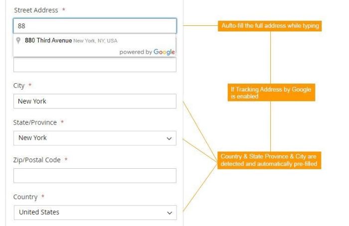
#15 Shorten with automation – predict search and autofill
No one likes filling out a form all by themselves. It’s time-inducing, boredom-provoking, and downright backward in this day and age.
With GeoIP Detection & Google Address Suggestion, your customer can quickly add in their shipping information by just entering a few letters.
Also, you can echo this sentiment with the payment and shipping methods. Yes, keep all the options, of course, but you can pre-select/set the default beforehand and smoothen the road for your buyers.
#16 Clear communication with sensitive fields
It’s time when customers can’t fathom why you ask for specific information about themselves. And with the risk of a data breach, more and more people don’t want to share their data online.

The outcome here is that they will be more likely to back up and cancel the purchase upon being asked for such information. That’s why you need to make a case for yourself here. Try a tooltip or even a full-blown pop-up to describe why you ask for these and your promises on how everybody involved handling this information.
You can also provide examples for the fields to further explain what you’re asking for specifically. That’s an excellent way to boost your usability at the checkout stage.
#17 Opt-in and out your field.
Each ecommerce platform has its own default set of fields for the checkout page. Your job here is to customize it to your preferences by excluding unnecessary or adding new fields to ask.
This evaluation will depend on your business as a whole and how you manage,/separate your customers for further support down the line. Either way, always learn from other blueprints (especially your rivals.)
#18 Alway indicate progress
No matter how hard you try to find a shortcut for checkout, it’s always a long and complicated process. As a result, you want to show the progression when it comes to checkout.
It can be numbered group field, step indicator, progression bar, and so many more. That’s how you encourage customers to finish their purchases.
#19 Pay attention to responsive
It’s the age of cellphone and other smart devices.
Even though the desktop holds the best conversion power, the rise of its alternatives is worth mentioning and taking into account. That being said, always have the checkout for mobile and tablet beside desktop for maximum sales success.
One Extension For All 19+ Steps Above
In this segment, we’ll dive deep into Magento 2 addons, which can help you achieve most, if not all of the one page checkout examples above.
Magento edition
One-step checkout Magento is genuinely a game-changer. You can easily find your way around this if you have an understanding of PHP coding language or at least have experience with it.
However, with the concern of messing up the core code-based as well as time-saving and cost-effective, an extension is the right choice.
And among thousands of Magento 2 one-page checkout tools in the market, we strongly recommend you to use BSS’s extension.
GRAB NOW: Magento 2 One Page Checkout to streamline your checkout process for more significant success.
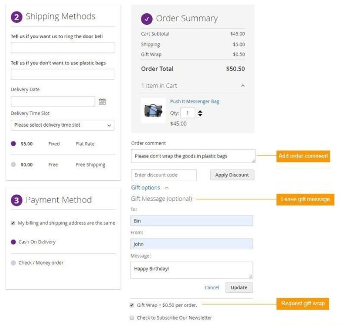
With this module, you can tick off every single practice above and beyond. It helps create honest and transparent communication between both parties. At the same time, utilizing automation to fasten the checkout process.
In contribution to faster checkout, this extension has the automatic filling feature to help your customers finish the shipping and billing information in no time. Notably, it will urge customers to finalize their orders more.
Moreover, the trust badge included is a sweet touch for further establishing trust with your buyers. The extensions support tons of payment and shipping methods across the board that sure can satisfy your diverse customer base.
And to seal the deal, this add-on is high on compatibility with live demonstrations waiting for you to plug-n-play. During and after the purchase, the support is off the chart and will guarantee you a bang for your buck.
Check out the list of its features:
- Lightning setup with unlimited customization capacity.
- Elastic checkout with multiple addresses and automatic GeoIP detection.
- Fully-geared for RESTful API and GraphQL API.
- Plug-n’-Play compatibility.
- Work well with GEOIP, Order Delivery, Checkout Custom Fields, Guest to Customer extensions.
- Compatible with popular payment methods and free support on highlight themes.
- Support all MageSolutions themes, Fastest and Infinit theme of Codazon, and all Alothemes themes. Cover all Magento payment options with popular & raising payment systems.
Shopify edition – Coming soon
WooCommerce edition – Coming soon
BigCommerce edition – Coming soon
Wrap Up
This is the list of 19+ best ecommerce checkout practices, and I sincerely hope you can transform your checkout experience to be more professional and profitable while being user-friendly.
I will continue to work and try other checkout flow innovations to update this blog, so stay tuned!
BSS Commerce is one of the leading Magento extension providers and web development services globally. With experienced and certified Magento developers, we commit to bringing high-quality products and services to optimize your business effectively. Furthermore, we offer FREE Installation – FREE 1-year Support and FREE Lifetime Update for every Magento extension.
CONTACT NOW to let us know your problems. We are willing to support you every time.