7+ Popup Ideas For Websites & Examples For Flying Results!
In this article, we will show you 7 best popup ideas for your eCommerce business to make more money!
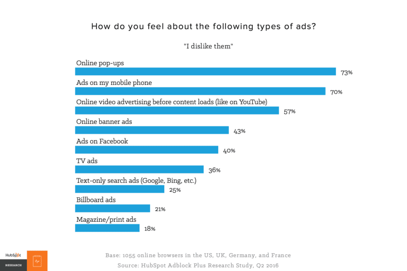
So, popup – annoying, isn’t it?
Well, that’s my exact thought not long ago: they block my view, it’s hard to get rid of them to continue shopping, and just too obnoxious. And I’m not alone on this.
But it got me thinking, what if we can create a pop up that surprising but delightful to customers at the same time? So, I went to investigate.
After spending time testing out and reading up on many materials, I’m glad to share the results of successful setup of popup ideas for websites with you!
But first of all, you need to understand the definition of popup.
Contents
What Is A Popup?
A popup is a window that literally pop up out of nowhere when a visitor enter a website (hence the name popup) and blocks the current user interface to ask for a specific action from the viewer to:
- Subscribe
- Buy something
- Go on to a list
- And so many more
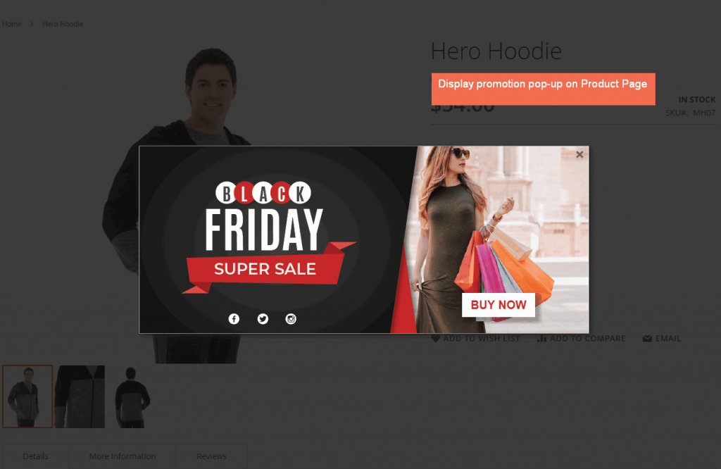
Pop up had a bad reputation due to its early day being used to shovel advertisements that are aggressive and suspicious.
However, over time, pop up has become one of the most effective and cheapest marketing tools, especially in converting optimization.
If you’re using Magento platform to build your online store:
CHECK OUT 7 Magento 2 Newsletter Popup Examples to steal & earn more subscribers!
What Makes Popup Ideas Effective?
Remember the definition of pop up earlier? The most important part of a popup and the reason it is still being used regardless is that it demands a specific action.
Virtually, pop up is the trigger button for any initiative you build it around.
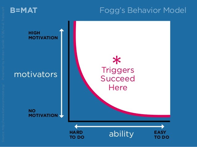
Since customers are on your site, they have an interest in your product, which can guarantee a level of motivation. You can spike up this number by suggesting a valuable message that customers care about (great sources, fantastic deals, support packages…)
All it’s left is to craft that message with a straightforward CTA that takes buyer’s right to their goal and pop up is undeniably the obvious choice here.
It’s bold, in-your-face, and hard to turn away. That’s why even though most web users (even Google) hate pop up, their behavior proves otherwise.
The Whole Whale shares this success in subscribers for newsletters by 300% after using pop up while the traffic only changes for about 4%. That is a triple on conversion rate without any extra spending on funneling traffic signals.
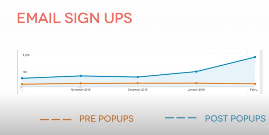
This number should tell you how much power a popup holds.
And there are many ways you can put on a popup that works amazingly, let’s talk about them.
Key Factors To Create Great Popup Ideas
We have shown you how effective popups are. But keep in mind that not all popups are equally effective.
A recent study shows that popups triggered in context convert 40% better than popups without.
So to create contextual popups, you should remember these key factors:
- Be targeted: Target your popup based on your potential customers. It will help your message appeal to the right people.
- Be generous. The best way to get your visitors to take action is to make them an offer they can’t refuse. For example, you can make your popup promotion more appealing with a good discount deal or free shipping.
- Be friendly. When writing your message, you would want to keep it in as few words as possible. But don’t forget that the popup is also your chance to build relationships with your potential customers. Carefully in choosing words that showcase your brand’s personality. You can even make things personal by populating your popup with your visitor’s first name or the search terms they used to find your offer.
7+ Popup Ideas For Your Websites & Online Stores
Now, as we promised, here are seven powerful popup ideas you can set up on your own ecommerce website.
#1 Increase first-time purchases
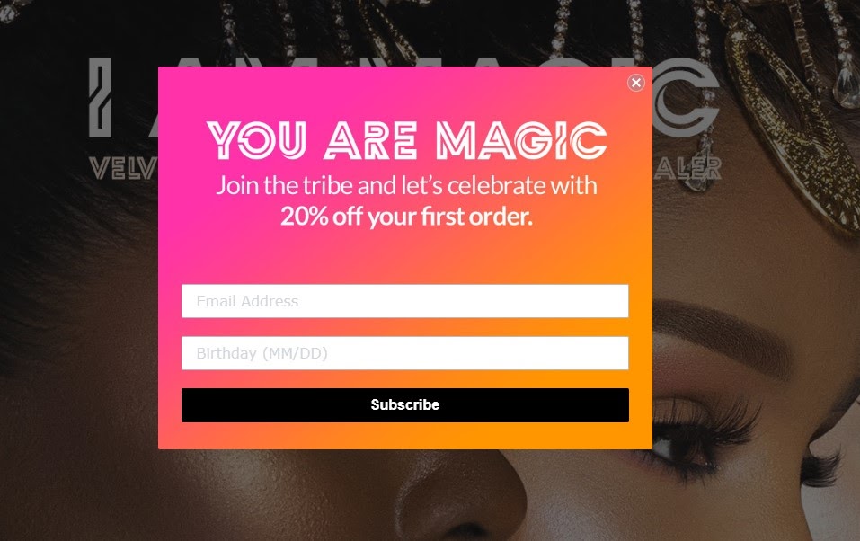
Juvia’s Palace shows this pop up right after you click on their site.
Here are why it works:
- The value proposition is clear: 20% off the first purchase
- Straight forward CTA
- Vibrant and welcoming message
First-time customers are always the hardest to convert, but at the same time, it’s hard to ignore a 20% discount. After that, you can perform other marketing strategies to get them into repeat customers.
Learn from this, and you can form a pop up that boosts the first-time conversion rate for your online store.
Not every pop up has to appear right at the homepage. You can try another type of pop up: trigger to show up.
Specifically, we’ll talk about how you promote cross-sell, up-sell, and related products for customers using an add-to-cart popup.
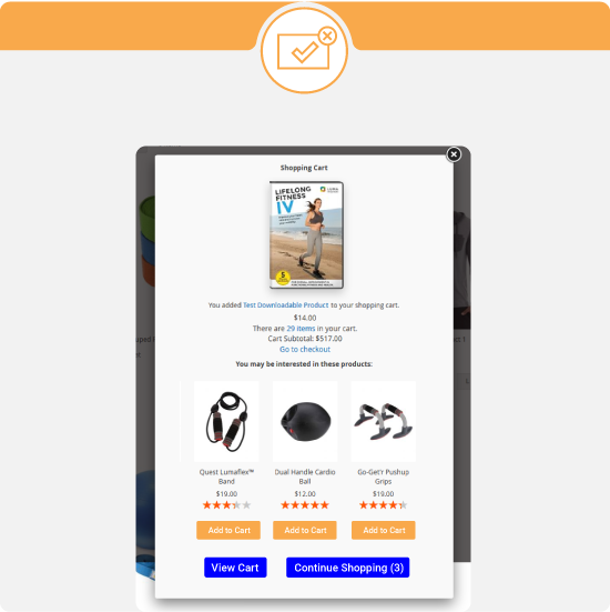
Instead of a dull notification that customers have added A in the shopping cart, try this instead. Show them a popup with a catalog of related products (for cross-sell) or better version/deal of the product they just add-in (for up-sell).
This pop up works because your customers are in a shopping mood! They’ll more than likely see other options you put in front of them and grab that as well.
#3 Promote limited-time deals
Here is where the pervasive nature of pop up shines.
Not only that a pop up demands immediate customer attention, but also the clock you put with it as well.
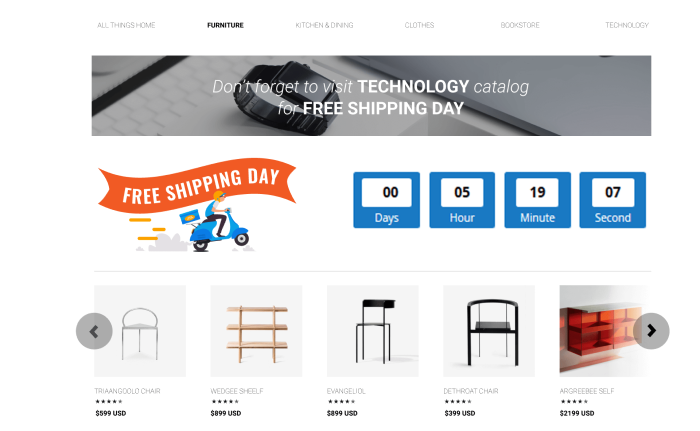
Scarcity and urgency drive your sales like crazy as it triggers FOMO – Fear Of Missing Out. A well-crafted pop up with a countdown clock is the ultimate sale booster.
#4 Unlock exclusive offers
Just imagine scrolling through a category, and then this pops up.
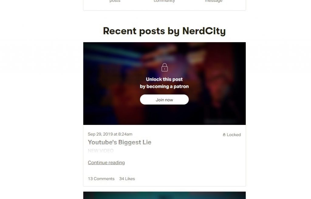
Exclusive access offers, in a sense, also a FOMO-triggered strategy: you put a gate over part of your content that creates a hype surrounding it. This tactic shots up the value of your content immensely. It doesn’t matter that the locked content is more valuable than the opened one.
Because it isn’t widely available to the mass, it’ll be largely marketable and desirable.
And yes, these popup ideas for websites are more common in the non-eCommerce field when the value you provide is content, not product.
However, you can twist this to your benefit of selling something: offer early-bird admission, exclusive deal for B2B customers, unlock customization options, and so many more.
The choice is yours.
Using popups to navigate customers on your site is a great move, and I tell you why.
We’ve talked at length about how popups are progressive and required immediate attention from customers. Such nature attributes are what we’re looking for in a lead separator.
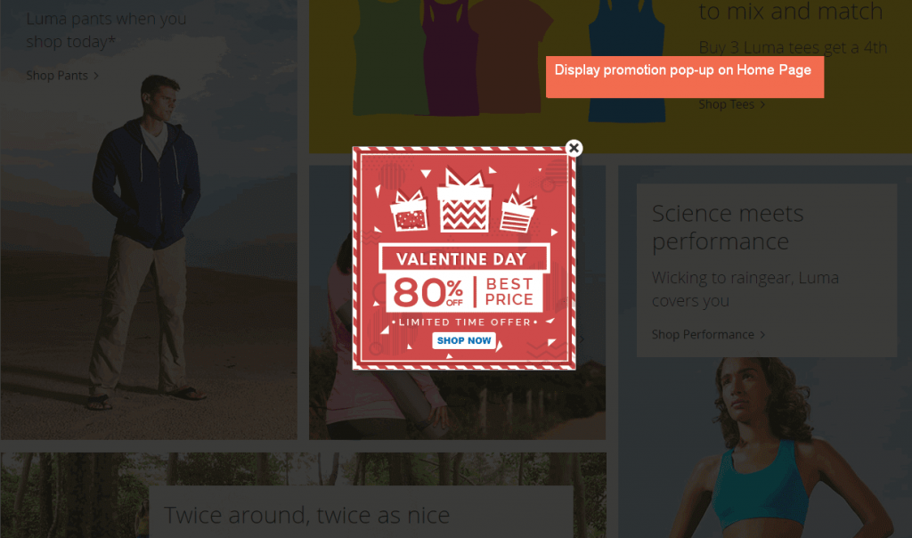
One again, the combination of high motivation with convenience contributes to trigger the wanted behavior (go to your pre-set destination) through the pop-up.
The only note here is to keep in mind user intent. Because if they’re spending time on the winter section, you then suggest they go to your summer sales, it’s most likely to fail.
#6 Prevent bounce back from the webpage
These types of popup ideas are a bit advanced. They use mouse tracking combined with other criteria (time on page, time engaging on-page, …) to determine whether or not the visitors want to leave. Once the intent is set, a pop up will appear to get their attention accordingly.
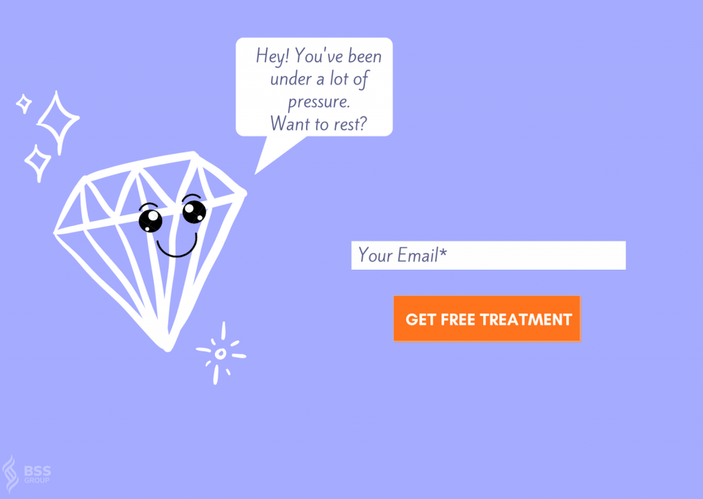
Such exit call-to-action can be annoying to some, but you can’t know that for a fact before you put this upon your audience.
Testing is always appropriate when it comes to marketing tactics, and this is the same.
#7 Save a sales
Swinging to another side of exit intent pop up, we have a specific type of lightbox that attempts to save a purchase from being canceled.
Once the system notices behavior that it deems indicative of an abandoned cart – a pop up like this will jump out.
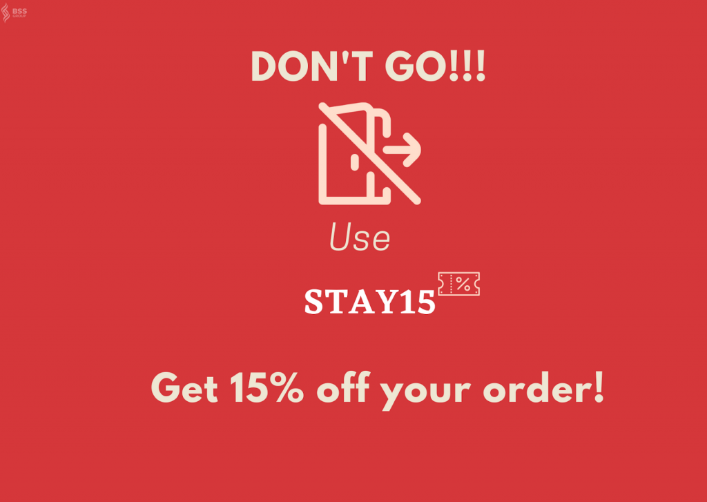
It’s a fact that 2 out of 3 online shoppers leave the online shop without finishing their orders. And the list of reason goes on and on:
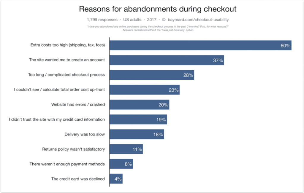
As you can see, each reason here can turn into the message you want to address with the customers at hand. You can try testing to find the best one that fits your customer avatar or upgrade the detector system to determine the cause of an abandoned cart, then suggest the rightful popup ideas.
Popup Ideas Best Practices
Brand awareness
Make the pop up in-sync with your website design. Try to evoke the feeling that it’s build-in.
Segmentation
Create pop up with a single focus: intention, device, browser, location, pages,…
Specialize trigger type for each of them.
No spam zone
Don’t show a popup again and again after customers close it down.
Space out the time duration, don’t be spammy.
Easy way out
Don’t be stingy! Let customers find the exit easier.
A/B testing
Testing variables to consider: headlines, size, animation, CTA, opt-out,…
Mobile friendly
Minimum field to aks, lighter image, shorter message and CTA.
List Of Best Popups Providers
I understand you have limited time, resources, and skills to entirely create a CSS popup. So, let take a look at these websites below:
| Provider | Pros | Cons |
| Sleeknote | Smart triggers Real-time analytics A/B testing 7-day FREE trial |
Expensive in the long run Stiff template |
| Wisepops | Compatibility off the chart Easy to design Fit various marketing needs 14-day FREE trial |
Pricey (monthly charged) Lack of template |
| Popup Domination | Reasonable price (yearly charged) Great theme/template Analytics and testing Smart triggers |
Not suitable for big eCommerce (charged on views) Need to work more on compatibility |
| Wishpond | Great packages (DIY and full team) Excellent design Great triggers signal Automation included API access |
Expensive |
| Optin Monster | Easy to build Smooth integration Variety of triggers Real-time data |
Lack of prebuild examples |
Wrap Up
Popups are handy marketing tools to promote engagement. You can set them up to multiply your email list, gather leads, increase order value, save a sale, and a lot more.
Along with this text, I’ve shared with you several fantastic popup ideas for websites to build your lightbox around and get flying success. Hopefully, the example and best practices guide I laid down will help you create a pop up that converts (amazingly, hopefully.)
BSS Commerce is one of the leading Multi-platform eCommerce solutions and web development services providers in the world. With experienced and certified developers, we commit to bringing high-quality products and services to optimize your business effectively.
CONTACT NOW to let us know your problems. We are willing to support you every time.

