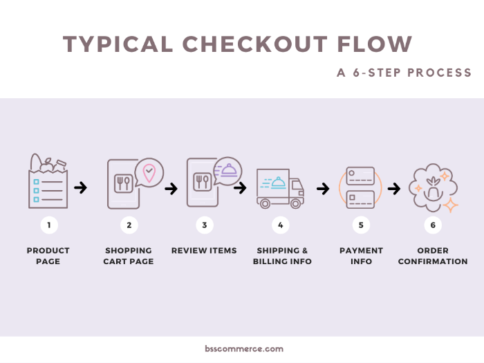
Universally, it takes six steps to finalize a purchase. But the undeniable truth is that the more steps a checkout flow involve, the harder it is to convert.
Why? Because customers now have multiple stages of walking away from their shopping cart.
Therefore, the concept of one-page checkout that organizing everything into a single layout comes to life.
>>>KNOW MORE ABOUT MAGENTO 2 TO SHORTEN THIS PROCESS: Magento 2 One Step Checkout: Complete Handbook A – Z! – BSS Commerce Blog
Today, let’s gather all statistics and facts surrounding online checkout preferences and answer the question of why this particular checkout interface is widely favorable in the ecommerce world.
One-step Checkout Overview
Table of Contents
Before discussing, we must put down the foundation as well as basic ideas about one-page checkout first.
The layout
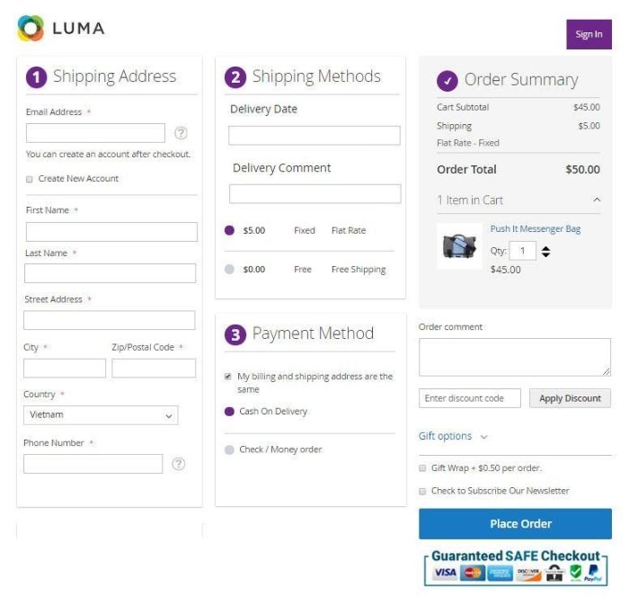
The name is pretty self-explanatory, therefore, showing you the actual demo seems more appropriate and straightforward:
LIVE DEMO WITH REAL PEOPLE: Book your Magento one page checkout live demonstration with a dedicated supporter NOW.
As you can see, everything (and I do mean everything) customers need to fill and know about their order is set into a single page. The only step a customer needs to take to finalize their purchase is to click the order button.
Statistics & facts about the one-step checkout process
What causes abandoned carts?
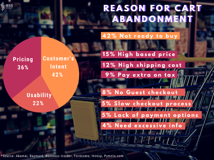
Generally, we can separate cart abandonment reasons into three categories: customer’s intent, price, and usability.
ERASE THESE REASONS: Learn how to minimize cart abandonment in easy 1-2-3 steps!
Intention and pricing dictate customers’ behaviors the most. However, the technicality of the checkout process also plays a significant role here.
And since these other two factors are hard to optimize, we can only count on the improvement of the checkout flow to change the conversion rate.
Let’s bring out the statistics.
One-step vs. multiple steps checkout
Elasticpath did an A/B testing on this matter, and their results were astonishing.
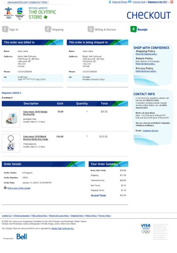
Multiple steps checkout
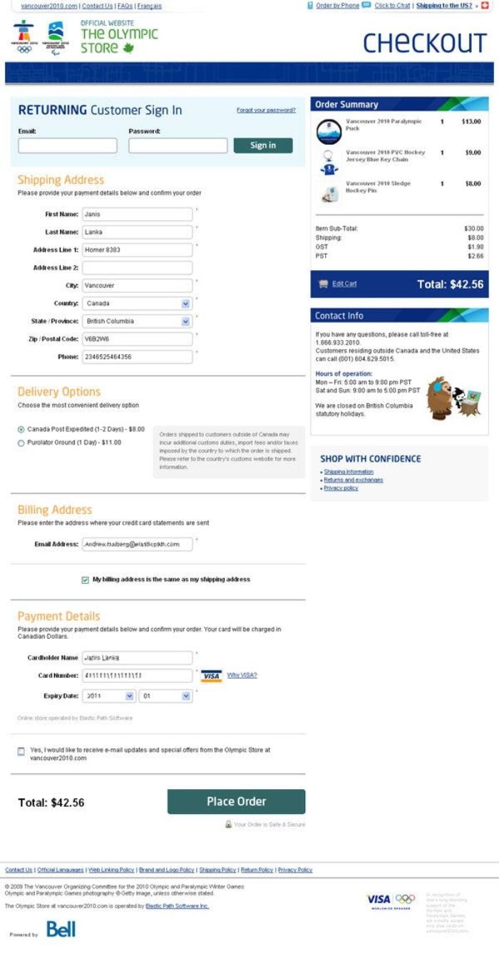
OSC
They found that the one-step module generates a 21.8% difference in conversion rate compared to the multiple-step option. Notably, they saw the winner ahead of time at 300 orders but decided to run the experiment to 606 transactions, and the result remained the same.
We must also talk about another research by TLC in 2017 on this comparison. It showed that there are few differences between one-step and multiple steps checkout across the board.
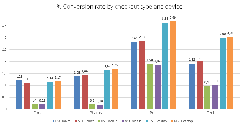
(OSC: one step checkout | MSC: multiple step checkout)
However, if you interpret the data carefully, you can see OSC scores better on the mobile front. And with the current record of mobile in the total ecommerce, I’m confident that OSC is better for the majority of online stores.
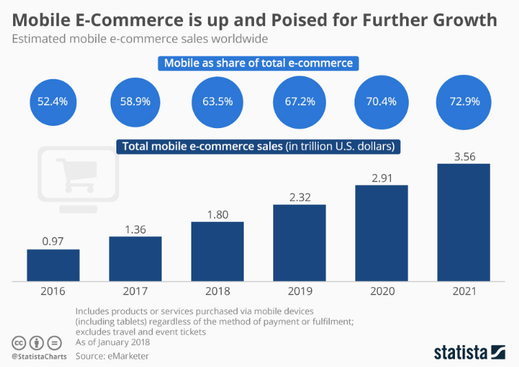
Numbers don’t lie.
The Drawback Of This Option
Every checkout option has its flaws, and this model is no exception.
Hard to do analytics on checkout performance
Let’s say you spice up your payment options and want to see how it helps the conversion rate.
With the multiple-step option, you can attract data at the payment fulfillment stage of the checkout to see whether your change directly affects your sales.

It’s harder to do with a setup when everything is in a one-page layout. Of course, you can use a sophisticated tracking system to get that data, but it will cost you a lot of resources.
The long-form is scary
It can be overwhelming for the customers to see a lot of information thrown to their faces right after they land on the checkout page.
The direct result of that is they will bounce back immediately.
Short of personalization options
In addition to the longer form, a one-page layout is indeed a real estate experience for shop owners. You have limited space to lay the must-filled information out while offering customers to do paint their own orders.
Slower loading page
Undoubtedly, a one-step model takes longer to load the whole page than multiple steps checkout. There is no fun in waiting to finalize an order, and if your customer has a short attention span, you will lose their purchases.

Why It Is Still Your Best Choice
Fewer clicks and faster checkout in total
Yes, the loading time takes longer, but the total checkout time is significantly shorter with the one-step model.
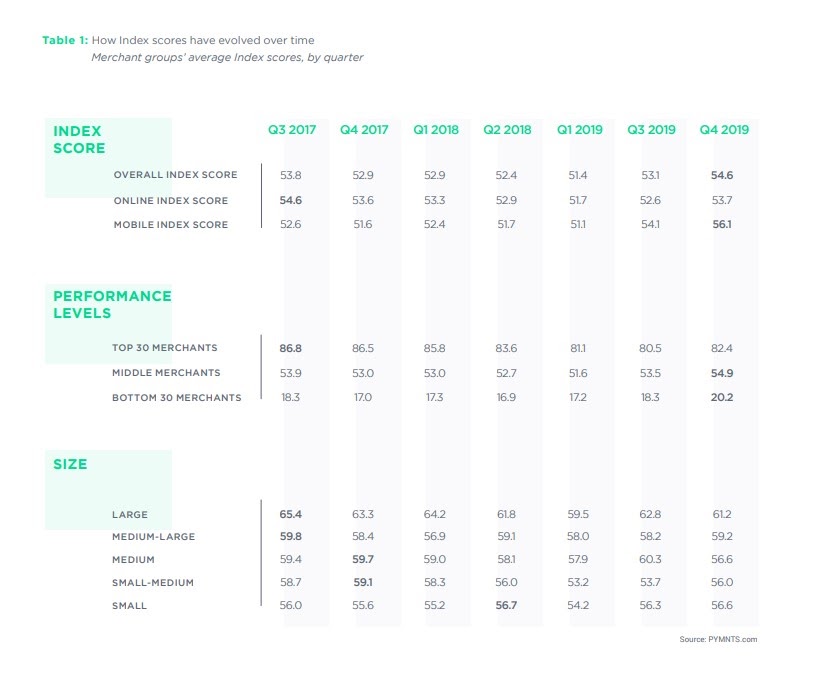
Pymnts.com released their finding on this matter in February 2020, and they showed that the best conversion rate websites offer a more frictionless checkout experience.
They’ve tracked the checkout metrics since 2016 and built a system to evaluate the checkout process (Checkout Index Score) as in how easy it is to buy something off a website based on 70 attributes.
As shown here, websites with faster checkout are also the top merchants in the ecommerce scene.
Moreover, customer behavioral research shows that the fewer clicks it takes to complete, the higher the conversion success.
Because the form makes the filling process more accessible and smoother to follow, ultimately translating to faster checkout.
Highly user-friendly
Eyeflow is something that is subtle in volume but has a tremendous impact on customers’ decisions with their shopping cart.
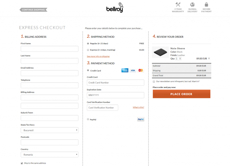
With this checkout option, your customer can navigate through the entire process at ease and flow-through without any conflict.
Moreover, the checking back is also more natural with this checkout option, no need to go back and forth between stages to change specific details about the order.
More streamlined and indicative of a process
Multiple steps checkout with more stages involved is notorious for being interruptive and challenging to follow.
It’s a simple math question. Put yourself in the customers’ shoes, which one will you choose:
Repetitively filling some fields then waiting for the next screen to load about three times
OR
Simply add in all information and click on the place the order button to finish.
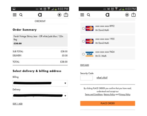
The second option is obviously more favorable. Hence, one step version for the win here.
Garner customer satisfaction
It all comes down to this – satisfy your customers. Everything you do, every step you take to better your e-commerce, is all in customers’ favor.

That’s why you should pick one-page checkout to run your final miles. The one-page interface genuinely and universally delivers a fantastic shopping experience.
No hassle is the goal to strike for, and it’s even more critical at the checkout page.
One-step Checkout Best Practices For Magento Users
Earlier this month, I wrote a piece on the best practices for optimizing the checkout process at the macro level.
And since we’re a Magento-focused blog, I figure we should learn how to apply these tips to leverage the Magento default setting.
#1 Pick your trusted extension
Unless you have a fair understanding of coding language & logic, it’s more economical and efficient to install a module to help with checkout customization.

ULTIMATE SHOWDOWN: 25+ Magento checkout extensions compared and rated to foster your success.
#1.1 Pick one that mobile-friendly
We’ve established the number to prove that mobile is the future of ecommerce; that’s why your extension should provide such a seamless experience across the board.
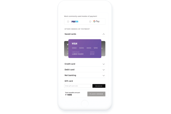
If you worry about the lengthy form, accordion-style one-step checkout Magento is something you should look into and apply for your store.
Pick one that mobile-friendly
Compatibility is extremely important. You install extensions to run your store smoother, not for them to fight each other.
Moreover, you should look for a module that works well with your current themes. For example, BSS’s Magento one-step checkout extension is compatible with common themes on the market: all MageSolutions themes, Fastest and Infinit theme of Codazon, and all Alothemes themes.
Pay attention to compatibility
A quick call-back here, no guest checkout option available takes up 36% in total cart abandonment caused by usability attributes.
That’s why letting customers finish their orders without an account is a must. And can actually expand on that with even more options to check out: log in with social media, google account, and more.
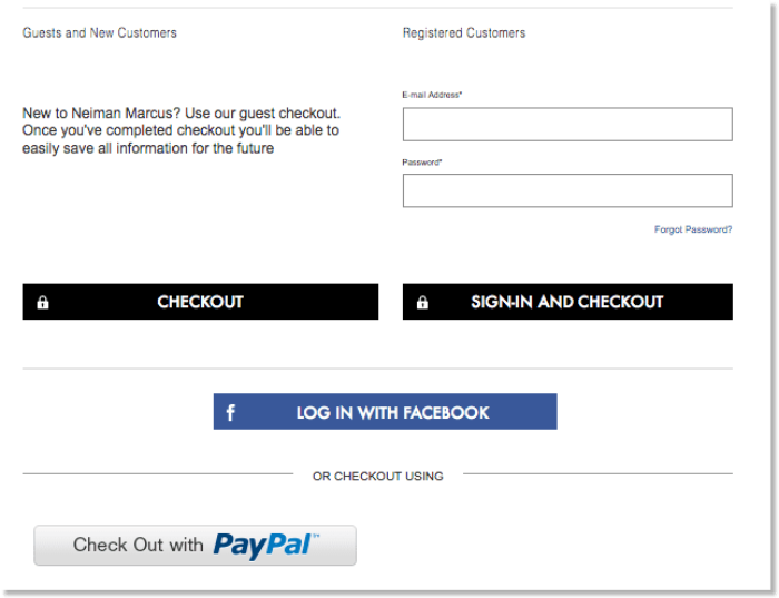
Why? Because more options equal more chances to increase conversion. Moreover, you get to access a vast pool of customer information and the potential of social selling.
#3 Re-arrange the checkout template
Every third-party provider has its own checkout preset, and the chance it fits you like a glove is low.
Your shop is unique and also your preferences. Therefore, you would want to mix up the built-in template and be the best fit for your store – functional and aesthetical speaking.
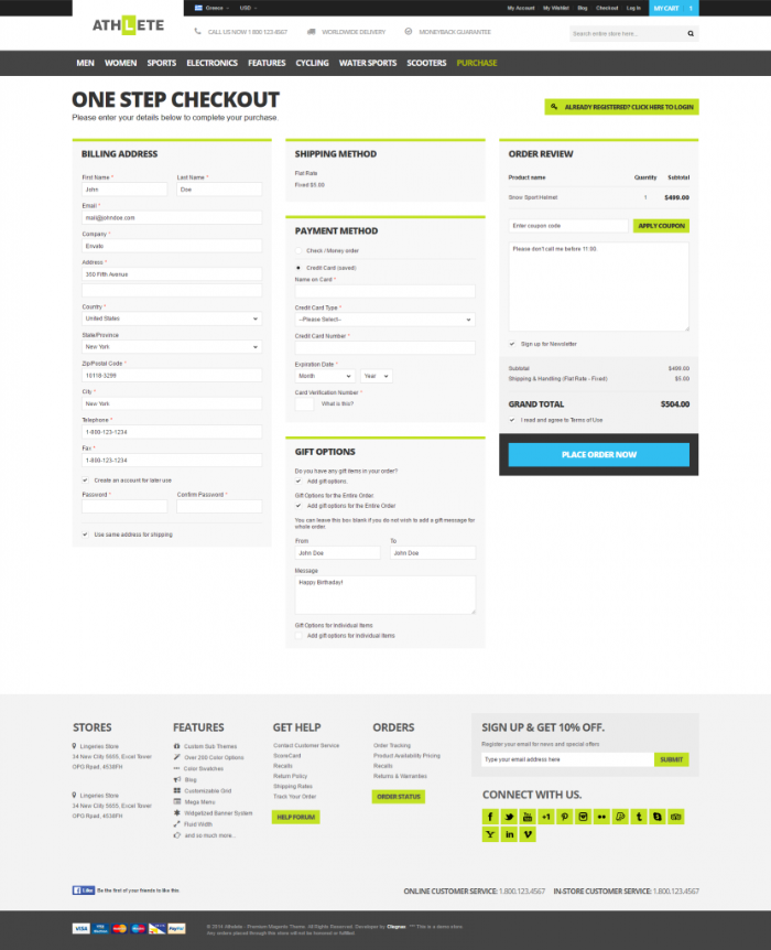
However, there’re several fields and blocks in one-step checkout for the Magento extension that is set in stone, namely the shipping, billing, and payment info. Rather than that, it’s free will.
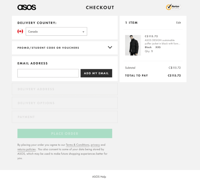
You can wipe off distractions such as the header and footer, menu buttons, as well as other unnecessary fields. Giving your checkout a smooth and clean look will guarantee a much better conversion rate.
Something like this:
#4 Make use of automation
Another feature to look for when you pick out your one-step checkout for Magento extension is automation.
Like this one:
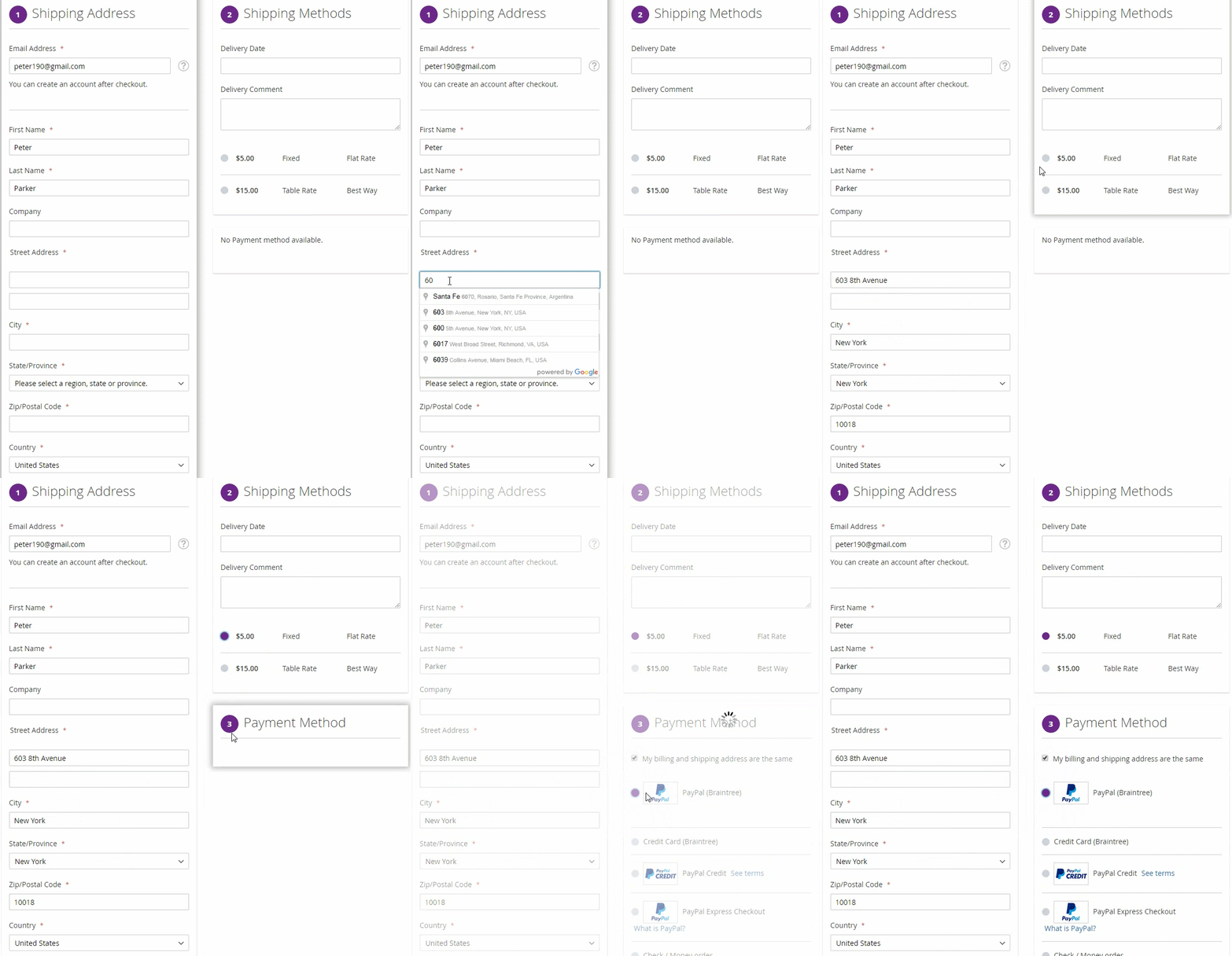
You can foster this idea to pre-select the shipping and payment method to faster the checkout process.
#5 Provide a variety of payment methods
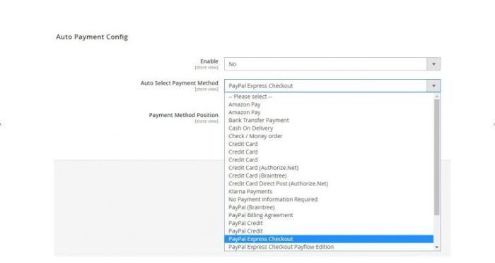
The default Magento payment range is truly amazing.
However, placing even more options for customers to choose from here is something you should consider.
Why?
Because at this rate of technological and financial service advancements, it’s up to you to offer customers their wanted payment method: credit card, mobile payment, bank transfers, e-wallet, prepaid card, direct deposit, cash.
#6 Give room for coupon and discount
Price is the driving force for customers to finalize their orders. If they see the opportunity to have a better deal, they will be more likely to buy.
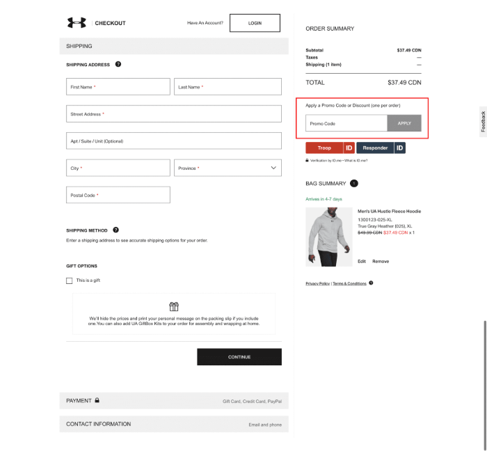
However, you need to be careful about this. Of course, the more obvious and more natural it is to spot and fill, the better, but you want to communicate your discount policy earlier, loud and clear.
If customers see this field and never see any of your offers, they’ll run to find one and get caught up elsewhere. Therefore, be complicit in your promotion.
#7 Turn up trust signals
A breach of personal information is a legitimate fear when people shop online, and it makes sense for customers to cancel their purchase if they feel skeptical about your website.
That is why some trust badges like this will make the change.
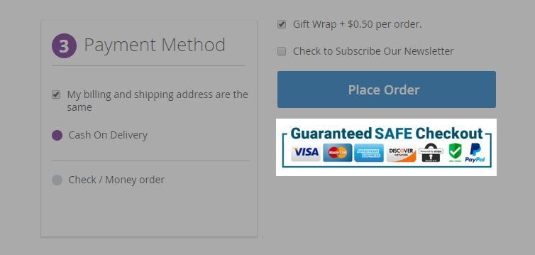
However, remember, credibility can’t be built upon some icons only. You need to put more work to gain the trust of your customers, and this is only a small step.
Wrap up
We’ve presented you with facts and statistics about one-step checkout and why the benefits wipe all of the drawbacks away.
BSS Commerce is one of the leading Multi-platform eCommerce solutions and web development services providers in the world. With experienced and certified developers, we commit to bringing high-quality products and services to optimize your business effectively.
CONTACT NOW to let us know your problems. We are willing to support you every time.
