About five years ago, when Apple released Iphone 4 /4s, “Retina” concept came along.
Retina, defined by oxforddictionaries.com, is “a layer at the back of the eyeball that contains cells sensitive to light, which trigger nerve impulses that pass via the optic nerve to the brain, where a visual image is formed”. Apple brought out “Retina” concept to let the world know the fact that: When devices such as Iphone, Ipad, Macbook were equipped with Retina screen, users looking at an image on it would not be able to see any single pixel, which meant the pixel resolution was extremely tiny that the gaps were like invisible to human eyes. Thanks to it, images looks much sharper and smoother.
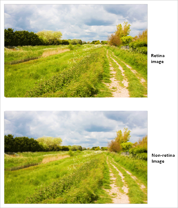
With an ordinary website not using “retina image display” technique, pictures will be greatly blurred when being seen on retina screen. Why? Because a retina screen has double resolution than usual, picture size will be reduced a half and it will be stretched out in order to fill up the whole screen frame
In actuality, retina display (the concept named by Apple) is just the ordinary type of screen and it is integrated with advanced technology to at least double the resolution of current standard full HD screen.
Nowadays, on lauching a website, we also should optimize images at form of retina display so that they will not get blurred on devices with retina functionality.
So, how to optimize retina image for Magento Websites?
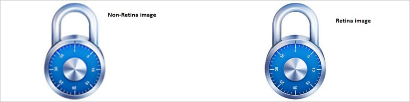
In the progress of creating an image or icon for a Magento site, we should make it in two different versions at the same time
- Ordinary version for normal screens like full HD ones. We name this version as usual (e.g. ,image.png, image.jpg)
- Retina version for devices using retina screen
For this version, we should name it the same as the ordinary one then add @2x into the end for distinction. This is just the common way to distinguish them from each other, so you can name it whatever you want. But we apply common rule in this example (e.g. , image@2x.png, image@2x.jpg)
Now we have two versions ready, then how to use them?
Depending on each case, we have different ways to handle
In case of using css
We declare the typical css code as follows:
/*CSS for basic styling and non-retina image path:*/
.image-bg {
width : 100px ;
height : 100px ;
background-image :  url (image.png) ;
Code css for retina screen
/*CSS for serving the retina image to devices with a high "device-pixel-ratio":*/
@media
only screen and (-o-min-device-pixel-ratio: 3/2),
only screen and (-webkit-min-device-pixel-ratio: 1.5),
only screen and (-moz-min-device-pixel-ratio: 1.5),
only screen and (min-device-pixel-ratio: 1.5)
only screen and (min-resolution: 1.5dppx) {
 .image-bg{
  background-image: url(image@2x.png);
  background-size: 100px 100px;
 }
}
In case of using JavaScript
For example, an image tag has structure as below:
<img class="retina" alt="" src="image.png" width="100" height="100" />We get the code to check retine screen :
var isRetina = (
window.devicePixelRatio > 1 ||
(window.matchMedia && window.matchMedia("(-webkit-min-device-pixel-ratio: 1.5),(-moz-min-device-pixel-ratio: 1.5),(min-device-pixel-ratio: 1.5)").matches)
);
After that, we use jQuery to filter out the images needed for retina screen (only the image tags have class=”retina”)
$(function () {
   if(isRetina) {
       var images = $("img.retina ");
       for(var i = 0; i < images.length; i++) {
       // create new image name
       var imageType = images[i].src.substr(-4);
var imageName = images[i].src.substr(0, images[i].src.length - 4);
       imageName += "@2x" + imageType;
       //rename image
       images[i].src = imageName;
    }
 }
}
This code is better to be loaded in the aftermath when users load the website on their browsers.
When a browser runs through those code lines, if retina screen is checked to display the website then normal images will be automatically replaced by the ones with higher resolution with suffixes are @2x.
With Retina Image Display, your Magento-based websites will be definitely more friendly to users regardless of screen display types, which is followed by other advantages for your online business. In case of any relating questions or problems, please do no hesitate to share and we will discuss openly to deal with them.