
With the development of the Internet and the benefits of online shopping, there are a lot of changes in customer‘s shopping habits. This also makes the difference between online and offline stores.
While every online shopping element is entirely different or gets modified from the brick-and-mortar store. Platforms, approaches, customers, type of products, means of delivery, payment options, and so on.
There is still one metaphor that we copied&pasted from real-life experience to the web application without much modification: the cart.
Today, let discuss why this term is out-dated from the get-go and what needs to be done for a better replacement.
Reality: The Online Shopping Cart Is Laughingly Uneffective
Table of Contents
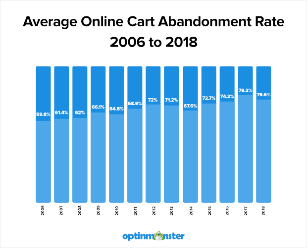
7 out of 10 online carts get lost into oblivion. The term “cart abandonment” then has become a tagline in every sales booster blog post as a direct result.
It’s a prevalent problem for e-commerce since the very first day:
So why is that? There are so many contributing factors that included but not limited to:
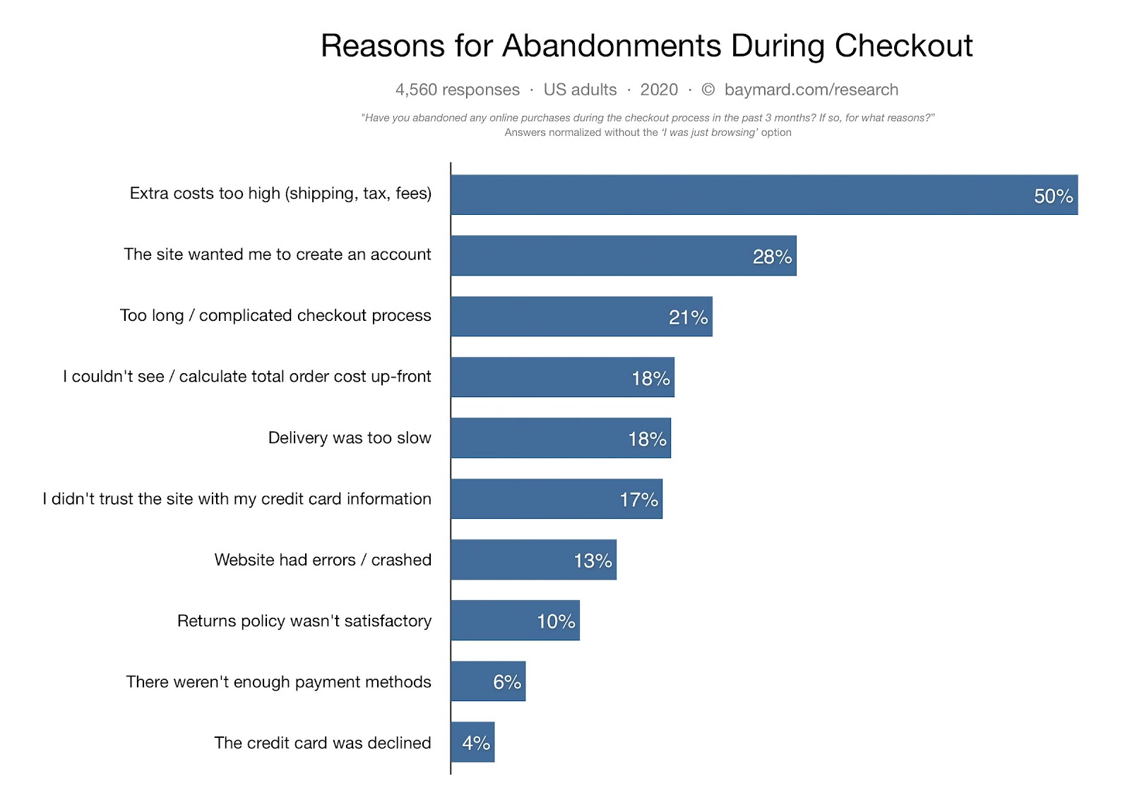
Of course, this report has taken out the “online window shopper” portion of this equation. The answer is that because we CAN NOT tie customers down to a website when there’re millions of similar alternatives on the world wide web.
Or CAN we? Put a pin on this; we will come back to it later (trust me, it will be sooner than you think :). )
In general, we can categorize every headliner for cart abandonment into 2 groups:
- Customers’ behaviors.
- The site’s unseasoned customizations and optimizations.
These two are highly interconnected, but they influence each other differently. Think of it as the relationship between DNA, and it’s surrounding environment.
While customization and optimizations will be integral to the individual e-commerce site’s DNA, customer behaviors fuel these improvements.

Accordingly, each business’s results will differ due to different environments and how they react.
However, we must realize that the rate in which the brand’s DNA changes is much slower than customer demands.
Regardless of reasons, we can all agree that the online shopping cart is underperforming at best and down-right useless at worst.
Numbers don’t lie.
Responsive Online Shopping Cart – A Confusing Pronounce
In the search for elevating the cart’s effectiveness, we see the emergence of the adjective “responsive.” However, these are little to no business successfully articulating this word on their online presence.
Don’t waste your time anymore. Let’s discover “the secret” of a “responsive online shopping cart”!
Why do e-commerce businesses tend to optimize for design?
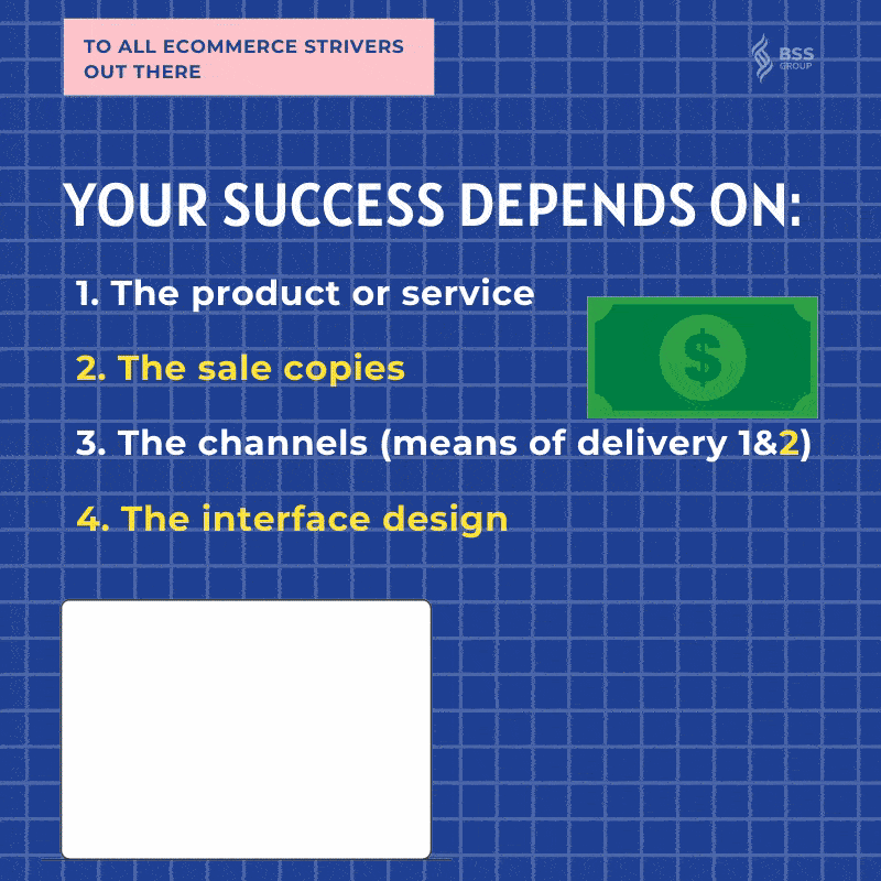
Noted, it’s more than evident that there are more contributors to an e-commerce success rather than the shopping online cart. And to be more specific:
Now we analyze every factor to see clearly why optimizing web design and content is better.
- The product or service: These attach to a launched e-commerce website. It takes banks (both money and effort) to optimize product or migration to another platform.
- The sale copies: We got various colors and flavors in each content. So there are diversity of ways to call customers to action.
- The channels: The market is already saturated with unique products to begin with.
- The interface design: Where customers interact directly. All the experiences when shopping online are here. It is decisive to attract customers and boost the purchasing decision quickly or not.
Therefore, it’s usually the best move to switch up content and design for a better revenue turnover. It’s budget-friendly, user-optimized, and profit-focused.
What is responsive design? And why it’s so taboo.
In the book Responsive Web Design, Ethan Marcotte shared his view about responsive design. He compressed the idea into a single tactic: Asking the right questions.
It’s not inherently about the placement of images and media queries but how you can solve the users’ problems while interacting. But that’s just half of the requirement.
Unfortunately, so many businesses just stop right here and don’t push the limit to finish the other half of the equation. In fact, it’s the lack of leap forward optimization for rising users’ devices that holds a large part of the online business back.

Here are THE REASONS why mobile app metrics are crucial to your success.
Responsive also refers to the ability to develop a fluid grid that effortlessly adapts to the increasing number of the devices on which your customers are using.
The combination of research on user behaviors and providing an interface with a high usability level is what makes responsive design the right approach to go.
Rather than creating multiple versions of your website – focusing on making one that excels at adaptation. It’s cheaper, effort-friendlier, and more optimized.

In conclusion, we’re aiming for a web product that has:
- Nice-looking design
- Full functionality regardless of sizes
- User-friendliness in navigating and interacting
And that’s what makes the word “responsive” taboo.
>>> It’s hard to aim for everything.
When there are so many goals to meet, it usually ends up with an average result. Moreover, everyone has their own way of interpreting the word and apply it to their website.

For example, some prefer ajax checkout cart, while some despise the idea of it. And you can make the straw man argument for both of these takes on the online shopping cart.
But there is an excellent theory in which you can place your design on. In short, you must focus on the 4P to optimize your cart design: Price, Product, Place, Promotion with the keyword – always.
- Show customers the full price.
- Let them review the products on the spot.
- Aim for a streamlined and eye-flow-friendly placement.
- Have room to put on promotion.
Now, let discuss the main reason that makes the checkout cart so ineffective.
Poor User Experience: Root of The Problem
There is no other explanation for the checkout cart’s embarrassing performance rather than people DON’T have a good time shopping online.
And this pervasiveness of poor user experience has led to some of the saddest most epic failures in e-commerce. These hiccups can stem from many places even before customers reach the checkout stage.
It’s time to discuss the pin earlier.
While we accelerate almost every aspect of real-life retail to better, faster, and more frictionless than ever for e-commerce, we let the cart sit there in a cold blizzard.
In the race toward the fastest transaction, we’ve forgotten the human factor, especially in the most critical part of such operations – the conversion station.
Such a shame that commerce – a product of the 4.0 technology era has seen less modernization in customer experience than an offline business. Take a look at Sephora:
There is a fellow introvert on the Sephora customer experience team who deserves A RAISE RIGHT NOW pic.twitter.com/4Aan7lUyVD
— Cami Williams (@cwillycs) November 4, 2019
This is a prime example of how you take customer preferences into creating a personalized shopping experience.
Never try to tend to only ONE group, make it easier for the minority, but don’t upset the majority.
Now, let’s dive in.
The past, present, and future of e-commerce: Creating an experience.
While we often talk about the immediate nature of e-commerce, we’ve forgotten about the interactive side.
In fact, it comes in waves.
The past – the 1.0 era of e-commerce/internet.
The Internet has introduced a solution to the long-winded traditional selling methods: faster in speed and bigger in exposure.

The first one to jump on this train was the B2C and C2C business. E-commerce in this phrase was only a stepping stone to bridge the online and offline market. This means e-commerce at this time was just another marketing word.
The cart, therefore, is completely ignored. However, the success of this has piqued B2B business interests, which introduced us to the 2.0 era of e-commerce.
The present- the 2.0 era of e-commerce/internet.
Most B2B organizations acknowledged not long after propelling their original web store that clients needed more than just to have the option to put in an online request.
They needed to see their request history and approach solicitations. At the same time, customers needed to get item suggestions. They required an all-encompassing encounter, not only a one-dimensional deals channel. Along these lines, organizations conveyed (or if nothing else, some of them did).

BINGE the ONE&ONLY Magento B2B Guide you need to know.
This was the start of online business 2.0.
B2B business improves the client’s involvement with a push to keep clients cheerful and drive more deals. This is still obvious today.
Indeed, our exploration shows that 76% of B2B associations plan on redesigning their original web store and using existing information to give the highlights being requested by clients.
As earth-shattering and imaginative as internet shopping was in the 1990s, it’s currently become the standard.

Most organizations have made sense that they can’t manage the cost of not selling on the web. Many are effectively dealing with improving the current online channel. Others are falling behind (however, they won’t pull it off for long).
As indicated by our ongoing exploration (directed with Sapio Research), the same number of as 75% of B2B organizations who don’t at present have a web store have had clients request an online deals channel.
It’s to be expected. B2B clients need a more straightforward and quicker approach to make buy-on-request, day in, and day out. Online business is the appropriate response. Vigorous, modern, and client-driven internet business is a far and away superior answer.
The future – the 3.0 & 4.0 era of e-commerce/internet
Your clients are rapidly growing out of essential web store functionalities.
Numerous associations are perceiving the significance of putting their web stores at the core of future business development plans (and in case you’re not doing it, there’s a decent possibility that it’s your rivals who are).
Organizations are currently taking a gander at online business stages that will future-evidence their computerized techniques.
This implies finding an answer (as Magento) that can be wholly coordinated inside their current foundation, bringing both interiors and outside confronting frameworks together, and that can convey more prominent personalization and more grounded client encounters.

Coordinating your web-based business arrangement inside the remainder of your association’s IT foundation can likewise drive more extensive business benefits. Because of this reconciliation (as per our examination), organizations have — by and large — seen:
- a 22% expansion in income development
- a 21% expansion in benefit
Organizations are proceeding to put resources into online business arrangements, advances, and creative methodologies that will assist them with staying up with evolving markets, and evolving scene, and an undeniably computerized world.
This isn’t probably going to hinder at any point shortly, particularly not with online business 4.0 not too far off.

We’re taking a gander at a future where AI, AR, VR, and the Internet are the drivers and impetuses of vivid online business experience that not just react to, meet, and surpass clients’ needs but also predict them.
All in your checkout cart.
Increase user experience with 9 Pro Tips to Fix Magento 2 Add To Cart Slow!
How To Make A Defining Online Shopping Cart
Have the right mindset
Keep this in mind.
Customers aren’t ours. You just completely let go of your needs and desires for their behavior and shifting into what I call: the gardener-flower concept.

The seeds already are what God designed it to be. The gardener is not trying to make the seeds become what the gardener wants. The gardener is establishing an environment where the seeds can grow what it wants to be.
You’re going to provide nourishment and support, not preconceive what your customer needs to be. There is a real arrogance in that.
Let’s approach the cart design with this mindset.
Step 1: Do test(s) on your checkout cart.
Samples are great, and all but you can’t rely on them to develop your checkout cart. It needs to be the right fit for your website and product only.
Moreover, you should test the cart from the start of its implementation to plan if all the stages work efficiently. Practice proves that even minor design changes can bring significant differences in terms of usability.
Which ultimately translates to a wider profit margin.
Conduct your test and get a report like this:
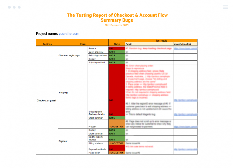
Know where to start and gather insights/advice on how you can be better with your cart application.
Step 2: Venture to the field.
Know yourself – a must.
Know your competitors – an absolute requirement.
Once you identify your rivalry on the market, try to let them walk you through their checkout cart process. For maximum effectiveness, you must treat this as an experience and an interview at the same time.

This means try your best to immerse into their flow while keeping an eye out to screen the cart. That way, you can have the best of both worlds – insights as a customer and information for competitive advantages.
Besides, I recommend you think about these questions and note down the answer during the process:
- What you interact with on the checkout cart – the must.
- What you ALMOST do on the checkout cart – the potential.
- And what you don’t interact with on the cart – the absolute no.
Another test you should conduct for the cart is eye tracking.
Eye-following investigations are utilized to figure out where a client is looking on the page and in what request. The more profound the shade of the warmth map, the additional time the client spent seeing that segment of the screen.
It makes eye following incredible for figuring out where and when clients are separating from your site. It likewise features when a substance is unessential.
Notably, everything has two sides to it. Checkout out the pros vs. cons of eye-tracking testing:
Step 3: Analyze the reports.
After you have gotten the eventual outcomes of your site convenience tests, the primary concern you should do is accumulate the information and watch any issues that analyzers share for all goals and reasons.
Look at the proportion of time it ventured through them or their test subjects to complete various endeavors and consider what you can change so customers can complete these tasks snappier.

FIRST THINGS to know before you optimize your Magento cart.
Furthermore, note any analysis the analyzers have given you, and where this isn’t clear, do contact them to clear out any ambiguities. Reveal any enhancements you can to improve the accommodation of your site at the most punctual chance.
Thus likewise, with site testing, accommodation testing is an advancing cycle, so make sure to seek after usability tests again you have made changes. This not merely ensures that the movements you made were fitting yet will help you effortlessly of utilization issues.
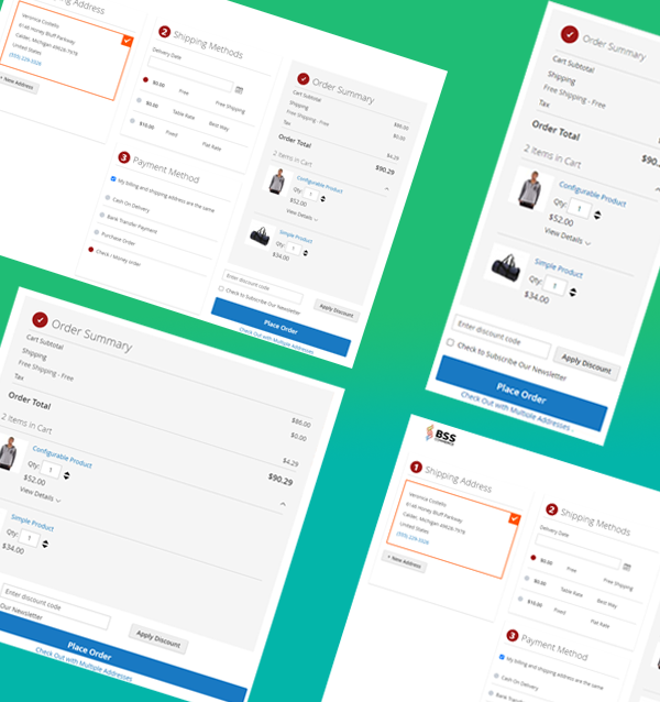
Step 4: Shape the new and improved cart experience.
Once you have the conclusion from all the testing above, it’s time to put it to work.
But first, let’s have some recommended reading:
- Magento 2 Checkout Process – Easy Optimization Steps
- Know Now 10 Vital Practices Of Magento 2 Checkout!
- 9 Secret Techniques To Enhance Your Checkout Process In Magento 2
Now that you have the holy trinity knowledge: yourself – your competitor – your market, you’re ready to put out your new cart.

Make it personal, informative, interactive, and utilitarian. To echo the point I made earlier, optimize for each customer group but always plant other options for the majority.
The best checkout cart is the one that can strike a balance between universality and individuality.
Don’t miss a common payment method that will play a important part to increase purchasing experience >> Paypal Settings for Faster Magento 2 Checkout: Don’t Let It Confused You!
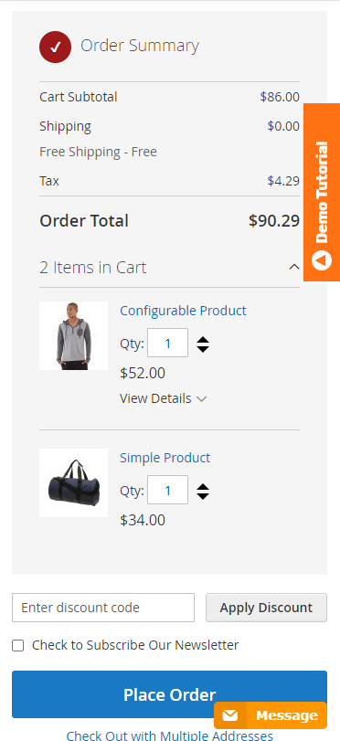
Step 5.0: Set for bright and bold thumbnails & CTA.
There’s nothing more irritating than a small absurd thumbnail that scarcely assists with distinguishing an item.
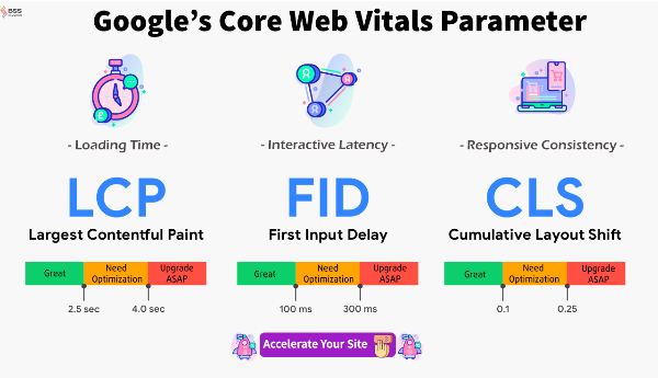
At the point when your clients survey their item, offer them the chance to see it appropriately in a generous size and goal. This is the time when responsive design and setting come to play.
GRAB the responsive Magento 2 One Page Checkout NOW.
Furthermore, showing an average estimated picture additionally enables versatile clients to have a superior portable encounter.
Data progression is the structure used to show and rank data as per its significance.
While planning truck pages focus on the rationale behind catches, sections, and titles as they will vigorously impact the clients’ recognition.
Basically, the general guideline is to evade any conceivable disarray by keeping it clear and basic.
You can utilize a wide range of hues (ideally coordinating your site), although we suggest a limit of 3-4 shades one after another. Size is also a much-needed factor in this equation.
Remember, customers that are using the smartphone for purchase need more prominent CTA. At the end of the day, the thumb is not as accurate as a mouse.
For sure, hues do assist you with picking up guests’ consideration, so use them shrewdly:
- Feature significant data
- Utilize an unmistakable shading to recognize the CTA
- Use lines or sections to structure your page.
Step 5.1: Offer a variety of payment options.
Having diverse payment choices is a need in the present super online business condition.
Not exclusively will this assist you with increasing more changes; however, it will likewise promise guests that are utilized to a specific installment arrangement.
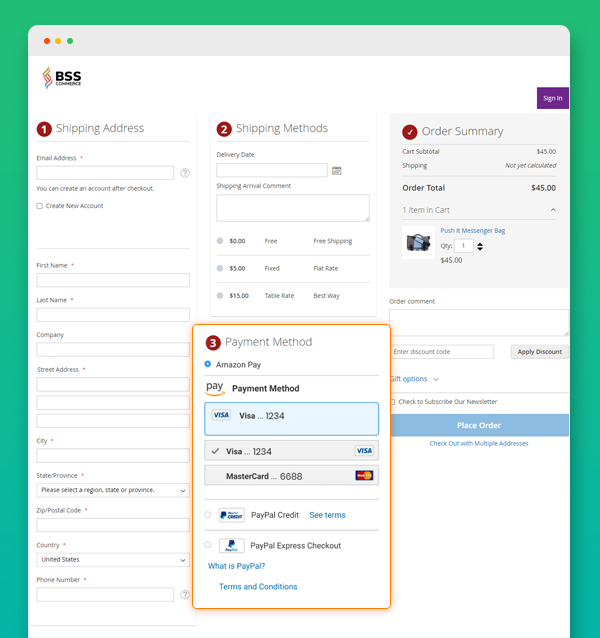
Indeed, it’s essential to the point that half of the ordinary customers would drop their buy if their preferred installment technique weren’t accessible.
If you run a universal online business store, remember that installment strategies vary, starting with one nation then onto the next. What’s utilized in the US isn’t equivalent to in Europe or Asia.
Ultimately, attempt to divert clients dependent on their IP area to offer them a customized experience dependent on the cash they use and their preferred payment techniques.
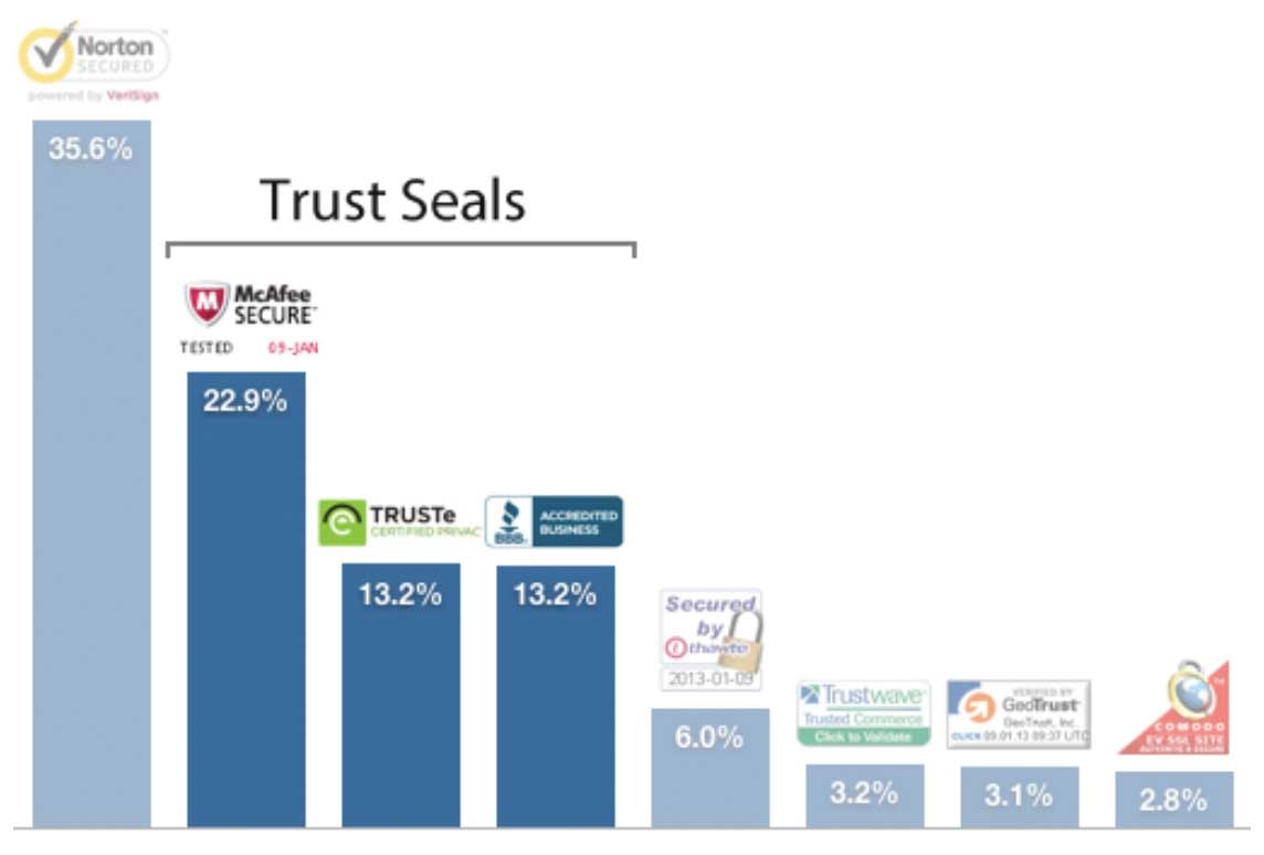
Step 5.2: Consolidate trust.
An ongoing review is driven by Econsultancy detailed that trust seals are the absolute most significant factor in picking up clients’ trust towards a site.
Truth be told, they matter more than peer suggestions or dependable structure:
If you don’t realize which seal to utilize and might want to know the rundown of the best trust badge… don’t move.
Baymard led a top to bottom investigation initially led in 2013 and refreshed for 2016:
A simple trust signal can actually take your revenue off.
Step 5.3: Place further contact and support.
Indeed, your guests need to feel that they are genuine people behind your site – it’s called client support.
Regardless of whether it’s a somewhat new choice for e-advertisers, offering a live visit or telephone help administration directly on the truck page is an incredible alternative to building changes, gaining clients’ trust, and influence your image character.
We’re all pursuing brand acknowledgment, right?
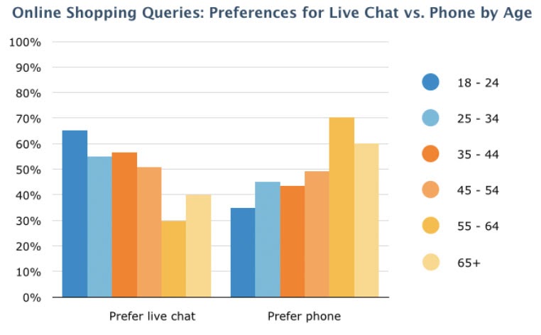
Regarding picking between live visit and telephone help, remember that recent college grads lean toward live talk; as this review drove by Software Advice plainly shows:
Be smart about this!
Step 6: Rinse and repeat.
Optimization is not a step; it’s an ever-going process. Once you implement the new cart, you need to do this all over again.
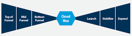
Think of it as a bow tie funnel, one you shrink down everything, and it’s time for a more significant spectrum to go and test your cart again!
This way, you reinforce and highlight your new and improved shopping cart. While the market and its content are always changing, it’s best to keep yourself on track and even take a leap if needed.
Furthermore, if you are in B2B market and want to increase more and more customers and revenue, don’t miss 14 Suggestions of Magento 2 Wholesale Extensions in B2B.
It’s Time For A Better Shopping Cart
It’s anything but difficult to overlook that clients investigate each move they make once they arrive at the checkout. Much the same as how to be fruitful in any everyday issue … it boils down to proven standards within the providing experience field.
Each field, all of the duplicates, each logo, is examined and prepared, regardless of whether just on an inner mind level, significantly if they’ve never purchased from you.
Getting this, in case you’re proactive in discovering approaches to decrease fears, increment trust, and repeating the reasons individuals choose to purchase from you, you just might have the option to get more individuals going from the checkout to turning into a real client.
BSS Commerce is one of the leading Multi-platform eCommerce solutions and web development services providers in the world. With experienced and certified developers, we commit to bringing high-quality products and services to optimize your business effectively.
CONTACT NOW to let us know your problems. We are willing to support you every time.