
Doubtlessly, checkout is the grand finale that every store owners desire to achieve, and it’s also the empowerment of ecommerce success.
So Magento 2 one step checkout – should or shouldn’t we install it? The article below will bring you a thorough answer with statistics and facts.
Moreover, we’ll provide you with the best examples and practices of this Magento 2 One Step Checkout to render a user-friendly and conversion-optimized checkout page.
Quick recap: What is Magento 2 One Step Checkout?
Table of Contents
First, let’s get this out of the way:
Terminologically speaking, there is little to no difference between one step checkout and one-page checkout within the Magento’s realm. These two terms are pretty much interchangeable.
To give it a definition, Magento 2 One Step Checkout is a Magento, and its partners attempt at shortening the checkout process with fewer steps and a more optimized page layout.
Here is a visual comparison between the default and the alternative.
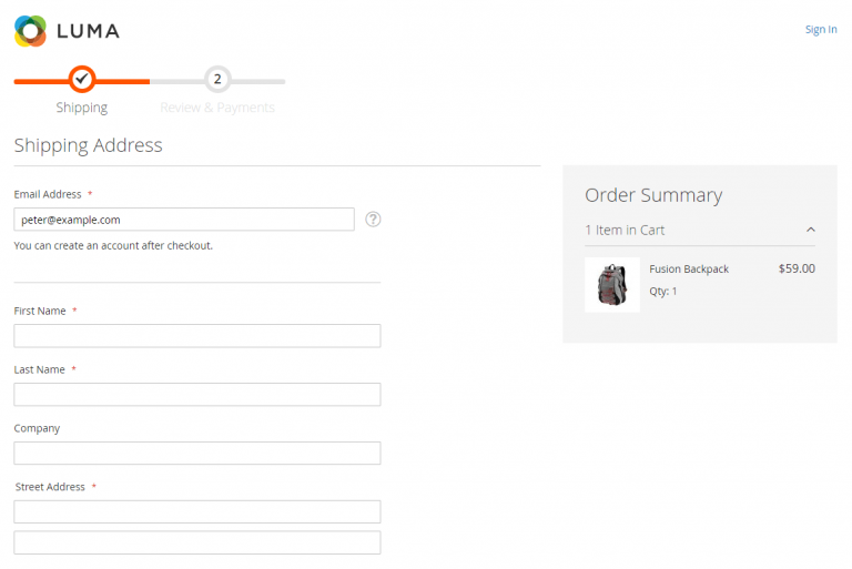
Default Magento 2 One Page Checkout
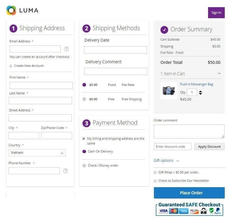
Alternative Magento 2 One Step Checkout from BSSCommerce
DEEP-DIVE ANALYSIS: Magento one step Checkout, one page, Vs. multi-step checkout comparison
Now, let’s get into detail and answer the questions of this post.
Start with the desktop checkout.
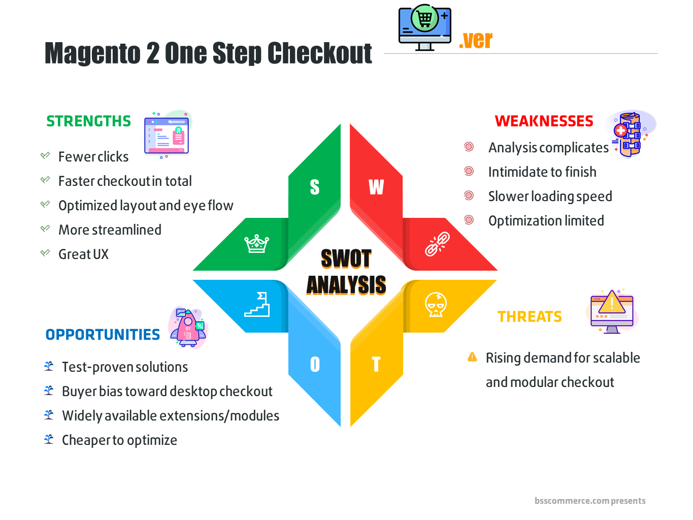
SWOT analysis of Magento 2 one step checkout – desktop edition
EXPERIENCE FOR YOURSELF: Book a one-on-one live demo with dedicated supporter NOW.
Why SHOULD you use Magento 2 one step checkout for desktop?
Precisely, we will dissect the strengths and opportunities that this checkout option withholds.
Fewer clicks when purchasing
So why do we consider this a strength of Magento 2 One Step Checkout? Pymnts has monitored the checkout performance of ecommerce websites for years, and here are their findings on this topic:
- The average number of clicks to purchase from the top checkout website is 17.
- In contrast, websites with five more clicks to purchase fall under the average checkout process score.
It shows that fewer clicks result in better checkout flow and actually make a dent in the conversion rate.
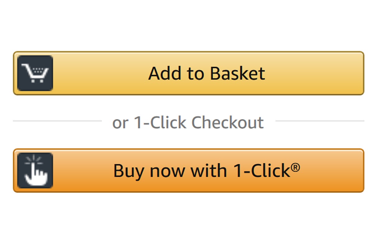
Moreover, let’s look at the blueprint of ecommerce – Amazone. 1-click checkout was indeed a game-changer when it first came into the scene and even until today.
UNIVERSALLY APPROVED PRACTICES: #19 best ecommerce checkout steps to steal and better your store!
Of course, Amazon’s success lies within so many more factors and innovations besides this checkout option.
However, considering Jeff Bezos sued Barns and Noble for using the same checkout pattern and finally trademarked this technology in 2002, you can imagine why this is such a precious innovation.
After Amazon eliminated this feature in September 2017, countless ecommerce websites have adopted and replicated the exact same patent for their businesses. Even Google.
This result is because they understand the genius in simplifying the checkout process. It offers a much smoother, frictionless customer experience that helps eradicate abandoned cart livelihood.
And isn’t it what you strike for as an online business?
Faster checkout in total.
The speed of your checkout process is absolutely vital to your ecommerce success.
Research has shown that 1 more second on the loading time eats away 7% of a site’s initial conversion rate.
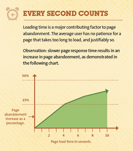
Courtesy of Hobo-web UK
And such hiccups will scare 8 out of 10 customers away from your site – forever! To make matters worse, they’re more likely to share a negative experience with their acquaintances.
Moreover, it’s public knowledge that Goole counts pagespeed as a rank factor.
So, we’re facing a win-win-win situation here; faster checkout is a net-positive for every party involved in an ecommerce transaction: you, your customers, and the search engine that helps connect you two.
As a matter of fact, the total checkout time on a one-step interface is noticeably lower than on a multiple-steps layout.
Let me explain why.
The standard checkout flow consists of 6 steps, and a checkout page takes care of such a process from step 2.
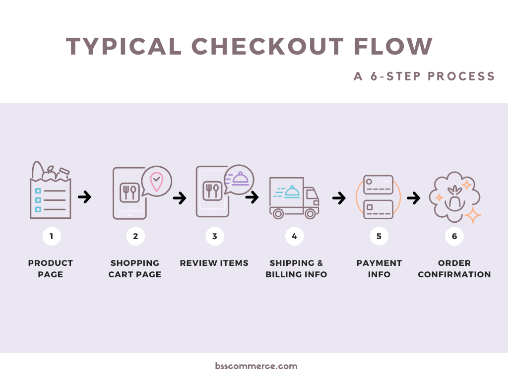
Here is where the Magento 2 One Step Checkout and the multiple-step checkout differ.
- The multiple steps interface loads each one of the steps above one after another (synchronous).
- The one-step checkout page loads EVERY SINGLE ONE OF THOSE STEPS ONCE (asynchronous).
Subsequently, the total time it takes to fully render the whole checkout process is much shorter for one-step checkout.
SPEED IT UP, SMOOTH IT OUT with 8 tips for Magento 2 checkout customization!
Optimized, streamlined layout and eye flow -> great UX.
I think the number about customer satisfaction that I shared earlier should tell you how much power UX holds.
It’s optimal if you can fit everything onto a one-page layout; a lot of transformation contemplates have demonstrated that the fewer snaps to check out there are, the higher your conversion rate will be.
With 2 or 3 columns designed, a checkout page like this will indicate a process that encourages customers to fill out and finalize their orders.
Moreover, one step checkout also gives customers better eye navigation. There will be no hustle in checking back and forth for their order details.
It’s a test-proven checkout solution.
Indeed, there are countless studies on ecommerce checkout that conclude that Magento 2 one step checkout is the ultimate solution.
>>> CHECK OUR MATH RIGHT HERE: One step checkout statistics and facts
And still, Baymard comes to the solution that this checkout layout is not the ultimate solution for UX; it always shows better results in both customer’s end and your revenue turnover.
Buyer bias toward desktop checkout.
Ecommerce sites live and die with their conversion rate.
Even though mobile checkout is coming in hot with its rising popularity, desktop still hosts the best conversion rate checkout page.
And since we’ve talked in-depth about how much a Magento 2 One Step Checkout vision can help your ecommerce, applying it to the hottest interface is the right move.
Large market -> cheaper to optimize
One search for “one step checkout” on Magento Marketplace turnovers a whopping 172 results.
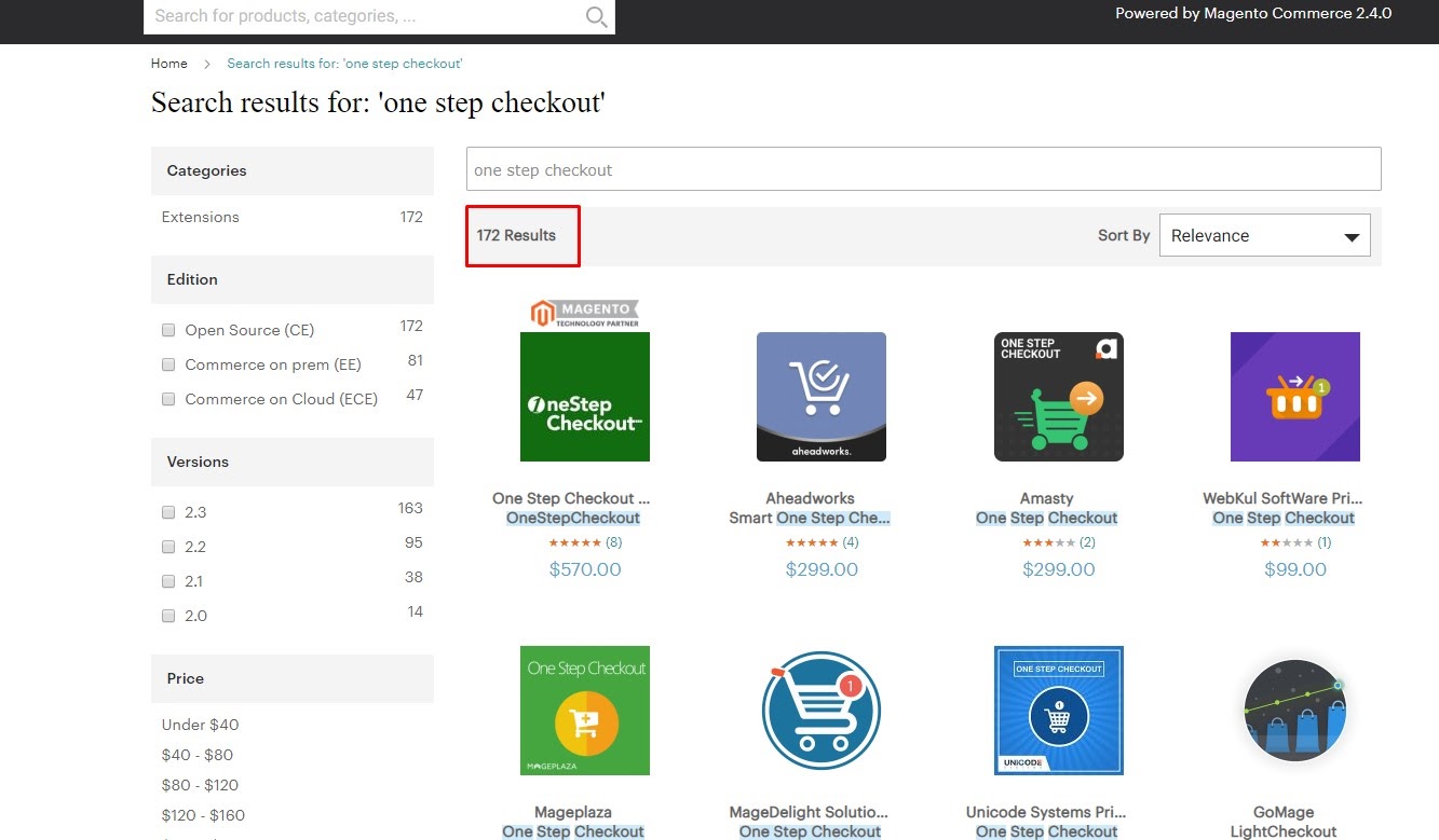
BEST VALUE CHECKOUT KIT ON THE MARKET: Grab this Magento 2 Checkout Suit now!
This number should tell the massive market for one step checkout optimization kit, and what comes with it? You have a competitive market that will keep the price point average with price tiers that serve different business scales.
From here, you can easily pick and choose your ill-fitted extensions for your ecommerce operation and run your best Magento 2 One Step checkout process!
Why SHOULDN’T you use Magento 2 One Step Checkout for desktop?
I give you 5 reasons why:
- Scary to finish: The default one-page checkout seems to have two fundamental advances. When customers are demonstrated plainly about what they should do, the checkout page looks long and overpowers clients directly on the initial step. This inconvenience can lead customers to forsake their trucks.
- Speed: Long checkout pages set aside a very long effort to be stacked. Also, endless looking over causes customers to feel disappointed.
>>> SPEED UP CHECKOUT PROCESS: Learn how to optimize Magento 2 Checkout Slow now! <<<
- It is hard to examine: As referenced, one-page checkout makes it harder to break down which point or factor on a page causes card surrender.
- Limited room for customization: On the default checkout page, some propelled highlights don’t get prioritized. No organization alteration is permitted, no blessing wrapping/informing is shining, clients can’t leave request remark, select conveyance time, etc. Thus, this causes a few burdens in the checkout procedure.
>>> CLICK HERE to discover the answer of How To Add Custom Fields To Checkout Page Of Magento 2? within 5 minutes read!
- Demand for scalable and modular checkout: We’re in the digital phase that growing bigger and bigger in terms of technological advancements. With more and more payment options, demands – the checkout layout needs to be able to host all of them to ensure customer satisfaction.
Magento 2 one step checkout best examples
Bellroy
Not only this is a conversion-optimized layout but also a great UX one.
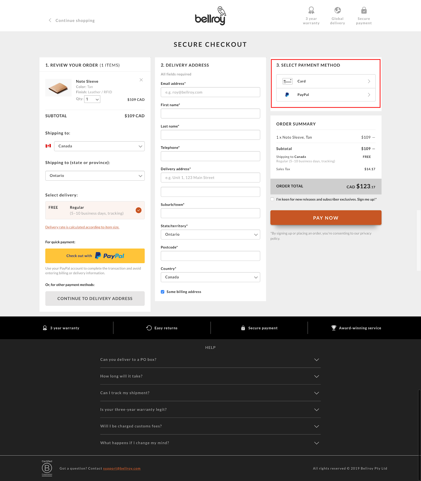
COPY THIS CHECKOUT DESIGN by installing this Magento 2 one step checkout extension.
The 3-columns arrangement gives the site a tidy and professional look while maintaining all the necessary fields.
They likewise constrained the fields a client needs to finish to spare time and lower the ricochet rate.
There is the primary field for the location; this implies the charging address is a matter, of course, the delivery one.
Be that as it may, to be cautious, so the client doesn’t misjudge you, you can compose delivering address and put in sections charging address. Along these lines, you will maintain a strategic distance from any disarray.
Moreover, you can see the design for CTAs is *chef-kiss*. They’re bold, vibrant, in-the-face, and enticing to click.
ASOS
The checkout page for ASOS is just otherworldly.
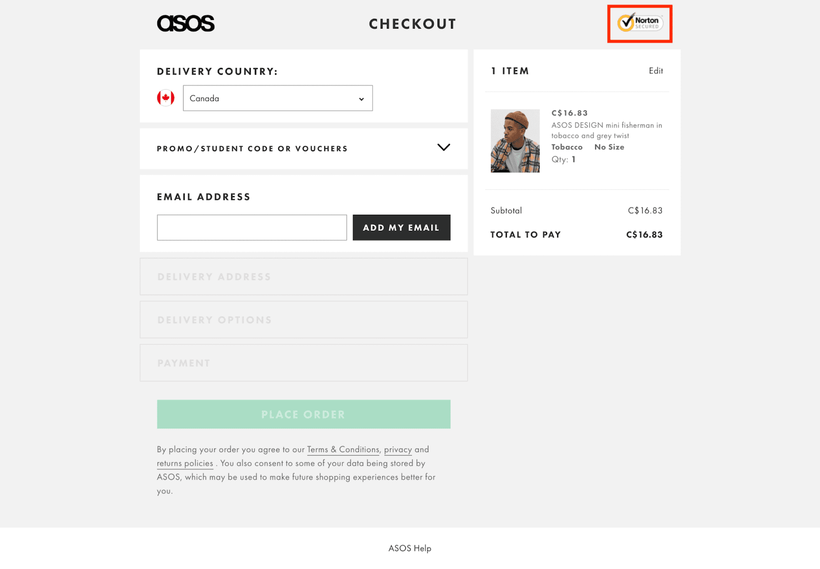
It’s simple with the accordion style, which leaves the impression that it’s quick to finish. This makes the figment that you can fill in everything rapidly.
Our brains think along these lines as well; you complete something through and through, and like this, their checkout procedure feels common while finishing it.
Another genuine model is their blunder messages with the direct links to Term & Conditions, privacy, and return policy. Most checkout forms feature the fields in red when something is missing without giving an appropriate clarification of what to do. This makes dissatisfaction for the end client and builds the opportunity that they will leave the site.
At the same time, customers can review their cart right along with finalizing their orders.
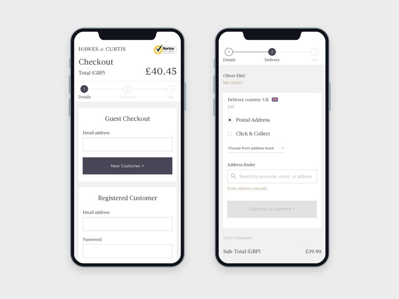
Why is it not ideal to use Magento 2 One Step Checkout for mobile? And how to fix it!
Limited space
So here is the undeniable truth: the mobile screen does not support the Magento 2 one step checkout interface.
Moreover, you’ll deal with a different type of customer.
Let’s start with user behavior on mobile:
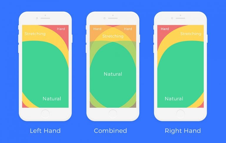
- 3 out of 4 mobile users navigate with one hand.
- 9 out of 10 people use a thumb instead of a finger on a smartphone.
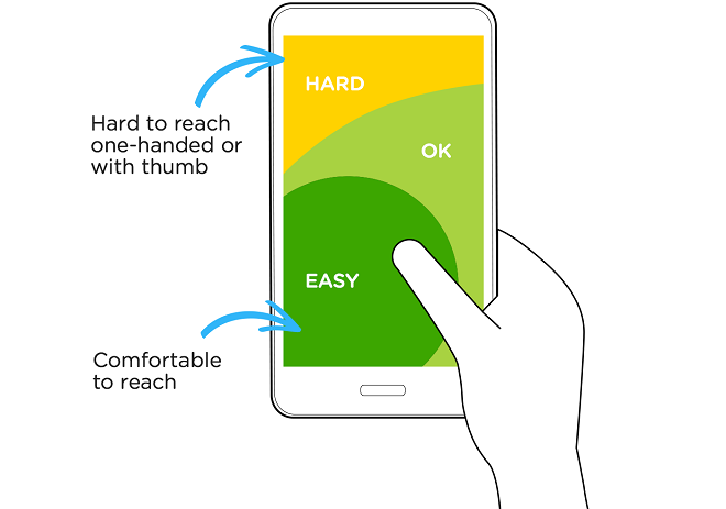
These behaviors lead to the heat map for mobile users looking like this:
Not only do we have a smaller screen to render a checkout page, but we must also face the challenge of user behavior.
So what can we do about this?
How to improve:
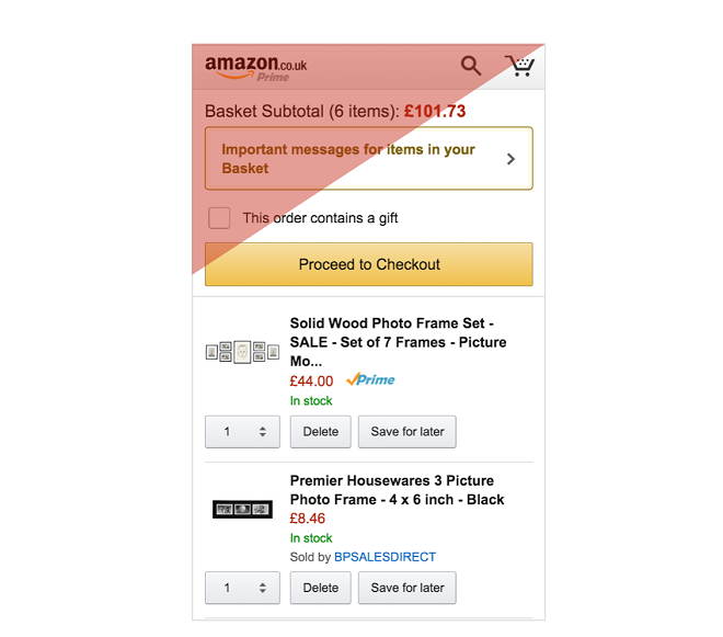
Once again, let’s take Amazone’s checkout page as an example:
NOTE DOWN these absolute “no” in Magento custom checkout!
As you can see, they put notification of price, logo, and other separated parts on the hard-to-reach zone.
Furthermore, CTA (Proceed to Checkout) and the ability to modify items in the cart are within the easy-to-reach range for mobile users.
And on this note, you can sacrifice other fields to shorten the checkout page, but not the CTA.
Remember, the thumb is not accurate as a mouse. You need a CTA that is bold and big enough for the customer not to miss it.
As per an examination on the Mechanics of Tactile Sense by Human Fingerprints did by MIT Touch Lab, the standard width of a grown-up thumb is 1 inch (2.5 cm); which changes over to 72 pixels and that of the forefinger is 1.6 to 2 cm (16 – 20 mm); which changes over to 45 – 57 pixels.
Too much scrolling
Composing and text contribution on cell phones are a UX challenge; writing normally will be slower on versatile touch screens compared with work areas where producing is completed through consoles.
Contact screens also require on-screen consoles to take up half of the perceptible screen zone when used.
This is why you need to keep text contribution to the base for customers on your checkout page.
How to improve:
Using tab to differentiate amongst checkout sections
Recollect that preceding getting to the checkout page, customers would have just been perusing, choosing choices, and squeezing catches, such as the ‘add to truck’ button.
The checkout is most likely the main page in the channel that will require the console input section.
Separating structures, such as the checkout page into different pages that lone takes up half of the screen, with a reasonable “next” catch and progress pointer, guarantees that guests are not threatened by the console input passage prerequisites of an intimidatingly long structure.
Accordion checkout style
Another direction you can go about this is to use the accordion checkout style. Unlike using the horizontal tab, we will put them in the vertical order.
The eye-following test meetings of various accordion-style checkouts uncovered that explaining the reason and directing concentration towards the current checkout step can viably be altered by looking over clients to the start of the new checkout step when they continue.
NEED BETTER MOBILE CHECKOUT TIPS? Read up on this mobile one-page checkout Magento article!
Presently, the significance of such auto-looking over relies upon which parts of the further advance would somehow or another end up out of the client’s viewport.
Thus auto-looking over is especially critical to executing if the outlines of past increases are tall, and long checkout streams where the synopses will include paying little mind to how reduced they are.
Wrap up
So here is the takeaway from this article:
Rule number one – if a customer finishes a checkout procedure in under 1 minute, you have a winning checkout stream.
If you organize execution before anything else, it will assist you with conveying higher outcomes. If you can slice through vast amounts of activities that are not valuable for a practical site, at that point, it will drastically improve your results.
I comprehend that we, as a whole, need to have a few movements that intrigue the guest, yet it will come down to whether you would like to dazzle or convert?
Everything in the checkout stream ought to be structured to subtleties and potential mistakes. Continually ask yourself, do we need these additional fields to lose a client, or can we remove them? Would we be able to consolidate these 2 stages into one? Is the charging structure sufficiently simple to fill in? Or, on the other hand, is it clear enough? How quickly can a client checkout? We should test the procedure with irregular individuals who don’t know anything about our shop, and so forth.
BSS Commerce is one of the leading Magento extension providers and web development services globally. With experienced and certified Magento developers, we commit to bringing high-quality products and services to optimize your business effectively. Furthermore, we offer FREE Installation – FREE 1-year Support and FREE Lifetime Update for every Magento extension.
CONTACT NOW to let us know your problems. We are willing to support you every time.