First, we should define how important Magento web design of the homepage is.
Statistics conducted by Digital Resources showed that 94% of all first impressions on a website are design-related. Another one by John Kramer 2019 also revealed a noticeable point: 36% of visitors will click on the business logo to reach the homepage as soon as reaching a website via a referral.
The above numbers have emphasized the importance of Magento web design for the homepage and that you need a more special one than the default design. There’s no problem making use of the default Magento homepage design, but a unique concept customized to your brand is necessary to give your business a spot on customers’ minds.
Default Magento Web Design for Homepage
Table of Contents
A homepage is the first thing customers face when they search your exact website URL, so it tends to leave the first impression on visitor minds in most cases. In general, a homepage has these main functions:
- Give a short introduction of your brand
- Provide visitors with an overview of your industry, product, or services
- To be a central place for any navigation action by showing categories or providing visitors with a search box to search for any products or services your store offers.
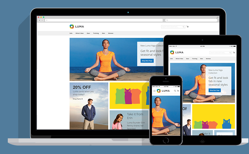
The default Magento homepage design consists of three key elements: Header, Footer, and the main content block. Your business’s logo, footer links, or more additional blocks using widgets are configurable. However, further requirements related to complex block code need to be fulfilled by one of these solutions:
- Using a proper theme
- Opting for custom Magento website design service from scratch
- Customizing based on a theme
The Magento website design cost for a custom homepage differs from agencies and customization requirements and may be fixed or hourly charged. To prepare for your Magento web design, move to the next part for some tips and ideas for custom Magento homepage design.
EXPLORE IN DETAILS: Magento costs to build a basic to custom Magento website (Magento website design cost included).
#1. Header
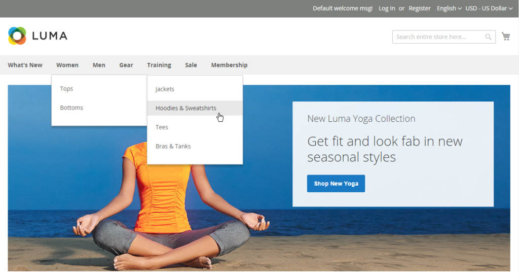
The best practice of Magento homepage design is placing mainstream categories or product finding paths on the first positions in the header. Don’t let those eye-catching positions go to waste, but take advantage of them to increase CTR to your products and services.
You should make sure the main navigation via the header is designed in a logical but simple way so that customers can easily browse the store and find the right products they need. A drop-down menu works really well to display further navigation in a clickable hierarchy. This design allows customers to cut down significantly on steps or clicks to reach a specific product, and then, improve the Magento experience.
Also, don’t forget to choose font styles, white space, spatial indicators, borders properly to create a clear navigation menu for easy scanning.
Search Bar
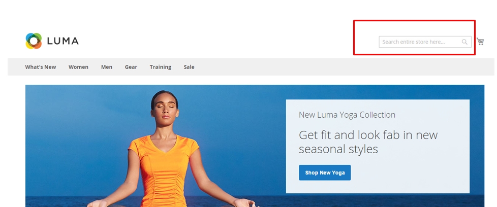
A search bar is another common path to finding products, usually placed in the header of the homepage or the central location of the screen. Every time customers shop on an ecommerce website, they always search by entering a keyword via a search bar. Even so, we have seen some websites having a search bar blending in with other elements on their homepage, making it almost invisible.
An outstanding search bar using a different color from the background or a highlighted border is always loved by customers. It should provide enough space to handle long queries and end with a search button (as texts or a symbol). Besides, don’t forget to add a call-to-action sentence or a suggestion to the search bar, like the best seller of your online store, for example.
For more excellent search experience, your search bar can provide search suggestions or autocomplete function to ease the process for your customers. In this way, you encourage them to buy something out of their shopping plan.
Courtesy navigation allows customers to perform secondary actions like switching currency and language, using quick contact buttons, and so on. In common design, those functions are usually displayed at the upper-right corner of the header with understandable icons or short text.
#2. Main Section in Magento Website Design
The main section in Magento web design is the remaining part when you remove the header and footer. Though the homepage content differs from site to site, it usually includes these elements:
- Hero section
- Promoted categories and products
- Unique selling points
- Reviews and testimonials
Hero Section
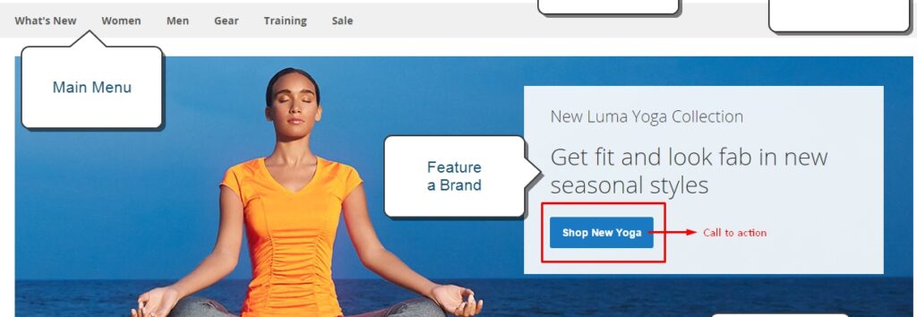
Hero section has the most impact on customers and appeals to them to take further actions on your site. The most important note is that you should not let customers get all the information in just a glance as they will skip the rest content of the homepage and miss other critical information.
In the practice of Magento web design, many designers are familiar with the use of a static image expanding to the whole screen with some texts and a call-to-action button. In case you want customers not to miss more noticeable content on your homepage, give them a sign for this (an arrow pointing down, for example).
The use of a carousel of images in the hero section is common on many websites. If you also do this on your site, don’t expect customers will check them all. The first slide will get the most views, so it should be designed impressively with critical information.
Slide control
An auto carousel is not always comfortable and even annoys customers when they need to stay longer in a specific slide. It’s better to let customers move to another slide when they’re ready.
Also, don’t just depend on the small dots to control the carousel as they may easily blend in with the image. Modern Magento web design should allow the finger slide motion on mobile devices to make it much easier to navigate the carousel.
Promoted Products & Categories
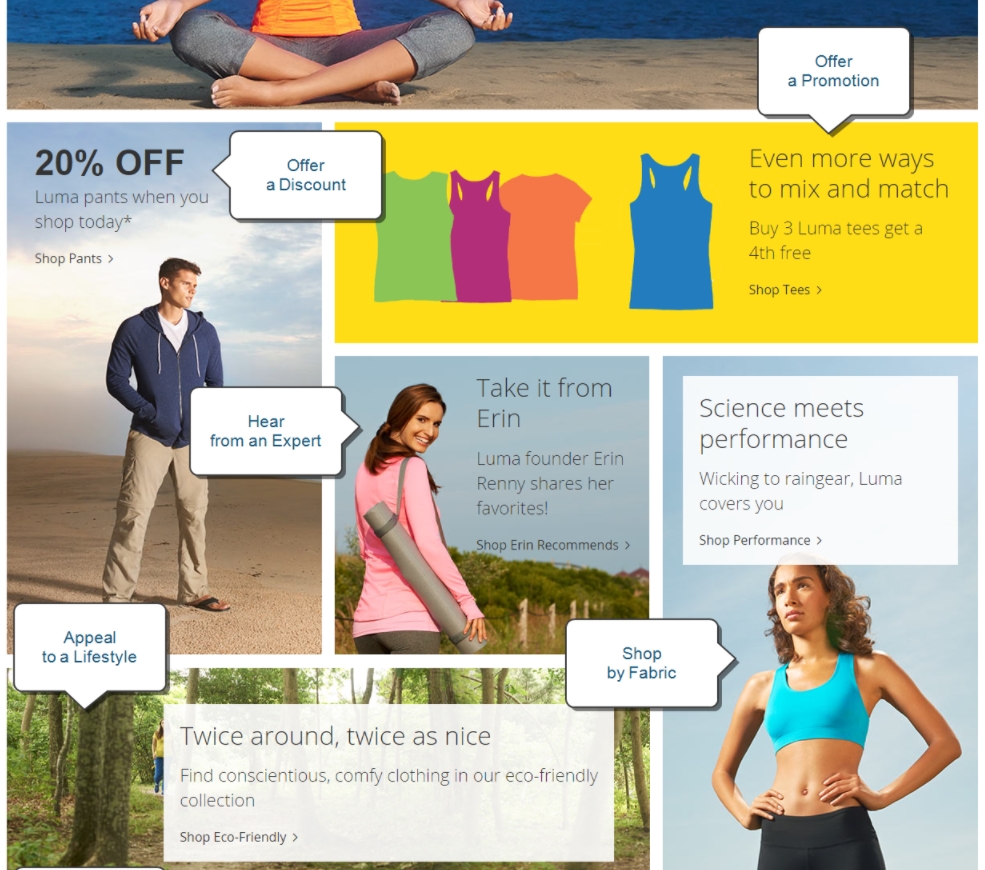
The display of the main navigation and some relevant sub-categories on the homepage will help you show off various ranges of your products. For this purpose, you have several choices for the display of promoted products and categories on the homepage using imagery, different text styles, icons, and so on.
Unique Selling Points
As you are not the only merchant offering what customers need, it’s necessary to give them persuasive reasons to rely on your products. Unique selling points (USPs) are what differentiates your business from others and your best competitive advantage. Most ecommerce online businesses use the USP section as a core element of their content.
Unique selling points should be short, clear, and displayed in a separate block. If possible, you should prove them by showing real numbers and certificates.
Reviews & Testimonials
Testimonials and personal recommendations are important proof of a business’s promise to their customers and have a profound impact on their shopping decisions. Even when a business offers high-quality products, customers only believe this when they hear that from real feedbacks.
When you quote feedbacks on the homepage, it’s always better to attach the evidence of previous works along with them or link to a trusted review platform.

Though the footer stays at the bottom of the homepage, Magento store owners should not ignore this element. Not the biggest concern, but in fact, the footer may get more attention than you think as many customers have a habit of reaching the bottom to find additional content (blog, brand story, etc.) or submitting subscriber information. Hence, placing the most important category link again at the footer is a wise idea to increase CTR on the homepage.
Contact Information & Social media icons
More than providing connecting methods via phone or email, contact information also reinforces customer trust in your business as they know how to ask for any problem.
If you want to expand your business impact via social media, don’t forget to place small icons linking to a business profile or customer communities via popular social networks like Facebook, Instagram, and so on.
As contact information is less important than other content on the homepage, you should give it very little space with a minimal look in the footer.
Contact For Professional Magento Web Design & Development
Each business has its own optimal and effective design, don’t limit your creativity in this very first step. We hope this piece of content has given you useful notes and tips on Magento web design to develop your ideas.
As Magento web design and development is a complicated process that needs to be implemented by professionals, a Magento solution partner with an experienced team will give you the best support.
SHOULD ALSO READ How Certified Magento Partners Power Up Your Ecommerce?
BSS Commerce is one of the leading Magento extension providers and web development services globally. With experienced and certified Magento developers, we commit to bringing high-quality products and services to optimize your business effectively. Furthermore, we offer FREE Installation – FREE 1-year Support and FREE Lifetime Update for every Magento extension.
