The topic today is “How to Choose Magento 2 Themes?”
Your ecommerce site is your storefront online. You need to make it attractive, accessible and highly functional to achieve business success. Having a great product is not enough, you have to bring it to the customer in a way that is appealing, functional and easy to find. That’s why Magento provides the Magento 2 theme to help you design your site to impress customers.
So, review whether it is time for your Magento 2 change theme?
1. What Is Magento 2 Theme?
Table of Contents
A Magento 2 theme determines the look of a storefront, which is what website customers see when they visit. The Magento theme is a component of the Magento application that provides a consistent look and feel visual design) for the entire application area (for example, storefront or Magento admin) using a combination of custom templates, layouts, styles or images.
The Magento theme links with the design of a website. A well-designed and coded Magento theme will bring positive effects to your online business. Magento themes usually follow a style and aesthetic based on the purpose of the website.
2. Default Magento 2 Themes: Luma and Blank

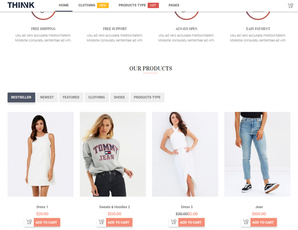
By default, Magento 2 introduces two different themes: Blank and Luma theme. In which, Luma is used as a demonstration theme, and Blank as a basis for custom theme creation. Moreover, Luma is created with the purpose to initiate the understanding of Magento 2’s theme structure while Blank provides the basic theme structure, used as a model to develop new themes in Magento 2.
To help you understand more clearly about these two default themes, you can read some differences between Luma and Blank themes in this article: Magento 2 theme comparison: Luma and Blank.
You Might Also WANT TO KNOW >>> How to install Magento 2 Themes?
3. Where to Buy Magento 2 Themes?
There are a lot of Marketplaces providing diversified Magento 2 themes for store owners to select such as:
- Magento Marketplace: Unlike Magento extensions, this marketplace has had just a limited number of themes until now. However, these themes are guaranteed to meet all requirements of Magento before being listed in this marketplace.
- Themeforest: This is a very big Marketplace selling themes for many websites built on various Ecommerce platforms, including Magento. Magento 2 themes on ThemeForest marketplace are divided based on industries such as fashion, furniture and so on. Therefore, it is easier for you to seek for the most suitable one for your website.
- Template Monster: Similar to ThemeForest, this is also another theme Marketplace for Magento 2 store owners to take a look at. However, the quantity of Magento 2 themes is a little bit fewer than that of Themeforest.
In addition, a huge number of Magento theme providers over the world also share the same market and launch thousands of themes to serve customer demands.
4. How to Choose the Right Magento 2 Theme for Your Store?
Choosing the right theme for your Magento 2 store can be a make-or-break decision of your business. So how do you determine if a theme is a good choice for your business? You can start by examining the fundamentals aspects of a theme: design and technical problems. Only after that should you check the vendor’s prestige and support policy.
4.1 Choose the right theme design
There are 3 critical elements of a premium website design in a Magento 2 store: clear visual hierarchy, consistent color, suitable font.
A theme having all these 3 design elements can assure the aesthetic aspect of your website. And a beautiful website helps communicate the quality of the brand, improve the visibility of marketing campaigns, make the foundation for increasing conversion rate and emphasize all the messages you want to broadcast.
- Clear visual hierarchy
Visual hierarchy refers to the arrangement or presentation of elements of information in a way that implies importance. With a website designed with a clear visual hierarchy, the users visiting your site can find and understand the most important message you want to communicate. Consider 2 pages below:
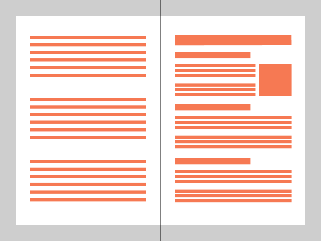
Which one do you think is more understandable? It is clearly the page on the right, which provides a way to catch the key information. In order to understand the left page, users have to read each sentence one-by-one to catch the idea.
As you can see, a visual hierarchy system helps prioritizes the content of websites. In Website design, a good visual hierarchy system means clearly discriminating the importance of the contents of a website page. This can be achieved by setting up the contrasting colors, a large difference in font size, or line spacing with the use of font of the text element or images.
When considering the website design, you can try this visual hierarchy test: zoom out to 50% (by holding CTRL + mouse scroll down in Windows OS), have 3 seconds to look at the design then look away. If then you cannot tell what the website is about, the theme is bad in terms of visual hierarchy. Your users would find it hard to understand what you are trying to tell. So a rule of thumb when choosing a Magento 2 website theme design is: go for the ones that are easy to understand hierarchically.
- Consistent color
Color is one of the most visual aesthetic aspects that easily affects visitors’ experience in an immediate way. People would perceive brand personality differently when it associates with different colors. That’s why there are some colors that are very commonly used in certain industries. For example, in the restaurant industry, the most used color for the logo is red, to trigger energy and even feelings of hunger.
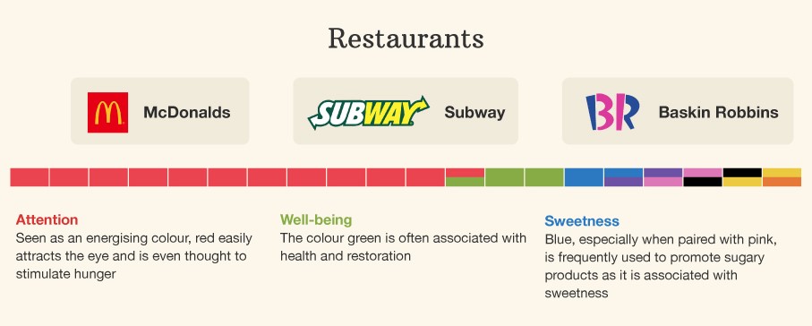
Image credit: visualcapitalist.com
However, in the communication industry, the color dominates logos is blue, as it conveys clear thinking and communicating.
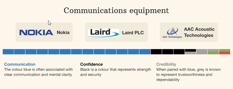
Image credit: visualcapitalist.com
In branding, the brand color helps customers memorize the brand, including its name, industry, products, and attributes. There is no exception to this rule, whether the (potential) customer interacts with the brand via offline or online stores. According to Kissmetrics:
“85% of shoppers place color as a primary reason for why they buy a particular product”
“Color increases brand recognition by 80%. Brand recognition directly links to consumer confidence.”
The Magento 2 website design color, therefore, needs to be consistent with the brand color for users to easily recognize the familiar brand, making the more purchase in less amount of time.
At its best practice, a Magento 2 website design should follow a color palette. You can learn to create your own color palette here. If you have already had a primary color, you can consider adding colors to different elements of your website using Adobe’s free Color CC. After that, you would want to change the color of multiple elements of the theme to the colors in your color palette. For example, you would want to configure the color of some texts, buttons like below:
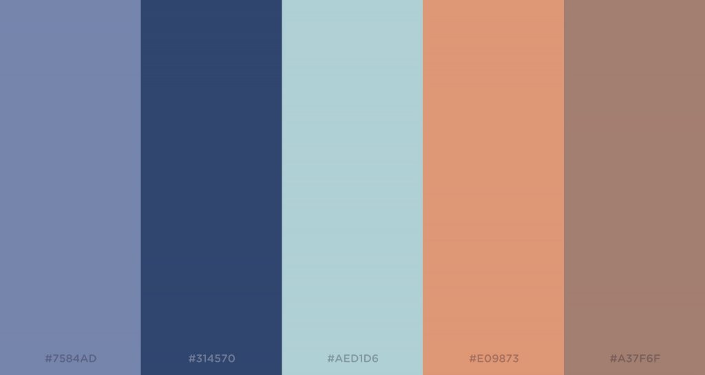
Technically, in this section, the theme that you can configure many elements color wins. These elements can be text color, background color, and button color. So in order to get the best out of the brand’s color, go for a theme that you can configure many elements’ color.
- Suitable font
When choosing a website design, font choice should be considered seriously. Poor font choice results in an unprofessional website.
So what makes a good font choice?
If you have had your fonts determined in your brand guidelines, congratulations. Just follow it, and be consistent with it. However, if you have not determined the font for your brand guidelines, you need to decide the theme in various sections of your website. Then you need to find a theme that you can configure to follow the font you chose. So in order to get the best out of the brand’s font, go for a theme that you can configure almost all text element’s color. However, even if the Magento 2 theme’s design is great, you should still consider another crucial aspect of the theme to make sure the theme functions correctly: technical.
4.2 Choose the theme with good technical attributes
There are 5 simple steps to consider Magento 2 theme ’s technical aspect: responsive check, basic page speed test, bug test overview, compatibility check, desired feature check.
- Step 1: Responsive check
Responsiveness is a must in Magento 2 website design in 2018. A study has shown that in January 2018, 68% of Internet users use the web with Mobile devices. Even from 2012, Google has claimed that 67% of users are more likely to make a purchase on a responsive website.
Responsive layout guarantees the user experience of your users across multiple devices, as well as increases your visibility in the Google search engine.
How do you check if a website is responsive or not fast?
Easy. Inspect the Demo website (in Windows/Linux, press F12; in Mac, press Command + Shift + C). Then click the devices icon, and test with all the different screen sizes.
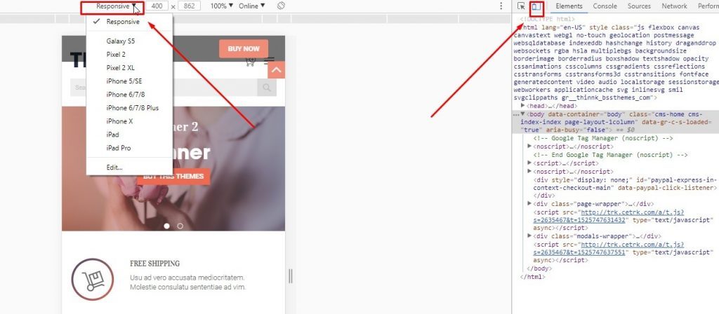
Any theme that makes you need to zoom in to see the content, or feel the text and image size is unnatural and not well-made responsive.
- Step 2: Basic Page speed test
A study from Google and SOASTAS in 2016 has shown that 53% of visits to mobile sites are abandoned after 3 seconds. That’s why your website would miss out a lot of potential buyers if the load time is high.
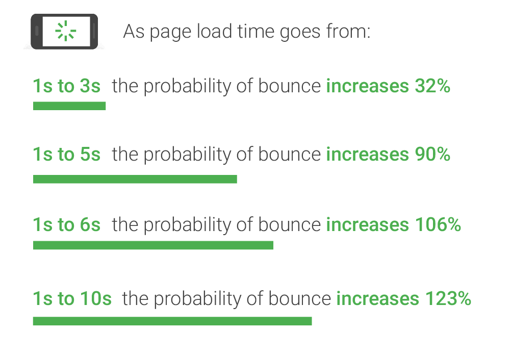
Source: Google/SOASTA Research, 2017.
There are many benchmarks in the internet era. Google’s best practice for the website’s page speed is 3 seconds, while Magento encourages websites to load in under 5 seconds.
How do you determine the page speed of a theme?
There are tools like GTMetrix or Google PageSpeed Insights that help you study in-depth and find ways to optimize your theme. But when testing in preliminary consideration, you do not need that level of complexity from a page speed report.
- Step 3: Bug test overview
Bug test is a long process in software development. In general, the more users, bug tests occurred by vendors and versions released, the fewer bugs remain. However, you do not need to be a professional tester when you test the themes’ bug. You just need to perform a basic test on 6 fundamental pages of the theme.
The key here is not to waste your time testing in-depth any theme, but just test its core function on the surface. Indeed, spend no more than 5 minutes in this section.
How do you perform a basic bug test on the theme?
Simply become a customer and try to make a purchase from the demo website. If you can successfully make a purchase and view the company’s about and contact page, the theme passes the basic bug test.
- Step 4: Compatibility check
The theme has to be compatible with your website’s Magento version to operate normally. If you are using Magento version 2.2.4, but the version supported by the theme vendor is only 2.2.1, then move on to the next theme.
How do you check theme and website version compatibility?
Check your website’s version by checking the bottom of your Admin Dashboard. Then check if that version is supported by the theme in the theme description.
- Step 5: Desired features check
If you have carefully planned your desired feature ahead, you will find this step very easy. By carefully, we mean having a list of the desired feature.
How can you check your desired feature?
You can use excel to compare different themes regarding your desired features. Occasionally, your theme will not have sufficient features you desire. And that is good for you because you are not looking for custom development. The good news is not all the features are equally important. There are features that are critical to your site, and there are ones that are not that important. Therefore, a rule of thumb is sorting features by priority and choose the theme that has most features with the highest priority.
For example, let’s say you want your theme to have 17 features:
Now you have theme#1, theme#2, and theme#3. You should have a sheet as below, and Sort all features by their priority.
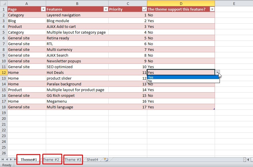
Now the theme with the best feature is the theme with the most “Yes” in the D Column, starting from the highest priority feature. Consider choosing that theme.
In Conclusion
So that’s all this article covers. By now, we hope you have a general understanding of Magento 2 theme, as this is everything that Magento 2 website users see and interact. To make the most out of Magento 2, you should spend significant time on the theme and decide whether Magento 2 change theme is required to improve the overall website user experience.
So what about your opinion? Let us know in the comment section below.
We are one of the leading Magento extension providers and Magento development services in the world. With experienced and certified Magento developers, we commit to bring high-quality products and services to optimize our business effectively. Let us know about your problems. We are willing to support you every time.
