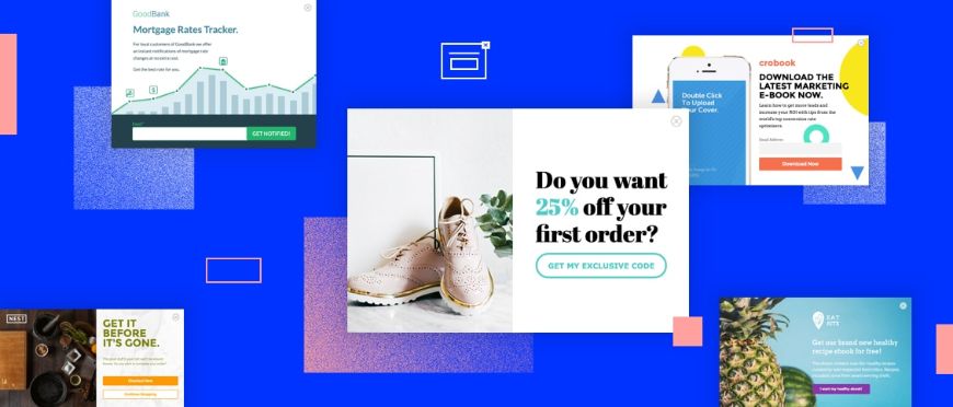
Magento 2 popup modal is frequently used on websites as a call-to-action (CTA) tool to highlight critical information. A popup’s CTA, for example, can ask the visitor to subscribe to the site’s newsletter.
According to Nielsen Norman Group‘s user experience research, 90% of the participants preferred to get updates from companies via email newsletter against only 10% via Facebook. This data could indicate that sending out an email newsletter is a good strategy for building customer relationships.
Thus, do not miss this opportunity and let’s look at some well-designed Magento 2 popup modals.
What Types of Magento 2 Popup Modals Are There?
Table of Contents
There are many types of Magento 2 popup modals available today; there are even creative types that combine two or more purposes. However, in general, we will have the following five common types:
- Click Popup: Unlike the other popup types listed below, click popups are an option for the links on your page. A click popup can offer anything. For example, you can provide a form on the spot rather than redirect your visitor to another page. Click popups are effective because they reduce the likelihood of your visitor leaving after being directed elsewhere.
- Scroll Popup: A scroll popup appears when your visitor scrolls down a certain amount of your page. You may, for example, ask them to subscribe to your email list after they’ve read half of your blog post.
- Countdown Popup: It can significantly impact conversion rates, depending on your business (many affiliates have found success with a 10-15-second popup). Most case studies agree that the best moment for your popup is within 60 seconds of a visitor entering your page.
- Exit Popup: Exit popups appear when visitors pass their cursor over the window or tab’s close button. It’s a last-ditch attempt to urge users to stay on the site and complete their checkout. Exit popups are frequently used in e-commerce to reduce shopping cart abandonment.
- Entry Popup: When a visitor enters your page, this popup occurs. An entry popup is your greatest buddy if you want to show something like a promotion or an exciting offer right as a visitor comes. Before visitors explore your website, an entry popup can inform visitors about a summer discount or brand-new books before exploring your website.
>>> Know how to create a popup in Magento 2 here.
20 Beautiful Examples Of Popup Modals
Mylo

Mylo should match the visual style of your site. You don’t want your modal windows to look like they’re from a third-party program. At Mylo, a menswear store, they follow this rule.
The popup modal that requests our website visitors’ email addresses is visually consistent with our brand. A lot of white space, crisp typeface, and language align with our brand’s design criteria in our scenario.
Backlinko
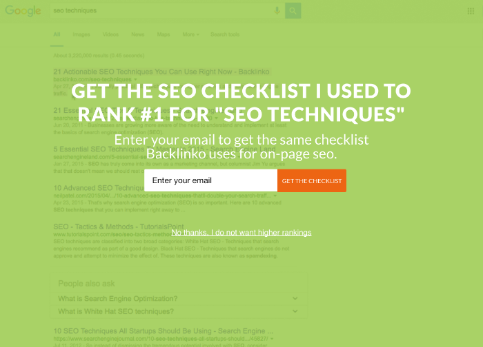
Backlinko, everyone’s go-to website for SEO tactics, uses a full-screen landing mat. The eye-catching colors and benefit-oriented headlines pique your interest, promising to present the same technique they do. “No, I don’t want higher rankings,” the negative call-to-action (CTA) encourages visitors to sign up and receive the checklist.
Jean STORIES
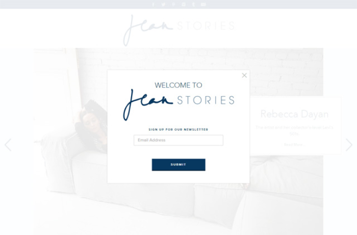
The modal window on Jean Stories (a fashion site focused on denim) is also in keeping with the general aesthetic style of the site.
Notice how their brand’s color palette is applied consistently throughout the modal window and how their logo is incorporated.
Bench.co
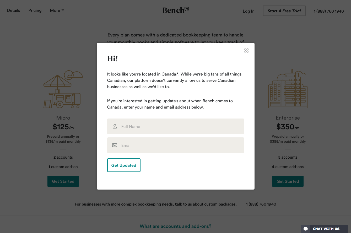
Bench, a fast-growing financial company, employs a Magento 2 popup modal to attract international visitors. You can learn how they use friendly communication and guarantee real-time updates in their popup. It’s an ingenious technique to gather contact information and keep all of their visitors informed until they’re ready to expand abroad.
AYR
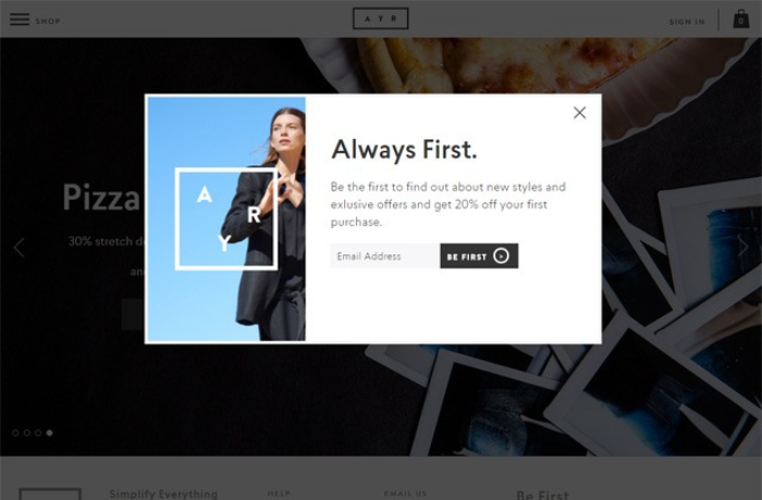
AYR should ideally have only one goal. The goal could be to inform visitors about a site-wide discount or to get them to subscribe to the site’s newsletter. You should only require essential information in a well-designed popup.
It’s not a good idea to overwhelm potential clients with form fields to fill out and boxes to check off because this could lead to inaction. EYR focuses on providing an incentive to entice users to take the required action, such as a discount on goods in exchange for signing up for the site’s newsletter.
Consider Top Best Magento 2 Newsletter Popup Extension To Expand Customer List.
Aweber
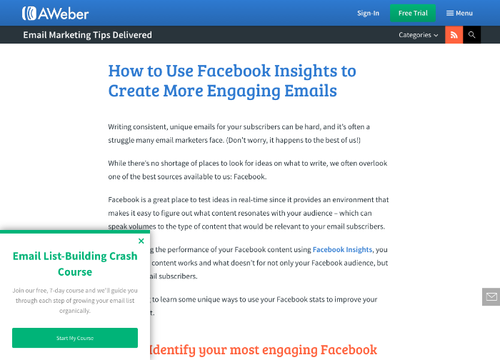
Aweber’s email experts and the sidebar popup are somewhat legend. They utilize it to promote their free 7-day email list crash course. It’s a clever approach for Aweber to catch a visitor’s eye while reading the blog and offer them their lucrative lead magnet. “Start My Course” is a concise, clear CTA that demands to be clicked.
Frank and Oak
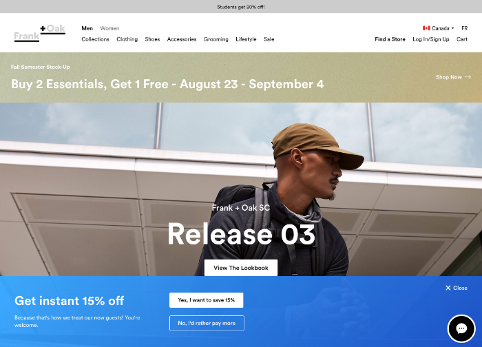
Frank and Oak, a menswear clothing behemoth, employs an entering footer popup to entice first-time customers with a 15% discount. This popup attracts attention with its eye-catching hue and lighthearted content. Frank and Oak employ their popup to provide value to their visitors before they begin their purchasing journey, improving the likelihood of a final sale.
Soggy Dogg
Don’t assume standard square popup windows don’t work. That is demonstrated by the internet store Soggy Doggy Doormat. A popup navigation window greets website visitors and directs them to the special offers landing page:
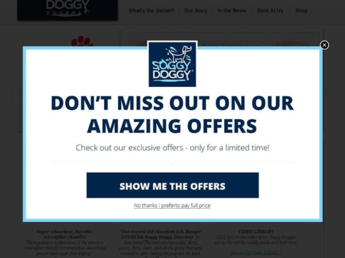
They entice users to do a simple action: visit a sale landing page, using two accents: headline and CTA button. They don’t need to explain the deal because this store only sells one type of merchandise. A simple CTA with no metaphors and a little FOMO effect between the lines is ideal for promoting a good bargain.
This type of Magento 2 popup modal is what I refer to as a “short path to a treasure.” Visitors don’t have to sift through a long list of discounted items if they choose “Show me the Offers.”
LEGO
What if your website accomplishes two or more equally essential purposes, each of which you wish to draw attention to? Follow the lead of LEGO, a toy company. In a navigation message that appears when you visit a website for the first time, you are offered to visit an e-store and a play zone:
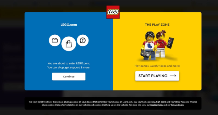
There will be no sales, simply beneficial information. CTAs are diverse, but they all have the same goal: to send people in the right direction.
Key Lesson: If your pop-up window has two components, align their CTA purposes with navigating, selling, or informing.
Convince&Convert
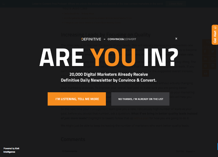
A stunning overlay-style scroll popup is used by one of the most significant web resources for conversion rate optimization material, which makes sense. “Are you in?” asks Convince&Convert to immediately grab attention and make visitors ponder. You may join 20,000 other digital marketers and receive their email if you’re a professional or aspiring digital marketer. Thanks to the offer and style, this is one of the more enticing popups we’ve seen around town.
Kate Spade
There are no-image subscription popups if you don’t want to focus on a specific category of products. They usually have a text and email capture field with a contrast CTA button on a solid color background. Just like Kate Spade’s website for bags, jewelry, and dresses.
Visitors to the main page will see this after a minute:
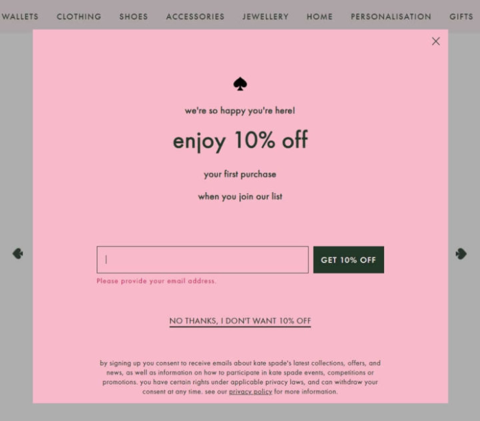
A fundamental strategy is to promote the first purchase discount in the header and lead capture form. The most exciting portion is a little down on the page. Play with the FOMO effect in the popup closing link’s anchor.
Key lesson: It’s different when you turn down a valuable chance. Even if you don’t need a product right now, you’ll consider twice to avoid future regret. A simple “I don’t want ____” or “I’d rather pay full price” expression does this. Make use of it.
Last but not least, there is a complete description of the newsletter content and a link to the privacy policy (GDPR in action).
Boost your email sign-ups and maximize conversions with a high-converting popup! Get the Magento 2 Newsletter Popup Extension to capture leads, offer irresistible discounts, and enhance user engagement effortlessly.
CoSchedule
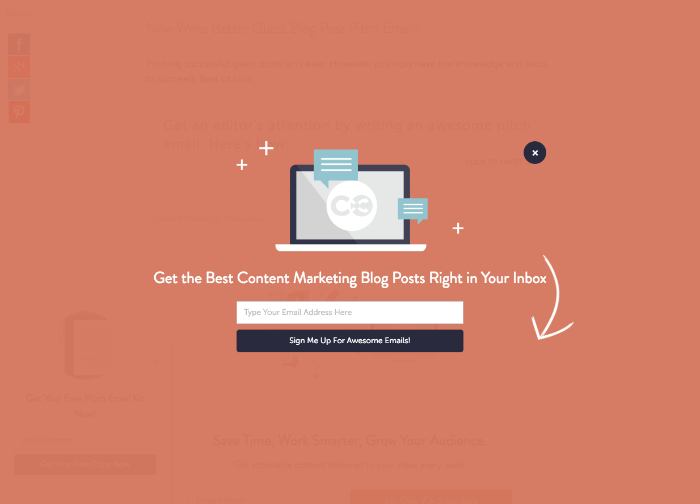
The content-scheduling geniuses at CoSchedule, who also run our favorite headline tester, employ a colorful landing pad to sign visitors up for the most outstanding new blog post alerts. Thanks to the clean and minimal design and directional cues, it’s challenging to resist signing up to receive greatness straight to your inbox.
Revolve
The discount heading, CTA, and Magento 2 popup modal close link in Revolve’s email popup message may appear the same. Those three abstracts have been seen previously. However, look beneath the email field. When a visitor may choose which information to subscribe to, this is a valuable feature:
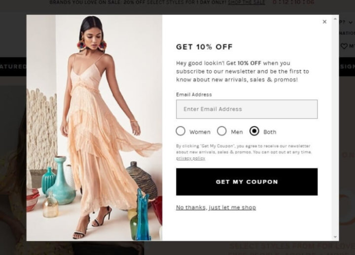
Simply pick the one that appeals to you the most. Email subscriber segmentation is a fantastic place to start when trying to engage a potential customer in a two-way discussion. The more relevant your offer is, and the better the customer experience you deliver, the more likely a subscriber will buy it first, followed by others.
Best Buy
Information is the 21st century’s gold. As a result, Best Buy’s online store allows visitors to be the first to hear about promotions and corporate news through email or text messages in two formats:
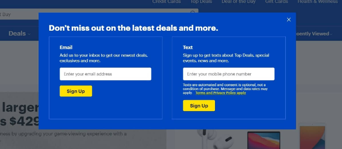
Key lesson: Don’t repeat the description if you’re offering two subscription alternatives. If you send the same information via both channels, note it in the popup modal’s description section. If you want to transmit specific content, use two descriptions.
Summary: Key Lessons
Magento 2 popup modals can prompt site visitors to do a specific action (such as signing up for your email newsletter) or communicate a critical message. A good popup modal will have the following takeaways:
- Focus on value above everything
- Location is crucial
- Relevancy goes a long way
- Test your messaging
- A clear and defined CTA works wonders
You can now see that you can do whatever your imagination can conjure up. Ideally, we suggest you with a Magento extension – Magento 2 Popup – to quickly generate all kinds of modals.
BSS Commerce is one of the leading Multi-platform eCommerce solutions and web development services providers worldwide. With experienced and certified developers, we commit to bringing high-quality products and services to optimize your business effectively.
CONTACT NOW to let us know your problems. We are willing to support you every time.
