PWA is the best of both worlds for e-commerce websites. It provides a helping hand in raising customer engagement and boosting sales scores. In case you are wondering how to make the most of this platform, take a look at the finest PWA examples below. We have collected and analyzed data to pick out the best ones in the PWA market in 2021.
But wait! Have you clearly understood what PWA is?
Table of Contents
Simply put, PWA is a website platform that is written in HTML, CSS, and JavaScript. PWA offers an app-like experience with instant page load time, rich features, and excellent visual design. A PWA site, according to our previous post Complete Guide to PWA for Beginners, must be:
- Reliable – Load instantly and never show the downasaur, even in uncertain network conditions.
- Fast – Respond quickly to user interactions with silky smooth animations and no janky scrolling.
- Engaging – Feel like a natural app on the device, with an immersive user experience.
You may not tell if a website is PWA just by the first impression. However, comparing a PWA page and a non-PWA page with the same content, you can see how the PWA version loads faster and feels smoother. Moreover, there are some tips to check a site for Progressive Web App: looking at its loading icon or “service worker” in the Google Inspecting tool.
GAIN KNOWLEDGE ABOUT PWA Features to explore how you can make this platform a powerful e-commerce weapon.
The best PWA examples and their success stories
The giants are emerging PWA and calling it the secret for their success in mobile websites.
Notably, many world-class brands choose PWA as a perfect solution to develop Lite versions of their apps. Lite apps have small app sizes, being stripped-down versions of the original apps. It becomes especially useful when you have data issues and memory limits. In this blog, we will show you popular names that are familiar with your daily life and their PWA versions.
Waste no time and have a gander at the best examples of PWA that would trigger your inspiration to build your own page now!
Uber
Source: hackernoon.com
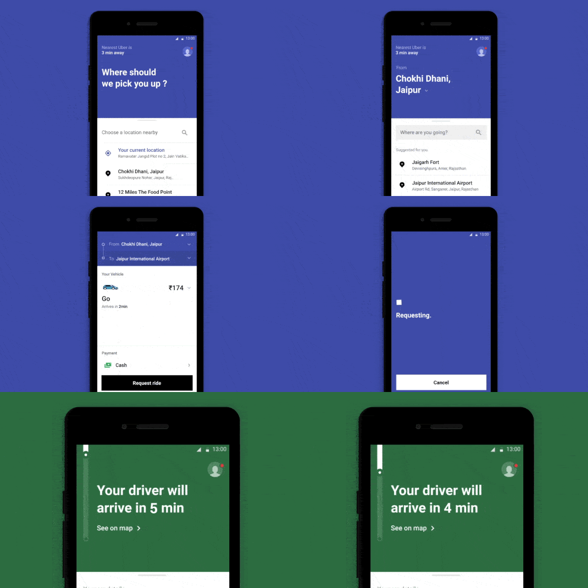
One of the must-know PWA examples is Uber. As the most well-known multinational ride-hailing platform in the world, Uber is reaching people from every culture and class. The company has realized the necessity of a user-friendly web app that is usable regardless of location, network connection, and device types. Sounds like a tough request? But PWA can handle them all!
With PWA offline and compatibility features, users can connect to Uber even when they are on the street, in a hurry, and have no time for the installation process. To ensure convenience, Uber makes sure to develop a lightweight web app with only 50kB core ride requests. This allows the app to keep its instant loading speed even on 2G networks.
Lancôme USA
Have you heard of Lancôme’s inspiring success story in building their mobile web app? This is considered the inspiring one in the PWA examples stories list. Back to 2016, their mobile conversion rate was too low compared to this on desktop – 15% vs 38%. It means that their customers were experiencing quite obstacles in their mobile shopping.
What was the Lancôme team’s solution to such matter? They came to PWA technology – an expert in improving user experience and engagement. The Service Workers system provides reliable performance even in poor network conditions and uses push notifications feature to improve re-engagement. However, the key to success is the brand’s attention-to-detail strategy. Take a look at one of their Progressive Web App examples site below:
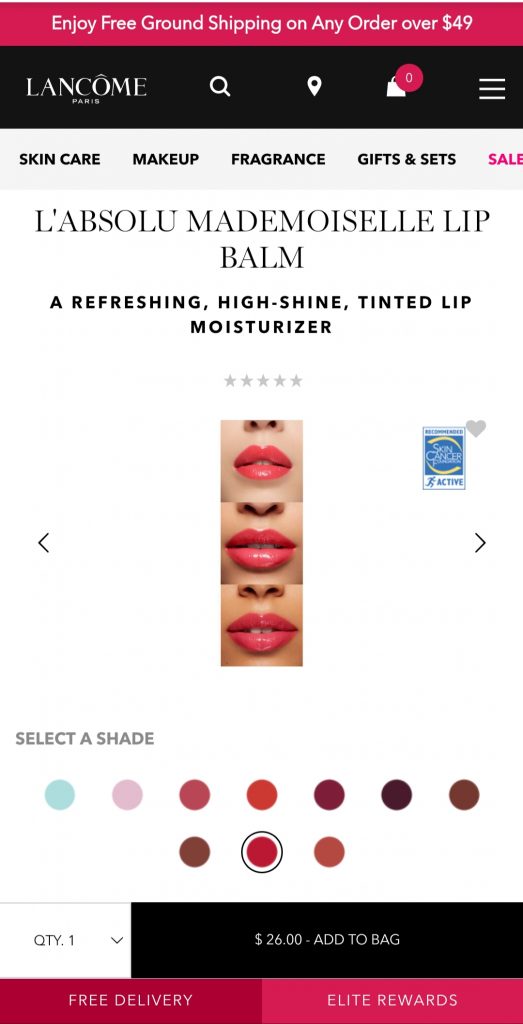
Even though you are on a require-low-data and no-installation website, you can still access every benefit to fulfill your shopping needs. From switching products’ types for comparison, adding products to cart, checking products’ quantity, and shipping method… all on one page! If this is not a rich customer experience, what else can it be?
You must be curious about Lancôme’s achievements to finish this success story. They achieved 17% growth in mobile conversion rates, 15% reduction in mobile bounce rates while reaching a 53% increase in iOS mobile sessions.
Source: medium.com
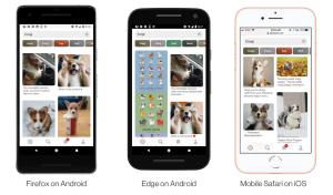
What were Pinterest’s challenges back to the years before 2017 – when they finally decided to implement PWA? Why is it picked in the best PWA examples selective list?
The thing is that Pinterest is all about creative ideas. This requires superb visual design and features so that users can enjoy the art without feeling overwhelmed. While native apps can fulfill this ambition, they can only convert 1% of sign-up and installation customers for the brand.
So how did the numbers change after Pinterest PWA version came out? The user engagement raised 60%, the brand ad revenue increased to 45%, and experienced 50% growth in click-through rate. Especially, the user submission reached 44% – such an improvement compared to the 1% results back then.
How did Pinterest receive this amazing raise in performance metrics? It’s because while the PWA site provides an app-like experience and features, it only requires 150kB of data storage and no installation. A quick comparison with 9.6M.B for native apps on Android and 56MB for native apps on iOS will answer your question.
Starbucks
Source: phpprogrammers.com.au
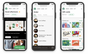
Facing the same challenge with Uber, Starbucks requires an app that is convenient for everyone to access. That includes the people who are constantly going in and out, those who are not always in stable network conditions, and many more. That’s why they switched to PWA. Starbucks and Uber are kinds of the same PWA examples in functionalities.
Offline connectivity is one of the most-exploited PWA features here. It allows users to browse the menu, customize and finish their order without a network connection. They only need to get online in the final steps of checking shipment price and confirming the order. Combined with the fact that the PWA version is 99.84% lighter than the iOS app, Starbucks reported gaining a 2x increase in their daily user interaction.
Twitter Lite
Source: lowgif.com
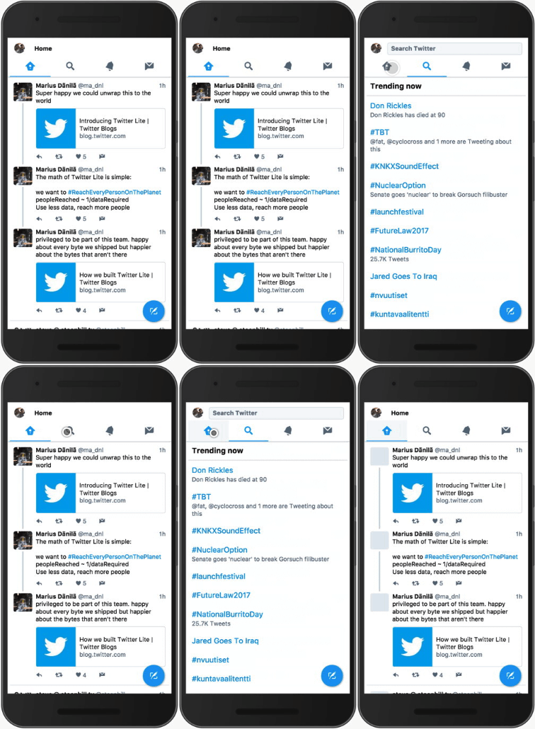
Twitter is a social media channel so its focus is on user interaction and engagement. Moreover, since 80% of their users were recorded to use mobile, Twitter came to PWA as a method to improve their user satisfaction. The PWA version officially launched in 2017 is called Twitter Lite.
Although the Twitter native app was quite successful, their PWA did even better. After the introduction of Twitter Lite, this company received a 65% increase with pages per session, 75% increase in Tweets sent via the Lite version. Not yet, its bounce rate decreased by 20% in the same period. This is a great Progressive Web App example in interaction rate.
Want to implement PWA now? Find our top 9 PWA providers here!
Forbes
Source: divante.com
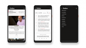
About Forbes. This is a global media company focusing on all-around matters: business, entrepreneurship, leadership, technology, lifestyle, etc. This means their target customers are diverse and not that everyone is willing to install an app, or always in strong network connection, and so on problems. This is when a solution such as PWA comes in – to fulfill a wide range of user types.
With ultra-fast speed and transitions, light design and push notifications function, Forbes succeeded in raising conversion rates and user engagement. To be more specific, there were 43% more sessions carried out per user and an increase of 20% in ad viewability.
Trivago
Source: medium.com
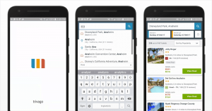
For Trivago, the question is how to provide an app requiring low configuration but still delivering the best services to users. Because this travel site’s purpose is to help users search and compare for different hotels, it needs to allow customers to filter their searches in price, rating, reviews, locations, etc. Thanks to PWA’s rich features carried out by Service Workers, Trivago achieved its goal of offering seamless interactions to its users.
Specifically, with the new PWA app, Trivago recorded an increase of 150% in engagement. In addition, the bookings converted through click-through rate grew to 97% (twice as much as this number in native apps).
Flipkart
Source:goodbarber.com
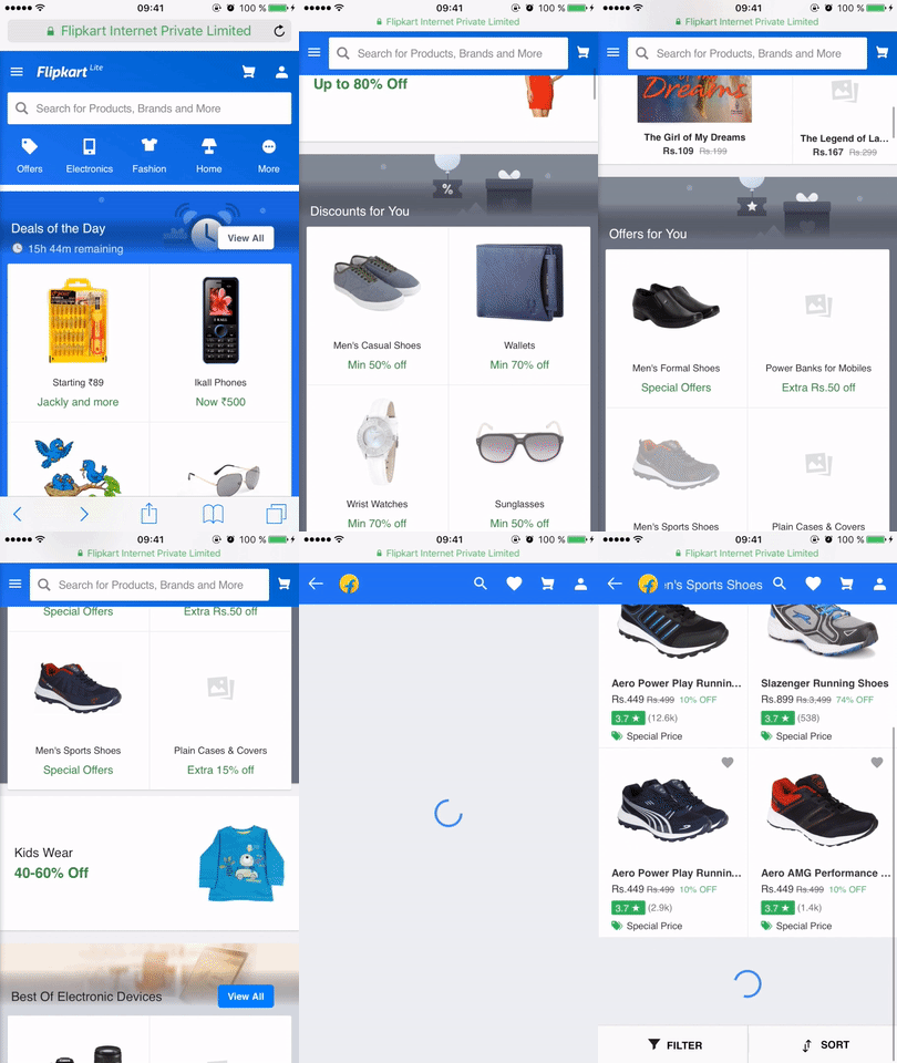
In the list of successful PWA examples, it’s a great omission if you don’t mention Flipkart. India’s largest e-commerce site faced trouble when 63% of the users connect to the website through the 2G network, there must be a light but powerful platform to provide them smooth experience.
That’s when the company came up with Flipkart Lite – the Progressive Web App version of this brand. With only 100kB of data storage requirement, this Lite version increased Flipkart’s conversion rate up to 70% and the re-engagement rate reached 40% in growth. Also, the company’s survey indicated that their users spent 3x more time on the PWA site compared to the traditional native app.
Spotify
Source: medium.com
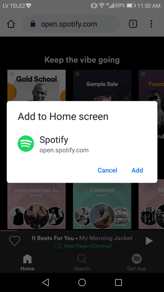
Spotify is a special case. The company came to PWA due to their disagreement with Apple regarding app store commission. This turns out to be a sound decision with the change in its background thanks to unique UI as well as significantly faster speed.
One vital feature is to add PWA to the home screen since Spotify provides offline music experience. With this faster and lighter PWA site, the company noted down a 30% increase in monthly active users. At the same time, its average listening hours per month grow 42% more and the number of desktop users experiences a rise of 42%.
Tinder Online
Source: rabitse.com
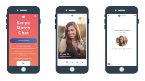
You must know about this popular dating app – also a popular PWA example. Users agree that they all love to chit-chat through their phones, but not on a website. And they also agree that not everyone is engaged enough to install a native app. That’s why Tinder decided to catch up with the PWA trend immediately by offering Tinder Online.
With this new PWA platform, the app shortens its downloading time from 11.91 to 4.69 seconds. Also, the new app is 90% lighter than the previous native Android version. Strikingly, it only took the team 3+ months to develop the PWA platform and received 10% data investment cost in react.
Wanna achieve successful like these brands? Take a look at Magento PWA Development to connect with our experts and make the dream come true!
Some PWA tips to fully activate the power of your site
Yes, PWA brings you great improvements in many aspects. However, not every company coming to PWA will become a successful Progressive Web App example. Here, we’ll pinpoint some specific actions you must ensure in order to earn the best results.
Create an attractive home screen logo
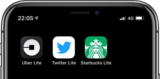
One of the highest-engagement-raise PWA features is “Add to home screen”. This means your PWA page will always be present in users’ home screens, but it also faces the risk of being indifferent and forgetful. Therefore, your task is to create a standout and unique icon so that your users can be immediately attracted to the PWA site.
Below are three PWA apps examples that will help you see the significance of an attractive logo.
Source: idownloadblog.com
When I showed this picture to my coworkers, all of them agreed that they were drawn to Twitter and Starbucks’ logos first. Uber’s logo seems to be dull and boring. However, since Uber is an extremely useful app, it still receives a high daily use rate.
Retain the exact scroll position of the list
This feature aims to build the best user experience. It happens when a user is checking out the list of articles/ products on your web page. When he returns to the list to check for another item, he’d want to be redirected to the exact position they were at, not the top of the list. This can be annoying especially when you have a long list of products.
Test your PWA with Lighthouse
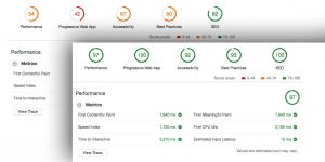
Lighthouse is an open-source tool introduced by Google. This performance management tool can run as either a Chrome extension or a Node module. Lighthouse allows you to audit any web page and get a detailed report. Moreover, you’ll receive a reference doc analyzing issues and suggesting solutions on how to fix the failing ones.
Source: wetopi.com
Wrapped up
With the rapid development of PWA, there are more and more brands are switching to PWA. Besides these above mentioned PWA examples, you can look for other PWA web pages with the same business to see how they are running their sites. The core features to be focused on of each business can be different. It’s necessary to understand your purpose and target customers to succeed in any strategy.
GRAB THE LATEST Magento 2 PWA Theme for a perfect method to transform your store to PWA.
BSS Commerce is one of the leading Magento extension providers and web development services in the world. With experienced and certified Magento developers, we commit to bringing high-quality products and services to optimize your business effectively.
CONTACT NOW to let us know your problems. We are willing to support you every time.
