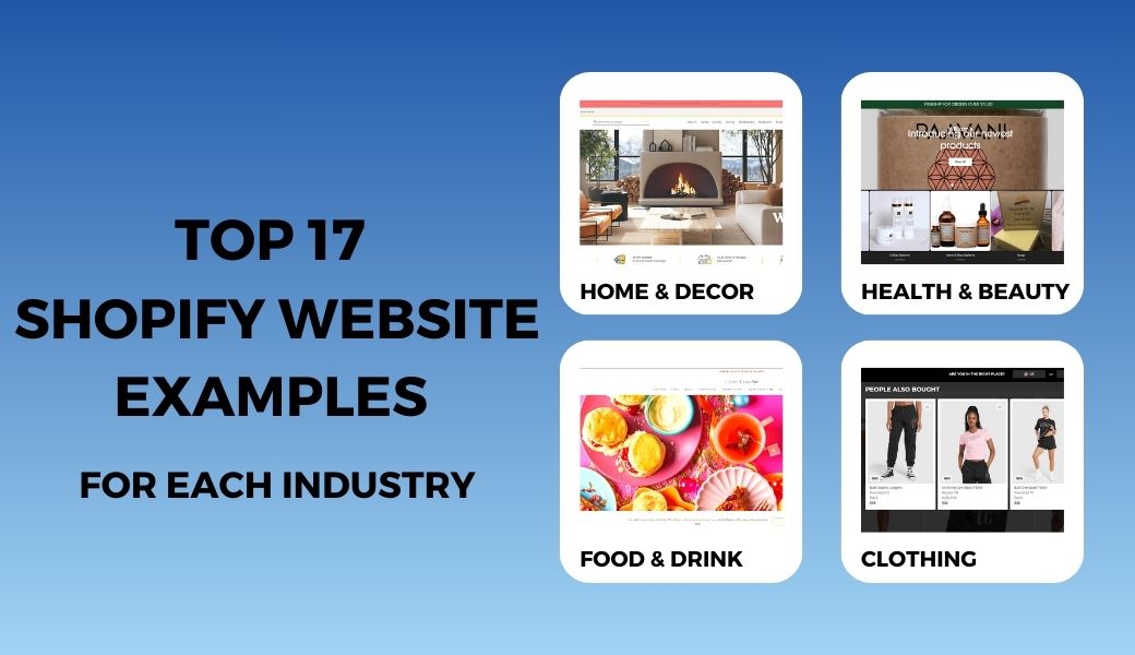
Have you ever researched a website and wondered how good its UI/UX is? How can they come up with a reasonable layout for your store? Instead of testing multiple times, we come up with suitable ideas for each industry. Below are the top 17 best Shopify website examples you can learn a lot from. Not only beauty but also many other factors make these stores successful and have the highest conversion rates.
Let’s dive into the top outstanding examples of successful Shopify stores in the world!
| No. | Website | Store Industry |
| 1. | Gym Shark | Activewear |
| 2. | Stella Allura | Clothing |
| 3. | Fashion Nova | Clothing |
| 4. | William’s | Skincare products |
| 5. | Morphe | Makeup products |
| 6. | Fenty Beauty | Makeup products |
| 7. | Heinz | Food & Drink |
| 8. | Have Beer | Food & Drink |
| 9. | Cutter & Squidge | Food & Drink |
| 10. | Clixento | Home & Decor |
| 11. | McGee & Co. | Home & Decor |
| 12. | Poly & Bark | Home & Decor |
| 13. | Ella and Eli Baby Store | Baby & Kid |
| 14. | Naturel Baby Shower | Baby & Kid |
| 15. | Huxbaby | Baby & Kid |
| 16. | UPstand | Home & Decor (One product) |
| 17. | Bokksu | Food & Drink (One product) |
Contents
Best Shopify Website Examples for Clothing Store
Gym Shark

Gym Shark is one of the standout Shopify store examples that you can see in every article about the Shopify website. Why? Take a look at their website; you can easily find the answer. They’ve got a clear layout and good navigation.
As an active clothing store, their store is not flashy but includes all the necessary features and content:
- Quick buy
- Mega menu
- Promotion banner
- Estimated shipping rate
- Layered Navigation
- Gift box/ gift card
- Product Carousel
- Cart Drawer
- Social media integration
What to learn from:
- Use a mega menu if you have multiple categories to organize your store into categories and subcategories, making it easy for visitors to navigate in just a few clicks.
- Quick buy feature to help customers make purchases more conveniently, speeding up the purchasing process
- Encourage customers to buy more with free shipping and estimate how much it takes for customers to reach this incentive.

Stella Allura

Stella Allura brings an elegant vibe with visual telling and conversion-boosting design. As an eCommerce business owner, you must know the importance of a home page where you have the opportunity to showcase your products, build trust, and persuade visitors to make a purchase. Built with Eurus Theme, this Shopify example website is full of features that will attract visitors with the first look.
Some highlights of Stella Allura’s storefront:
- Exclusive deal popup
- Quick view
- Estimated shipping time
- Featured Product
- Attractive slideshow
- Scrolling promotion banner
- Collection list
- Announcement bar
What to learn from:
- Attractive Slideshow & Announcement bar: They have a powerful and engaging carousel display about their products or brand story that captures visitors’ interest and curiosity.

- Exclusive deal popup right when visitors come to the website, making it personalized and urging visitors to take action.
- Featured Product: Show Featured products on the homepage to catch customers’ attention and drive even more sales.

- Strong Call To Action and Slogan: Stella Allura uses the Rich Text feature to customize your message to impress customers.
- Estimated shipping time: Show estimated shipping time on the Product Page, Mini Cart, and Cart Page. Improve customer satisfaction and loyalty by providing transparent and accurate information

- Quick view: Allow customers to view products from the homepage, making navigation easier.
Read more: Top 10+ Best Shopify T-shirt Store Examples For Online Store
Fashion Nova
Fashion Nova is one of the world’s biggest quick-to-market apparel and lifestyle brands. They’re famous for delivering the season’s hottest styles to millions of people worldwide, earning them the title of the #1 Most-Searched Fashion Brand on Google in 2018.
As one of the most successful Shopify website examples, Fashion Nova has multiple highlights on the storefront:
- Attractive promotion banner
- High-quality images
- Clear Call-to-Action (CTA)
- Testimonials & Social Proof
- Shop similar
- Use of Video
What to learn from:
- Discount popups show incentives to customers when they visit the website. Also, get customer email for the next promotion.

- Announcement bar with countdown timer: Urge visitors to take action and finish their purchases.

- Clear Call-to-Action (CTA): Each banner has its own CTA prominently displayed in a white color that stands out from the rest of the page. It communicates the action that visitors should take next.
- Social proof per product: Fashion Nova uses social proof in the form of customer reviews. The reviews are prominently displayed on the page, and they help build credibility and trust with visitors.

- Shop similar: Allow customers to search with images and show the most similar product to the style

Discover Top 11 most inspirational Shopify clothing stores examples
Top Shopify Website Examples for Health & Beauty
William’s

One of the sample Shopify websites is built with Eurus Theme (Breath preset), William’s is a new skincare product brand. The layout of this website is typical for stores with small to medium sizes. William’s has 4 collections and 50+ products designed for visual storytelling.
Some highlights of Stella Allura’s storefront:
- Featured product
- Product Carousel
- Clear product features & benefits
- Light/dark mode
What to learn from:
- Clean & minimal design: The first thing you’ll notice about William’s is its clean and minimalist design. The page features a simple and easy-to-navigate layout that lets visitors find what they’re looking for quickly.
- Clear product features & benefits: Users are very interested in the origin and ingredients of skin care products, that’s why William’s has provided full features and benefits of the product to emphasize natural origin that is good for the skin, building trust in consumers.

- Product Carousel: This allows visitors to browse through different products and collections easily.

- Dark mode: Dark mode makes shopping more comfortable, hence providing a positive experience for a higher purchasing rate.
Morphe

Morphe is a mid-range cosmetics brand from Los Angeles. Launched in 2008, this brand is trusted and used by many makeup artists. That’s why Morphe’s website focuses on showing products in the most specific way but still needs a neat layout.
Like most Shopify web examples for health & beauty, Morphe has a minimal layout. They use high-quality images and videos to showcase the products most realistically. The images are sleek and minimalist, which aligns with the brand’s overall aesthetic.
Some highlights of Morphe’s storefront:
- Appealing hero banner
- Shop by the look
- Standout CTA
- Social proof
What to learn from:
- Appealing hero banner: The first thing that attracts customers when visiting Morphe’s website is colorful hero images and standout CTA.
- Shop by look: Morphe uses KOL & KOC on Instagram to build social proof, which makes product benefits more realistic.

Fenty Beauty

Fenty is Rihanna’s beauty brand, so it’s not strange that the brand image is invested very carefully. Fenty uses high-quality images to showcase its products. The images are colorful and vibrant, which help visitors visualize how the product will look when used on all skin tones from dark to light and each face shape.
Some highlights of Fenty’s storefront:
- Hero video
- Product labels
- Discount popup
- Product-oriented menu
- Product ingredients & benefits
- Social proofs with video
What to learn from:
- High-quality images: bring a high-end brand feeling, customers can also easily see the product color.
- Use of video: Fenta uses a video to showcase the benefits and features of its products.
- Transparent details: Provide ingredients, benefits, and how-to-use information on the product page.
- Beautiful menu layout: Feature the hottest or targeted product in the mega menu to easily navigate customers.

- Social proof: Product images on websites are often affected by lighting, resulting in colors that are not exactly the same in real life. However, Fenty has added real user images to build trust and credibility with potential customers.
Top Shopify Web Examples for Food & Drink
Heinz
https://www.heinz.co.uk/

Heinz is one of the oldest and most famous brands for its ketchup product line. With its characteristic red color, the Heinz website, although simple, still makes customers remember its brand from the first time. Instead of focusing on the product, Heinz brings the story behind it and leads viewers into the world of content.
Some highlights of Fenty’s storefront:
- Storytelling
- Smart dropdown button
- Slider
- Recipes that use Heinz product
What to learn from:
- Storytelling: Instead of only showing product features or ingredients, put the story into your product, especially for food & drink stores. For example, now that users are more interested in healthy food, add nutritional values and product manufacturing methods to build customer trust.
- Recipes that use your product: Diversify your product uses. Here, Heinz offers many recipes that use ketchup as an ingredient instead of dipping as usual.
- Headline and Subheadline: The headline and subheadline of the Heinz website are attention-grabbing and clearly state what the brand is all about.
Have Beer

Have Beer is a unique craft beer subscription service. Have Beer will design a personalized label for customers, so they have a “Click here to create a label” button on the product page. After clicking it, a popup will appear and allow customers to make their labels.
Have Beer’s business model is quite special, so their website also has many highlights, such as:
- Popup verify age
- Appealing slideshow
- Image With Text
- Outstanding CTA
- Popup to create labels
What to learn from:
- Popup verify age: If you sell products to adults, a popup to verify the visitor’s age is necessary as soon as they arrive on your website.
- Image With Text: Using a 2-column layout for images and text will help you visualize the content you write
- Built with Eurus Theme (Breeze preset): You can have a per-page popup, announcement bar, an image with text, etc. without pricey apps. Buy 1 get 20+ app functions.
Cutter & Squidge

Different from 2 Shopify ecommerce website examples above, the Cutter and Squidge website has a colorful vibe and more information on the home page.
- Collage
- Discount popup when you click on the product page
- Product details
- Product Carousel
- Attractive CTA
- High-quality images
What to learn from:
- Colors mixed in design: Using colorful but still harmonious does not create an uncomfortable feeling for the viewers. Attractive hero image with highlight orange CTA button
- Collage: To help diversely showcase your products or tell your brand story
- Product Carousel: Show the hottest items of your store or new products, discount products based on your campaign
Sample Shopify Websites for Home & Decor
Clixento

Clixento is a new brand but has quickly become a trusted name in the home decor industry. Because they specialize in unique home decor items, their layout website also seems dark and magical to highlight their product the most.
Dark mode is no longer strange to us and more and more store owners prefer to use dark backgrounds to make products stand out, especially with products that have outstanding colors or need a luxurious look.
- Dark & luxurious layout
- Featured collection
- Top picks of each collection
- The button is rounded and has a beautiful arrow effect
- Slideshow
- Sticky add-to-cart
- Estimated shipping time
- Cart drawer
- Lookbook/Image Gallery
What to learn from:
- Shopify example website for dark mode: Dark mode makes shopping more comfortable, hence providing a positive experience for a higher purchasing rate. Using Eurus Theme you can easily switch between DARK/LIGHT mode
- Top picks of each collection: Navigate customers right on the homepage with the hottest products filtered by each collection

- Cart drawer: Improve UI/UX by letting customers know what products have they added to their cart without moving to another page. Create a smooth purchasing process, with minimal transitions and front page reloads

- Sticky add-to-cart: Help users add products to the cart more easily on the product page even if they’ve scrolled through the end of the page.

- Lookbook/Image Gallery: Showing detailed photos of the product or its uses is one of the fastest ways to motivate customers to buy decorative items

>>> Ideally, Clixento is using Eurus Theme (Breath preset) to build their store. So, if you also want all these features and layouts, the Eurus theme is a perfect choice!
McGee & Co.

McGee & Co is one of the best Shopify store examples regarding interior brands. McGee & Co offers high-end products and has quite high prices, so the general vibe of the website also brings a luxurious and elegant look, suitable for high-end product lines.
Some highlights of McGee & Co’s storefront:
- Promotion grid
- Image Gallery
- Estimated delivery time
- High-quality images
- Cart drawer
- Product labels
- Reward program
- Gift Registry
What to learn from:
- Reward program: The easiest way to nurture loyal customers and create strong customer relationships.
- Gift Registry: This program is especially suitable for interior brands because the wishlist for weddings, showers, and more will often be expensive items. If you don’t have any need to buy it yet, you can still save it and buy it when needed.
- Promotion banner: The banner will help display all the attractive deals with appealing labels. Customers will have to pay attention to your special promo.
Poly & Bark

Another high-end furniture brand but the website is more colorful. Even though red, yellow, and many other colors are interwoven on the website, it still gives an overall luxurious feeling. The images on the website tend to be cozy and brown. If you want to bring a similar feeling, you can refer to this color scheme.
Some highlights of Poly & Bark’s storefront:
- Banner grid
- Customer reviews
- Promotion banner
- Standout CTA
- Social integration
- Featured products
- Estimated delivery date
- Free swatches
- Recently Viewed Products
What to learn from:
- Recently Viewed Products: Remind your customers of the products they have browsed on your site and encourage them to revisit or purchase them.
- Promotion banner with standout CTA: High-quality images with attractive text & standout CTA will catch the attention.
- Banner grid: This will help display attractive collections or top picks with an appealing CTA, helping customers easily find your key products or new product categories.
- Social integration: Show how to arrange furniture and ideas to decorate the room, helping your products become more vivid in the eyes of customers.
Best Shopify Website Examples for Baby & Kids
Ella And Eli Baby Store

E&E positions itself as a store that sells baby goods at the lowest prices. Therefore, the sections about promotions and discounts are very important. If you also have the same unique selling point of low price, check out E&E’s way of highlighting this strength.
Some highlights of E&E’s storefront:
- Countdown timer
- Featured collection
- Slideshow
- Scrolling promotion banner
- Estimated delivery date
- Sticky add-to-cart
- Quick buy
- Product labels
What to learn from:
- Countdown timer: Never underestimate the impact of urgency in e-commerce. Sensibly push your customers to add to cart and finish their purchases.
- Sticky add-to-cart: Never underestimate the impact of urgency in e-commerce. Sensibly push your customers to add to cart and finish their purchases.
- Estimated delivery date: Transparent information will lead higher conversion rate.
- Product labels: Display your product with appealing labels, and let them know that these are discount products, best-sellers, or new ones.
E&E store are built by Eurus Theme with Swirl preset. All these features are included in Eurus theme without extra fee!
Natural Baby Shower
https://www.naturalbabyshower.co.uk/

One of the standout Shopify web examples for baby & kids stores is Natural Baby Shower, not fussy or colorful, the store has gentle and warm colors. In particular, the website is not only purely for sales but also has a blog section to provide more knowledge for parents.
Some highlights of Natural Baby Shower’s storefront:
- Blog
- Slideshows
- Collection for popular brands
- Customer reviews
- Reward program
- Buy now, pay later
- Affiliate Program
- Recently viewed product
- Benefit video
What to learn from:
- Use of video: Natural Baby Shower uses a video on its product page to showcase the benefits and features of its product. The video is high-quality and engaging and helps to build trust and credibility with potential customers.
- Affiliate Program: Not only will you retain customers with points every time you successfully refer a friend, but this program will help your store reach a wider audience without spending money on KOL or KOC. Know that customers become free influencers for you.
- Blog: Blog posts will help you gain organic traffic faster and easier. This is also a way to reach prospects and lead them to your product pages.
- Collection for popular brands: Particularly for baby products, the brand is very important, customers can only buy famous brands and be loyal to them. Therefore, if you are not a manufacturing business, filtering products by brand is a smart way to navigate customers.
Huxbaby
https://huxbaby.com/en-us

After consulting sample Shopify websites with light colors, Huxbaby is a typical example of a special layout and eye-catching colors for a baby & kids store. Huxbaby is a family-run business that creates high-quality, minimalist children’s clothing with an adult level of style.
- Collage
- Mega menu
- Smart filter
- Testimonials
- Drop-down button on the product page to show details
What to learn from:
- Drop-down button on the product page to show details: If you list all the product details, your product page will certainly be very long, but when using a drop-down button, the information only appears when customers click on it, which will help your product page look neater and clearer.
- Smart filter: Allows customers to filter by many factors. For example, Huxbaby allows filtering by size, style, gender, and sort, helping customers find desired products more easily.
- Unique collage: To help diversely showcase your products or tell your brand story. And the arrangement is up to you.
Shopify Website Examples for One Product
UPstand
https://up-stand.pro/

Shopify is definitely a paradise for stores that sell a single product, so many people are finding one product Shopify store example. Only selling one decor product, but the unique and luxurious website design is UPstand’s strong point.
To better match the product image, Eurus Theme’s dark mode is the perfect choice to help the website become more unique and beautiful. At the same time, dark mode is also very suitable for the product’s nature: unique and quality.
Some highlights of UPstand’s storefront:
- Dark mode built by Eurus Theme
- Slideshow
- Color swatches
- Sticky add-to-cart
- Announcement bar
- Discount popup
- Upsell & Cross-sell
- Cart drawer
- Gallery
What to learn from:
- Gallery: Nothing is more helpful than a gallery to showcase as many variables as possible. You can also add a CTA button to raise the chance to get more orders.
- Upsell & Cross-sell: Display personalized recommendations based on the products in the customer’s cart, increasing the chances of cross-selling and boosting your revenue.
- Dark mode built by Eurus Theme: You can switch between DARK/LIGHT mode manually or automatically with Eurus.
Bokksu
https://www.bokksu.com/

Bokksu sells a Japanese snack subscription box. A unique thing about this one product Shopify store example is that they don’t have a product page, they allow customers to choose and add-to-cart subscription plans right on the homepage. Therefore, their homepage is not only simple to navigate but also shows sales information as well as comparing their products with competitors.
Some highlights of Bokksu’s storefront:
- Only have one page
- Comparison Table
- Testimonials
- Subscription model
- Stunning photography of delicious-looking snack
- Discover varieties monthly
What to learn from:
- Use of the founder’s story and image: Bokksu clearly shows the image of the person behind selecting and packing the snacks for my subscription box, in addition to the story of why having these boxes makes their products more meaningful and connected to visitors.

- Comparison Table: Proactively compare your products with other vendors, highlight your strengths, and help customers make choices easier and faster.

- Discover varieties monthly: This section effectively tells about the different varieties you’ll get each month
- Color synchronization: The overall uniform color of the website shows Bokksu’s investment in images, creating a feeling of prestige and trust for customers.
Conclusion
Above are Shopify website examples that we have refined and summarized. Each example will have a different color and feel, so you will also have more choices for your brand. The important thing is that each brand needs its own brand identity to make customers remember. The example sections are just suggestions for you to have more creative ideas for your website.
Take note that mobile optimization, clear messaging, easy navigation, and social proof, as well as utilizing are key elements to creating a strong online presence and helping your business grow.