The default Magento 2 checkout page is good but not enough. That’s why you tend to customize the checkout page in Magento 2. It’s not easy, especially when you lack ideas and experience.
A superb checkout page design is required to gain traction with an online store. It’s not always apparent at first what qualities are most important. Hence, we help you summarize the top 10 best checkout module implementation examples below. This list can be model for you to learn from.
Let’s get started!
Common Checkout Module Implementation In Magento 2
Table of Contents
In the e-commerce world these days, people care a lot about checkout abandon which leads to lost conversion. According to a collection of 41 research, 70% of checkouts are abandoned on average.
Because the checkout page is where conversions happen, you need to make sure the process is as simple as possible for your visitors. Consequently, you should frequently review your checkout page procedure to increase conversions.
Don’t forget to check out 5 Tips To Minimize Bounce Rate In Magento Customize Checkout Page.
You should choose the appropriate checkout module implementation depending on your business size & field, customer behaviors, and needs. There are two common ways to customize checkout page Magento 2, including:
One-page checkout
Magento One Page checkout has grown in popularity as it streamlines the checkout process and makes it more convenient for customers. Clients don’t have to wait long for pages to load, so this form of eCommerce checkout page design improves the user experience. Users also don’t have to go back into the browser to change their entered data.
Designing a one-page checkout is challenging to acquire a considerable amount of data. Furthermore, the buyer may become overwhelmed by the amount of data they must enter and the disorganized page structure.
Multi-page checkout
Although it appears to be less user-friendly, multi-page checkout has several advantages. This style of checkout page layout makes data collection easier. You still have the data entered earlier if a customer abandons the checkout process at a later point. Because the forms and fields are spread across multiple pages, creating clean and simple page layouts is easier.
Read more Compare Magento 2 Single Page Checkout Vs. Multi Page Checkout to know more about the difference between them.
In addition to module implementation, you also need to consider the design. In the preceding quarter, one out of every five shoppers abandoned a basket, according to Baymard data. This was due to the checkout procedure being either highly long or complicated. While abandonment of the checkout page is unavoidable, you can at least reduce the number of people who abandon the checkout process.
Basically, you don’t want to provide a reason for the customer to depart. It’s best to have a fantastic layout, reveal shipping costs, offer payment options, and use suitable CTAs. Everything you customize checkout page Magento 2 should help you accomplish the process in less time and effort.
Customize Checkout Page In Magento 2: 10 Best Examples
Nike – Allow guest checkout
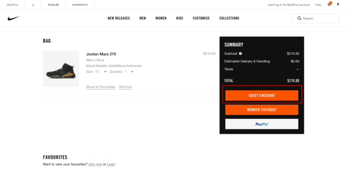
Customers should never be forced to create an account or register before completing a transaction. Customers are inconvenienced by the additional step (or stages), which slows them down and prompts them to ponder whether they want to proceed. Thus, Nike offers guest checkout choices so that clients are not inconvenienced and may proceed with simply their email address.
Although Nike customizes checkout page Magento 2 to a three-step process, its design is minimal. There is excellent navigation that includes error notifications for invalid information.
Moreover, Nike provides payment methods, which is a great strategy to increase conversions as it allows customers to choose their preferred mode.
Read more:
- How To Set Up Magento 2 Payment Methods? (Part 1)
- How To Set Up Payment Methods In Magento 2 (Part 2)
Pros:
- Throughout checkout, the order summary is prominently shown.
- All other charges (shipping, taxes, etc.) are included.
- Checkout is self-contained with little distractions (removed header buttons)
- Besides, The live chat option allows you to communicate with customer service right now.
- Guest checkout is available.
Cons:
- There are no trust symbols, seals, or badges on show.
- It has no exit-intent popups.
- There are no customer reviews available.
Walmart – One-page checkout
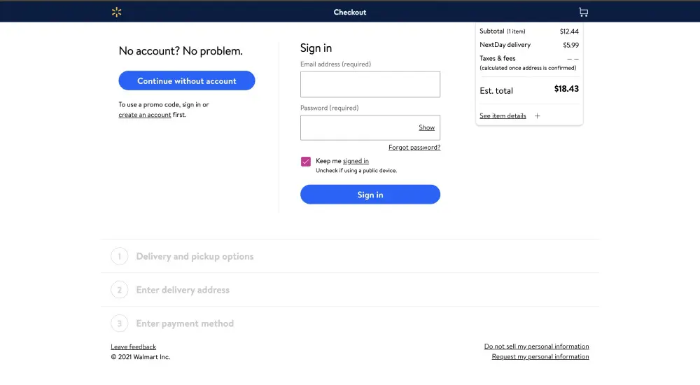
Like Nike, Walmart allows customers to checkout without registration or logging in. Users don’t have to fill out a single long-form because this eCommerce store has broken the one-page checkout into three components. It also alerts the customer if they enter incorrect information.
Pros:
- One-page checkout
- They remove almost distractions from checkout process (removed header buttons)
- Guest checkout is available.
- Alert the customer if they enter incorrect information.
Cons:
- It has no trust symbols, seals, or badges on show.
- Not have exit-intent popups.
- There are no customer reviews available.
Best Buy – Multiple-page checkout
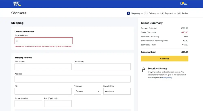
As we said above, there is no right or wrong when choosing a checkout module. If Walmart uses a one-page checkout, Best Buy is an eCommerce store with a multiple-page checkout. Moreover, this online store has a good design that allows non-login checkout, and it employs a progress indicator to show the shopper where they are in the checkout process. Users can also use the progress indicator to move between checkout steps.
Pros:
- Multiple-page checkout
- Guest checkout is available.
- Throughout checkout, the order summary is prominently shown.
- In addition, all other charges (shipping, taxes, etc.) are included.
Cons:
- There are no trust symbols, seals, or badges on show.
- There are no exit-intent popups.
- Lastly, do not have customer reviews or testimonials.
Asos – Display trust signals and badges
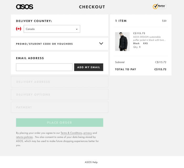
Asos has a simple, clean design that is easy to navigate. They customize checkout page Magento 2 with many best practices, but one critical flaw stands out: they make visitor checkout difficult rather than simple.
They direct you to an “already registered” website that serves as a login page. To check out as a guest, you must first click “New to Asos?” and then “Continue to Checkout,” which adds extra steps and makes it difficult to find. While Asos saves cart items, it does not automatically add them to your bag when you return to the checkout, instead proposing that you add things from your cart to your bag.
Pros:
- During checkout, a security signal is flashed.
- The order summary is readily visible.
- Separated checkout with no distractions (no header or footer)
- Besides, checkout in accordion style is simple and guided.
Cons:
- Attempts to force account creation; you must hit continue to progress to guest checkout, which may drive some customers to abandon
- Furthermore, promo codes made a prominent aspect of checkout; this may cause some customers to abandon checkout to look for a discount code.
Crate&Barrel – Connect to live chat with the click of a button
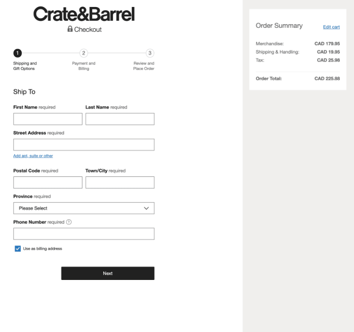
Crate&Barrel customizes checkout page Magento 2 with various best practices, including presenting the order summary, identifying the number of goods in the basket, product details, providing delivery method information, and connecting customers to help via live chat.
However, they miss the point on certain frequent pitfalls, such as overcrowding the checkout, cross-selling in a way that may encourage users to abandon the checkout, and leaving a header with a full menu.
Pros:
- The order information is readily displayed.
- Customers can effortlessly remove products from their shopping basket using interaction choices at checkout.
- Save the contents of your checkout for later
- With a single click, you can also access live chat.
- All customers are eligible for a discount.
Cons:
- Customers may be distracted by distractions such as the header menu and upsell.
- There are no trust seals or badges on show.
- Changing the shipment method is difficult.
Bonobos – Use data validation and input error notification
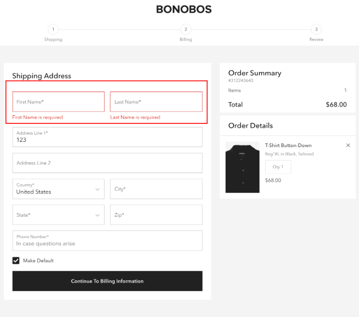
To eliminate errors during checkout and obtain more accurate customer information, including data validation and notifications for input errors in the checkout process. Following that, this function guarantees that clients submit data correctly, giving you verified information. It helps and streamlines the data entry process for the customer.
Pros:
- Use data validation and input error notification
- The order summary is readily visible.
- Separated checkout with no distractions (no header or footer)
- Finally, checkout in accordion style is simple and guided.
Cons:
- There are no trust seals or badges on show.
Nordstrom – Avoid surprise customers with additional costs
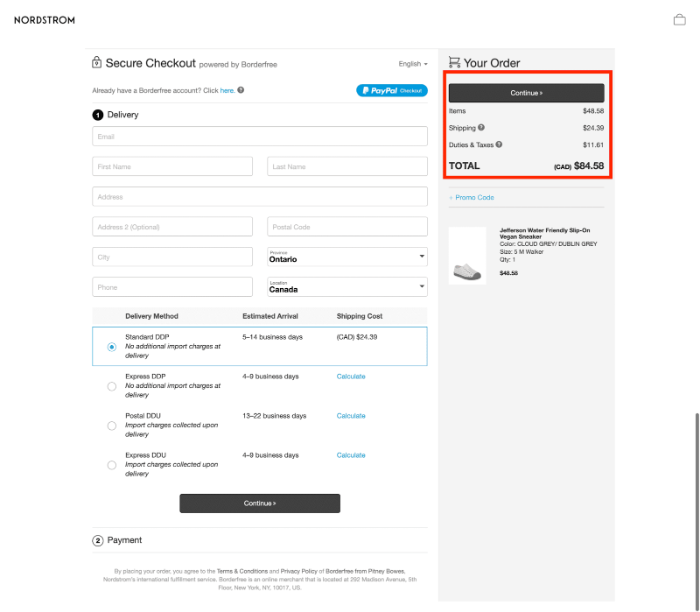
Customers will second-guess the worth of the purchase and whether they want to proceed if unexpected fees are added at the time of sale. To customize checkout page Magento 2, you should provide as much information as possible, including shipping fees, taxes, and any additional expenditures, so customers are informed of the entire cost before checkout.
Pros:
- Checkout in a quiet, enclosed area with few distractions (no header menu)
- There are trust seals or badges on show.
- The total cost, including any additional fees and shipping, is displayed clearly.
Cons:
- The customer must create an account to check out.
Bellroy – Best-designed checkout page
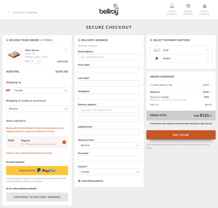
Bellroy’s checkout is likely one of the best-designed, consisting of a single page with many processes to guide the user. There are no surprises at the end because the information is displayed upfront. To guarantee that customers provide accurate personal data, they have form validation and error messages.
Pros:
- The order summary is prominently shown.
- Additional fees (taxes, shipping, etc.) were incurred.
- Checkout area with few distractions (header removed)
- Guest checkout is possible.
- Validation of the form and error notification
Cons:
- During the checkout process, theydon’t display trust signals, seals, or badges.
- There are no exit-intent popups.
- In the checkout, there are no customer reviews.
Threadless – Accordion-style checkout
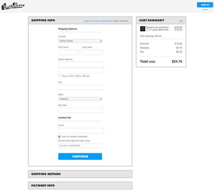
Unlike other customize checkout page Magento 2, which are so large that they take up more than the user’s screen, requiring them to scroll, Threadless’ checkout is compressed, allowing you to see everything correctly. Their accordion-style checkout walks consumers through the process, breaking it down into steps.
Pros:
- The order summary is visible during the checkout process.
- They show the total cost, including taxes and shipping.
- Login and sign-up choices are simple to use but not overbearing for visitors.
- The process is guided by accordion-style checkout.
Cons:
- There are no trust signs displayed.
- There are no consumer testimonies or reviews.
Easily customize checkout page Magento 2 with Magento 2 Checkout Custom Field. TRY THE DEMO SITE FOR FREE!
Conclusion – Should You Customize Checkout Page Magento 2?
To customize checkout page Magento 2, you should test several ideas to know what your customers desire. Moreover, creating a smooth and frictionless checkout experience will help you achieve a high conversion rate.
One-page and two-page checkouts are the two sorts of checkout designs, each with benefits and drawbacks. One-page checkout speeds up the process, but keeping the page layout clean and uncluttered is difficult. In contrast, a multi-page checkout makes the process appear longer, but building a more hygienic design is more accessible.
To save time and effort, we discussed some checkout page examples above. Check out and choose the best strategies to increase your business sales.
BSS Commerce is one of the leading Multi-platform eCommerce solutions and web development services providers globally. With experienced and certified developers, we commit to bringing high-quality products and services to optimize your business effectively.
CONTACT NOW to let us know your problems. We are willing to support you every time.
